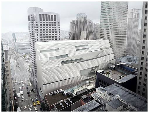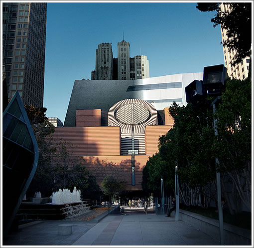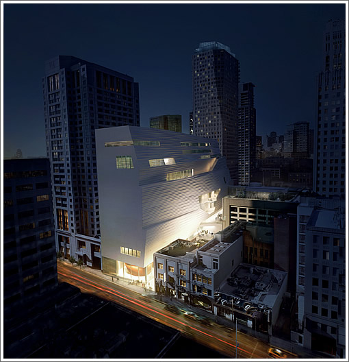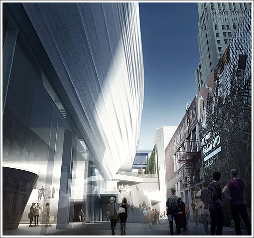
Back in May the San Francisco Museum of Modern Art (SFMOMA) revealed the rough massings and early Snøhetta design for the expansion of the museum. Today, SFMOMA released refined designs for the building as rendered above and detailed below.

The design of the interior spaces synthesizes the current Mario Botta–designed building and the new Snøhetta expansion into one seamless whole. Two main entrances (the current entrance on Third Street and a new one on Natoma Street) will lead into a central space that will serve as the public entry point to all galleries. To create an expansive, flowing space on the entry level of the museum, the original staircase will be removed from the Botta atrium.
The galleries in the existing and new buildings will be unified and total 130,000 square feet, double the current square footage. The building also introduces a façade on Howard Street that will feature a large, street-level gallery enclosed in glass on three sides, providing views of both the art in the galleries and the new public spaces. Upon opening, the Howard Street gallery will house one of the gems of the Fisher Collection, Richard Serra’s masterpiece Sequence (2006). The sculpture will be visible from the outside even when the museum is closed.

On its east side, the new building will feature a sweeping façade and an entrance in an area that is currently hidden from public view and largely unused. This will be realized through the creation of a mid-block, open-air, 18-foot-wide pedestrian promenade running from Howard Street through to Natoma Street that will open a new route of public circulation through the neighborhood and bring Natoma Street, currently a dead end, to life.
Additionally, the design opens up a direct pathway between SFMOMA and the Transbay Transit Center currently under construction two blocks to the east of the museum. The public promenade will feature a series of stairs and landings terracing up to an entry court that extends from the new east entrance, providing additional public spaces.

Groundbreaking for the expansion is currently scheduled for summer 2013 with completion projected in early 2016. And a link to the aforementioned video atop the page.
Omg, that’s UGLY!
I love it.
It’s starting to feel like a creepy monstrosity tho I’m trying to feel the love. Can something this forced and which looks like it’s trying too hard, actually work?
I like it. Upon seeing the massing I feared it could be monolithic and imposing, but I like what they’re doing with the terracing and texture.
Nice that there will be newly created circulation from Howard to Natoma. It is a little sad that the bottom flight of the Botta stairway will be removed but I understand the reasoning behind that decision.
Serra’s Sequence bottled up indoors on the ground floor? That piece was made for the outdoors!
It feels like Godzilla sat on the building while sipping his Samovar chai.
I think it’s probsbly the best design possible, given the non ideal wrap around the W hotel. Looking at it from Yerba Buena, it will look like two separate bldgs. But inside it sounds like it will feel like one integrated space. I hope plsnning doesn’t take them through the ringer, SFMOMA has potential to increase its presence and contemporary offerings in a big way with this. Personally I’m excited!
Btw milkshake, I think that Serra will be fine in that glass corner, as I’m betting the ceiling will be 30+ feet high. It’s cool that they are ‘opening up’ the museum to the public on that side of the street.
“It feels like Godzilla sat on the building…”
best description yet!
Funny how so many starchitect firms seem to have a signature look to their projects. A Gehry always seems to have that crumpled foil look, Libeskind cranks out fractured crystals, and Snøhetta seems to produce a lot of light colored textured surfaces. That’s probably a result of intentional branding, unintentional similarity, and customer demand (“My Gehry better look like a Gehry!”). OMA/AMO seems to crank out quite a variety of looks though though there are some cases that just scream “I’m a Koolhaas”.
hipster – I also like the idea of how the building enables after hours “window gawking” but there are so many other less robust pieces that could be placed there. That Serra piece is indestructible. Maybe the reason it needs to be kept indoors is because it could function all too well as a pissoir. A massive arty pissoir that is.
This is not sheer glass curtain wall construction featuring rigid right angles, so clearly it is inappropriate for the location (SF County). Also, it needs to be built taller and with less parking.
This design is a total bore. In 20 years we will all wonder what they were thinking. The front side is evocative of Gehry’s worst (think IAC headquarters) while no amount of superficial terracing can hide the overwhelming, uninspiring massing.
Where is rem koolhaas when you need him?
I’m the architect for the exterior.
We dredged up a section of the Titanic and used it for our model. As you recall, the Titanic was considered unsinkable because of the solid dividers that were to protect the ship in case of a single iceberg puncture. Thus, one of these dividers is the HUGE, practically windowless face for Howard street.
We felt this would evoke a sinking economy, soon to be followed by massive numbers of freezing deaths, along with a movie to be viewed over and over again by teenage girls.
So many architecture experts hanging around on Socketsite — who knew. Look, it’s a modern art museum. Shouldn’t it be a little provocative?
(editor has updated one of the photos)
That sheer white wall facing Howard has great potential for another bugsplat artwork such as featured on the parking garage, save this one will be a mid-2000s construction McLoft set adrift from Mission Bay.
That would be awesome, to see an artist’s conception of a shoebox apartment splatted into another surface. Seriously.
I rather like it.
They’re going to have their hands full powerwashing it if they want to keep it shiny.
As for windows: it’s an art gallery. While I generally agree that windowless walls suck, I’ll make an exception for this. It’s open at the pedestrian level, which is most important (blank walls on the street level really suck), and if you’re looking at it from a distance, it has an interesting enough shape that the lack of windows doesn’t detract.
And I really like the pedestrian promenade and Natoma entrance. We don’t have all that many active commercial alleys in SF, and it would be great if this led to Natoma becoming one– combined with the Transbay Terminal it could be a really fantastic “entrance” into the city: terminal -> bustling narrow street -> museum atrium -> Yerba Buena Gardens.
Would also be cool if you could stand in/on the transbay terminal, looking down Natoma, and see people on the balcony of the Moma, framed between taller buildings, looking back at you. Maybe put a coin-op telescope there 🙂
Remember folks, this lot is really narrow and llloooooooonnnggg. What else can u do but design a thin, tall box? They need the floorspace, so it’s gotta be multi story. Only so many ways to disguise it, especially with the W hotel on the corner.
It could be pretty decent – still withholding full opinion. Koolhaas’ partner in OMA just showed their own 4 or 5 schematic proposals in a public lecture in SF a couple nights ago. The designs were obviously less developed than this, but more abstract/conceptual in nature, less gestural. Not sure about this scheme’s compositional attitude, light color, and solidity behind existing SFMOMA and at Howard St…will have to wait and see, a lot can (and will) happen between now and when its built.
What else can u do but design a thin, tall box?
Keep it empty and call it an art piece on the post-technological ennui of dematerialization.
Then SF could claim to have the largest sculpture in the entire United States as well as saved a bunch of millions.
As a fan of contemporary architecture I have to say, I don’t like the renderings (maybe the real thing will look better but …)
As far as options for the lot size, well how about something like the New Museum in Manhattan (Hell, Yes!). http://www.newmuseum.org/about/new_building/
This is simply further evidence that they chose the wrong site for the new building.
^ it’s still boxy (literally) though.
Article in today’s NYT about the design (name link)
I randomly stumbled across the New Museum last month. I liked how it fit in perfectly to the general massing on that street in the Bowery while standing out as a contemporary building. The photos in that article don’t do it justice.
I like it a lot- I’m sure it will look amazing when built and a beautiful addition to our skyline.
They should have gotten the Swedish architecture collective Sven to design it instead.
Also, is the massive cheese grater they will run along the side going to be made in China?
Well, that’s just hideous. I know that all the drama is being generated over the view from the Hotel W, but what this does to the view from Yerba Buena Gardens of the old telephone building on New Montgomery (and vice versa) is without redeeming value.
jeez, for all the haters, you’d think they were proposing a museum with curving walls and a circular ramp inside! This is a good solution to the museum’s needs and the design is still being refined.
It’s in a city–in most city views, you just see other buildings and this will be a more interesting one to look at than most. Meanwhile, I think that NewMuseum building wouldn’t look half so good in this location sandwiched in among towers–nothing would. So given this location, and I agree with the decision to put it adjacent to the existing museum no matter what, I think it’s a good design and will make that neighborhood more interesting than ever. NOTHING would satisfy most people in San Francisco which is why, in the case of buildings with less political momentum than this, nothing exciting ever gets built and we end up with block after block of vanilla blandness. Just build it. Then I’ll personally decide if I like it.
This building is wonderful, and getting rid of the stairway at the center of the Botta design will improve the space which is a bit crowded as it is now.
Serra’s Sequence is beautiful outdoors, and its current outdoor setting at the Cantor Art Center on the Stanford campus is really quite wonderful. But be careful putting boundaries around the appreciation of such works:
During an interview while the sculpture was in New York, Serra rejected the notion that there was a “correct” way to approach his work. “This isn’t here to teach you anything,” he said. “It’s your experience and the private thoughts it engenders that are your private participation with this work.”
The error is not the current design on an almost impossible site.
The museum should have demanded the city use its powers of eminent domain to add the two or three lots on Howard immediately to the east. None of those buildings are worth preserving.
A bigger lot would have allowed the more glorious building that Snohetta and EHDD could have given us.
The scheme still feels absurd no matter how skilled the architect.
The solution: Tear down the original Botta building – What Alan Temko said looks like a “toaster extruding a cheese-danish”. Let Snohetta stretch out a bit a put more of the building on the better part of the site, and loosen up the mid-block.
The original is going to be gutted anyway. Don’t treat it like some landmark gem (that it isn’t).
“The solution: Tear down the original Botta building…”
If you’re going to tear down more buildings for more space, conifer’s idea is the way to go. The Botta building is one of the few interesting structures on that block.
Or, they could cover the YBG-facing exterior wall in red brick to connect visually with the Botta toaster. (I kid, but you know someone in Planning will suggest it!)