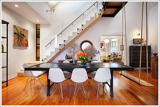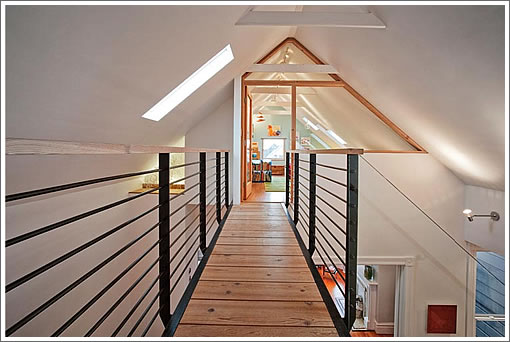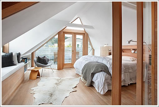
If you happened to tour the “Mork-Ulnes Design Clayton Street Residence” on the AIA’s 2009 San Francisco Living Home Tour, the address for which was correctly pre-identified by a plugged-in reader, you’ve already been inside.

At the time, however, 778 Clayton wasn’t on the market. But today, the renovated 2,618 square foot Victorian condo with modern Norwegian flair (think steel, glass and lots of blond wood) has been listed for $1,595,000.

∙ Listing: 778 Clayton (3/2) 2,618 sqft – $1,595,000 [778claytonstreet.com] [MLS]
∙ AIA’s 2009 San Francisco Living: Home Tours (Plugged-In) Challenge [SocketSite]

Cool place
Wow. The link isn’t working.
[Editor’s Note: We just double checked the links, all of which should work but do require flash. And unfortunately we don’t have any control over whether or not the linked-to servers can actually keep up. Cheers.]
This place is really awesome. I love the lighting the colors on the walls. It is all very interesting. But, a condo is not ideal for families. The neighbors will hate you downstairs and tandem parking is a pain as is having to share a backyard if there is one that is shared. 🙂
Very cool place. The site has a ridunkulous number of pictures. A dog! a swing! lemons! wow, this place has it all.
The presentation really does make me laugh, but the place itself looks wonderful and thoughtful. But that swing has to go….
Swing in living room, check. Church window in bathroom, check. Exposed brick, check. Golden Gate bridge view, check. Under $1.6M, sign me up.
The bedrooms are ridiculous. Too-steep stairwell to reach them and then you have to walk around with your head tilted sideways to avoid smacking into the ceiling. Dressers will stick way out from the walls.
It looks really nice sitting at a computer terminal, but I think living there will get old fast.
I like the place but how the hell did those stairs pass code being that steep, were they permitted?
Note the master bed looks like a queen bed turned sideways and then made up with the pillows on the sides so that you don’t see the actual head tilting you’ll have to experience getting past it, unless you are 4.5 feet tall and would actually orient it that way.
The place is a joke.
Those of us who have been in the space know it to be anything but a joke.
Very nice but I bet it will not fetch the asking price.
WOW. This is one of the most beautiful spaces I’ve seen listed on this site. A lot of love, communication and imagination obviously went into this home’s renovation.
I wonder what the architect would say about the “Norwegian flair” comment?
“I wonder what the architect would say about the “Norwegian flair” comment?”
He is from Norway so I dont think he would mind 😉
I know, that’s why it’s funny. So it’s just “Flair”, funny.
i saw this place in print and on the net before seeing it during the AIA tour (i believe it won awards for interior architecture and design and got the owner/architect a lot of work). i walked away contemplating the difference between photographing beautifully and being beautiful (in architecture and design at least).
it is a great looking, well thought out, light filled home but the quality of the finishes – plastering, painting, window sealing, floors, edge detailing – was a major disappointment. still at about $610/ft2 i doubt it will be around long.
Wow! Amazing!
* puts the open house on the calendar *
Some very interesting interior decorating going on here. I like that wooden fruit stand in the kitchen. Anyone know who makes it?
There are more shots of lemons, pillows, lamps and flowers than of the actual spaces and home. This trend of showing close ups of objects sitting on a desk vs. the actual room the desk is in, has become quite annoying.
I could understand if the home was being sold “furnished”, but this really is too much of the wrong type of information.
A client forwarded me a website for a townhome in Pebble Beach that is for sale to see if I thought it would be worth a rebuild project. There were over 40 pictures for a two bedroom townhouse, but no floorplans or basic room views. Instead of informational images on the townhouse, there was mostly dozens of pictures of pinecones, golf clubs, a misty grey view of a tree branch, and a close up of a steaming coffee cup and cookies?!
@SJM: I don’t believe the parking is tandem w/ the other unit. Website and MLS indicate 2 car pkg for this unit, which happens to be tandem, not side by side. No mention of yard so I don’t think it has one, but apparently has 2 decks.
Very cool house I must say.
The bedroom is really an attic disguised as a top floor. The space will be intolerable on those few hot days and worse on these cold ones. The whole thing is another display of childish ego. A swing/seat at the table is just stupid no matter how “mod-rustic” is looks.
If you want a modern home buy one, don’t gut a Victorian and lose all the genuinely sound energy features for something that will consume vast amounts of energy to heat.
this is a great space…I am amazed at the drop in prices over the last 4 years…makes me feel somewhat sorry for the folks that bought my $1,200 sft condo in buena vista park for $1.1MM just last year…they should have waited…but then again, i should have waited buying it back in 2006 for $1.1MM and then putting $.3MM additional into it…seems waiting is the best course these dcays although this seems tempting…but then I have been nothing but surprised on how quickly and far prices are dropping!!
Love the dining table room swing, my friends would so be fighting for that spot at our dinner parties!
don’t gut a Victorian and lose all the genuinely sound energy features
What genuinely sound energy features? I own a Vic and I don’t have any of those. Not a one.
Can anyone tell me who made the horn into a lamp?
I have a very similar old horn with the same patina and it I would love to turn it into a wall light.
btw… the property website sucks! never could find the open house time ( had to look on mls link)and it took me a while to find the photos.
but love it anyway!!
bgelldawg: 1/2″ drill bit and $10 at Home Depot.
Serious LOL at the “genuinely sound energy features” of old Victorian homes.
Don’t lol too hard, most Victorians were built will rooms/zones that could be closed off and heated individually to conserve heat. Having to heat an entire great room with high ceilings is the antithesis of that design.
None of you even know what kind of heat or insulation the house has.
It has radiant heating.
Michael,
You’re saying that a shut off valve on each steam radiator of a 100 year old house (with no insulation, single pane windows with rope and pulley systems, ancient heating plant, and a building envelope that leaks like a sieve) beats new constuction that conforms to 21st century codes? Really?
Well it would seem from the comments that current popular design taste in San Francisco calls for removing all historic traces from a structure and then installing a swing in the dining/living area. I would like to see how this design would feel if all of the art, furniture, horn lamps and swing were removed.
I can forgive the swing if it is a reference by the architect to the velvet swing of famous New York architect Stanford White, but that might be just wishful thinking.
And I also think it’s funny that the assumption is there was historic detail removed (and lots of it). When most of the time a fixer isn’t just unremodeled from it’s original state but in fact left to rot with it’s 50’s or 60’s finishes and no trace of anything historic before construction begins.
is there a fire escape from the third floor (attic)?
“You’re saying that a shut off valve on each steam radiator of a 100 year old house (with no insulation, single pane windows with rope and pulley systems, ancient heating plant, and a building envelope that leaks like a sieve) beats new constuction that conforms to 21st century codes? Really?”
Read what I wrote, I didn’t say that at all. I did say that a sound conservation feature of Victorian design was the ability to selectively heat rooms while not heating excess space that wasn’t being used.
Even assuming ultra-efficient insulation and heating, that living room is poorly designed from an energy conservation point of view.
Dwell magazine did an energy study of well maintained historic homes. Homes designed with mechanical rather than energy consuming electronic comfort controls, the ones modern homes depend upon, have features that use drafts to move air around. Those who complain about draft Victorians, are usually not willing to maintain them, even though the cost savings and energy efficiency are good for the planet, those accustomed to having everything meet personal desire find putting on sweaters instead of turning up the thermostat an imposition.
Victorians were designed with the kitchen in the rear, under the bathrooms often to heat water for bathing in tanks over the hearth/stove. Radiant heat from cast iron stoves was pushed from back to front using the air flow from the back door to the front. Transoms are air flow valves, so are doors and windows. Rooms were heated according to use and with the dining area near the kitchen, the eating space could also be warm when time came to sit down.
Rooms were all multi-purpose. The idea that individual bedroom, one per child each with it’s own huge bathroom and water supply was and should be an anathema to those interested in the environment. The cast iron tubs hold heat and heat the surrounding air as well as add moisture. Used water, “grey water,” was often drained into gardens (talk about local food supplies!) even when there was an attached sewer system.
Plaster and lathe, the main component of Victorian and Edwardian walls, is not only insulating, it is flexible enough to withstand many earthquakes. It slows burning, so protects blocks from being consumed by a fire in one house.
The greenest part of Victorian and Edwardian urban and home design was the backyard. A green space with trees in the center of every block contributed oxygen, space for birds who eat vermin, and created communities withing communities. This organic design made SF a city of neighborhoods, the idea so prized and undermined by real estate developers.
MCM, GMAFB. You make Victorian builders sound like hippies. They weren’t. Builders in SF were building with available materials and inherited techniques, and they were maximizing the 25X100 foot standard lots. Some of these techniques may be “green” in retrospect, but nobody in SF was building save the environment or reduce energy use, and I’ve never heard of a gray water system from that era.
BTW, row upon row of grand Victorian flats were built with miniscule back yards. Talk about “communities within communities”. Preserving a set amount of space in the backyard was a more modern development of the zoning code.
I remember reading about this in the NY Times. I want to see it now Read all about it:
http://www.nytimes.com/slideshow/2008/11/13/garden/20081113-HAIGHT_index.html?scp=17&sq=haight%20ashbury&st=cse
Article is here:
http://www.nytimes.com/2008/11/13/garden/13haight.html
where’s the facade??? i LOVE this. it’s like Ikea-gone-wild-and-classy.
The cast iron tubs hold heat and heat the surrounding air as well as add moisture.
Cast iron tubs take a lot of energy to heat up. So on a cold evening, you might have hot water coming out of the faucet, only to have warm water in the tub by the time it was full.
Cast iron tubs are great for retaining heat, which is what you’d want if you were taking a long bath.
Curmudgeon,
No, Victorian builders weren’t hippies, neither were plantation builders or castle masons. Limitations made them design buildings that worked in particular geographic areas. They all used every bit of available material and relied upon work, on craft rather than on expensive items. (“High end appliances” and “luxury finishes” in real estate jargon.) Ascribing motive is beside the point, except when one imagines that the free market has motives which are just sales tactics like calling the toxic waste in your fluorescent light bulbs energy saving.
It’s not a question of identifying the past by giving it contemporary identifiers. It’s about seeing how little people used to waste versus how much we, supposedly green advocates, waste now.
People used less paper a generation ago because there was less paper to use and it was more expensive. People took hot coffee to work, they didn’t take it in a disposable cup. Everyplace from airlines to restaurants to hospitals used reusable things instead of the disposable stuff we use now.
We dispose of houses either by gutting them or by demolishing them. No way does demolishing a home have an environmentally neutral impact. All the LEED certification in the world won’t balance out the waste products of a demolition and the carbon foot print from shipping all those “luxury finishes” to SF.
Socketsite is about wallowing in real estate fantasies, but there’s no presumption that the only value is the market value.
Victorian buildings as “Green” buildings?
Sure there were a lot of local products used. Like redwood. And they almost wiped out all redwoods in a few decades. This can be summed up in roughly 600 years of growth used up in 60 years. Not very sustainable…
Now this looks green because keeping these rot-resistant non-chemically tainted materials is the greenest thing to do. But they were not green to begin with.
Victorian buildings are green buildings if you paint them that way. They chose to paint it black. 😉
The sale of 778 Clayton closed escrow today with a reported contract price of $1,600,000, officially over asking by $5,000.