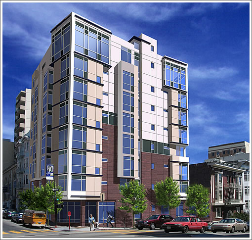
1299 Bush at the corner of Larkin as envisioned above and the reality to date below.
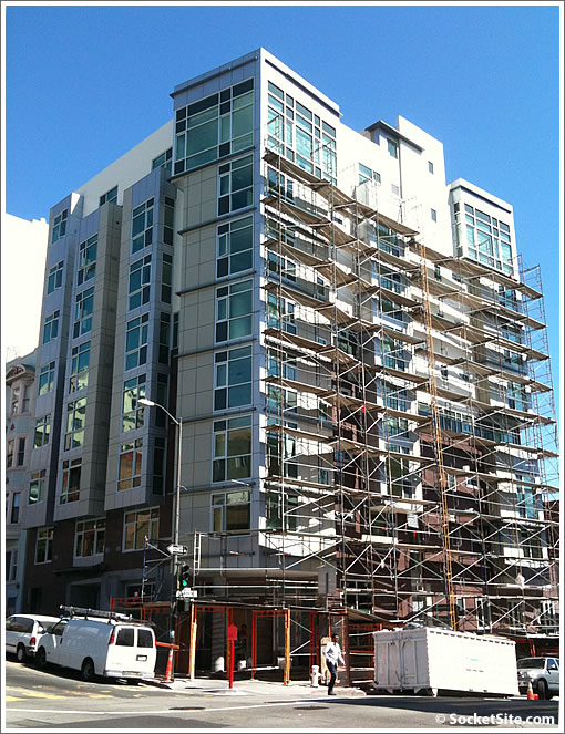
Once again, 26 units over ground floor retail (and 20 parking spaces) coming soon.
San Francisco real estate tips, trends and the local scoop: "Plug In" to SocketSite™


1299 Bush at the corner of Larkin as envisioned above and the reality to date below.

Once again, 26 units over ground floor retail (and 20 parking spaces) coming soon.
I’ve never understood why they use blue windows for the presentation but then switch to aqua/green in the real thing.
I’ve seen this several times, including Infinity if I recall correctly.
except for the color of the windows, it seems more true-to-vision than a lot of projects that have gone up.
and although it’s nothing special, it’s nicer than most of what is up in that area anyway. (like the Rite Aid or the Firestone or the other buildings up the hill from there.
These Boxed Pigeon-hole tall concrete buildings are an eye-sore in that part of San Francisco…
They remind me of the box cages that people in New York live in… a former life that I myself lived and don’t ever wanna to recall !
ex SF-er: the reason is quite obvious: blue or crystal clear glass sells better in the rendering. Then they install tempered safety glass in reality, which is always green.
Oh boy another boring lego-esque box! Guess it’s better than nothing, but man I agree these designs are getting tired.
My bet is that 70 years from now there will be massive fights in this building between those wanting to preserve these buildings and those who want to rebuild. These, my friends, are the City’s new Victorians. It’s as if they are the only things we allow. If we had more building diversity, this would not be an issue.
Methinks the future fight will more likely be about who gets to swing the sledgehammer.
I know I’m sounding like a broken record, but a few vertically oriented curves and ellipsoids, even if just false stucco lines and padding, would do so much to humanize these piles of bland.
The reality looks far better than the rendering. Renderings are abstractions, not photographs. From the quality of the rendering, looks like they used a cheap shop. Renderings can be expensive. A good one can cost $12k+
I’m happy with it – if only due to its height.
I’m amazed that anything more than a story that doesnt emulate a Thomas Kinkaide painting gets built in this nanny state of a town.
Ever watched our planning commission meetings?
The public comments make Obama’s health care town halls seem intelligent, thoughtful, and incredibly productive.
I live north of here on Larkin at love it, but honestly, I wouldn’t buy south of California; it goes down hill (no pun intended) pretty quickly.
I’m not an architect or an expert but I don’t think that in 70 years there will be any fights to preserve this look. They they get “tired” they will get “updated” with a more classical and ornate facade…you know, back to the future, so to speak.
It’s not green because it’s tempered. The glass is green because it’s tinted to cut down on solar gain. The other choices are grey and bronze. Long a staple of office building design, tinted glass has moved into high rise residential design to help with Title 24 requirements.
Why is it blue in the rendering? It’s not. It’s supposed to look like it’s reflecting the sky.
thanks for the information.
it’s too bad that blue can’t cut down on solar gain.
out of curiosity: how did ORH and Millenium manage to have blue windows? do they not need to care about solar gain? or do they use a different process?
ex-SF-er: You can [add] SF BLU to that list too…
70 years from now there will be massive fights in this building…
In 70 years, we will all be dead. So how does it matter ?
Nobody mentioned whether or not this is a for-sale or for rent project and it clearly lacks signage? Does anyone know?
^^^ Hmmmm….. the attitude that anything that occurs after our personal demise is insignificant might explain a lot of antisocial actions being made these days.
given that many things can happen within 70 years, like earthquakes, droughts, nuclear war, plagues, SF turning into a 3rd world city which it already appears to be doing, etc, i really wouldn’t worry about what people think about this facade 70 years down the line.
eternal city
words survive a legacy
judged tomorrow
Can we get some facts?
1. Who is the Architect?
2. Are there floor plans?
3. What is the price for the units? Are they 1 bedrooms?
4. What is the retail? Walgreens is diagonally across it.
Thanks
When is the open house? Price? any idea?
I Know that the Architect is ForumDesign (77 Van Ness, 818 Van Ness (“Artani”), 2655 Van Ness (“1501 Greenwich”.
Yes, you can also get solar efficient glass in blue. Pilkington’s Arctic Blue, for example. There’s also blue/green.
Personally, for a residence, I prefer clear glass but even with pyrolytic coatings it doesn’t perform as well as the tinted glasses. Next best, for color consistency is grey. To me green and blue glasses give a slight bottom-of-the-aquarium feel. They look great from the outside though and most people never notice the color distortion inside.
And yes, “clear” glass usually has a very, very slight green tint – which you can only see by looking at the edge. White glass, with no green tint, is available but it is more expensive.
To Hiyou:
-Grand Opening is Sunday, September 27, 12-5 pm
-Floor plans available on website soon
-Architect is Forum Design
-1, 2 & 3 beds, prices start at $495k