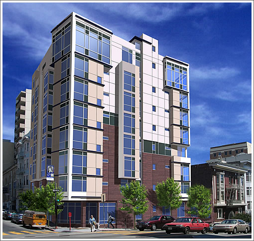
The plugged-in readers are on fire today as Luba (of Luba’s San Francisco Real Estate Blog) comes through with the rendering of what’s rising up at 1299 Bush Street.
That’s it people, take the weekend (and monday) off. You deserve it. And once again, you’re the best and thank you for plugging in.
∙ A Reader Asks, We Respond, You Embellish (Hopefully): 1299 Bush [SocketSite]
∙ A Reader Asks (And We Can’t Answer): Corner Of Pacific And Polk [SocketSite]

Very nice design, but still in the middle of the tenderloin
Bush St. is not “the middle of the Tenderloin.” The boundaries of the Tenderloin vary in different maps. Some consider Bush St the edge of the Tenderloin, and others place Bush St outside the TL. The city of SF officially defines the boundaries of the Tenderloin in the Tenderloin Police District:
http://www.sfgov.org/site/uploadedfiles/police/stations/Tenderloin.pdf
Note in the map the Tenderloin’s northern boundary is Geary St, so the city places Bush St outside the TL.
Bush St is 2 blocks from California St and Nob Hill. San Franciscans often refer to the area as the Tendernob, to describe its transitional status between the two greatly different neighborhoods.
What is “the middle of the Tenderloin”? Eddy and Jones Sts, maybe?
Is it just my monitor or is the exterior mauve? As in 1980s mauve?
Or, am I the one out to lunch here and mauve is back? Tell me that isn’t true.
Hopefully, I just need a trip to Fry’s.
Rich, you are right, it is mauve and the building DOES have that 80’s feel. Sort of reminds me of some of the discount hotels on the fringe of Palm Desert that were built when Ronnie and Nancy were in the White House. Oh well, for a city that lives off of nostalgia, I guess even our modern buildings are nostalgic.
You can see what was there on Google Maps Street View.
http://maps.google.com/maps?q=1299+Bush+St,+San+Francisco,+CA+94109,+USA&ie=UTF8&ll=37.792372,-122.417758&spn=0.006867,0.014462&z=16&layer=c&cbll=37.788925,-122.418483&cbp=1,528.3698932384354,,0,2.085777089469286
Is it me or do almost ALL of these new developments look like a Kaiser-Permanente Hospital???
I like the design, though maybe reality won’t be the same as the rendering. I’d prefer brighter colors however. Change some of that white to orange, for example.
Tough crowd here. The building is nice, has many units, and improves upon what was formerly in this location. I’m all for it.
There’s also a new building going up around the corner on Sutter, across the street from 1158. I love the sound of urban renewal in the morning.
Hope the creative aspect doesn’t get watered down that we revert back to the 80’s in mass.
“very nice design”??? — perhaps in Omaha. I totally agree with the Kaiser Permanente comment.
This is the height of formulaic mediocrity (layered grid lameness) — pretty much typical of crappy recent residential development in SF, and a rather pathetic addition to the city. As I’ve said time and time again on SocketSite, for you San Franciscans so willing to accept such mediocrity: go look at any decent recent residential design in any number of places beyond our provincial and small-minded version of multi-family architecture: Spain, Japan, Holland, Germany, Switzerland, Denmark, Austria, Belgium, Germany, Portugal, Scandinavia, the UK, or just NY, Chicago or LA — it all puts this to shame…
Why don’t you give us some examples of what you consider to be great design.
Mauve? Or is it a deep reddish-purple brick that relates to the existing building to the right in the picture. I’d give the builder the benefit of the doubt at this point. Once it’s constructed, then we can be critical. (Oops. That would be too late.)
eh, it’s better than what was there before. I think most of you people need a frontal lobotomy for demanding perfection everywhere. Baby steps.
“Why don’t you give us some examples of what you consider to be great design.”
Not necessarily a proper comparison to this development, but something I’d like to start seeing here in San Francisco for small scale residential projects:
http://www.166perryst.com/
blahhh,
I love 166perryst! Great example! We have so many amazing architects graduating locally from UC Berkeley, yet we do not take advantage of their skills and creativeness in SF! You have to go to residential homes in the North Bay (wine country) to see innovative designs, or some homes in the South Bay. We do not see any creative multi-residential or office building designs in SF.
In Northern California, there is just a “green” push. Why not be at the forefront, and design buildings, which take advantage of sunlight and wind to generate power for the building, use “green building methods, and design water systems, etc. that are friendly to the environment. What I am thinking about is the new Bank of America building in NYC, which they are building. I cannot recall the website, but I read an article awhile back in Business Week about how all of the water is recycled, there is greenery in the building sustained through adequate sunlight, it is linked to underground subway and has underground, secure car and bike parking. The design was quite magnificent. We should be at the forefront of “green” building and architecture.
We need to get away from boxy SomaGrand’s. I do like the curved shape of the Infinity (and no, I am not a buyer, those HOA’s are outrageous!)
Blahhh…
i agree, that is good design.
I also agree with others, not every building in Sf needs to be “great” design. the problem of course is that so very little of SF building is of even good design.
this is what happens when planning is so restrictive I guess.
Agreed..Perry Street is a really nice design. However I would love to put that in front of some of the mooks at SF planning…I can assure you they would have a fit!! I have gone through the website as well as that of the Architect and I can tell you that it is an incredibly expensive building to build. Which is OK when you have multi million $$$ units and a penthouse north of $10M. Half of this building at 1299 Bush won’t sell for that amount. So Kids, let’s have a few examples of some really good/great design where the preponderance of the units are less than $1m. Thanks
166 Perry street is very original and impressive. However, so are the prices – $1.9m for a 1146 sq foot one bedroom and a cool $11.5m for the 3400 square foot penthouse. If anyone tried to price accordingly in San Francisco, people [on this website especially] would be cursing them up and down and talking about the end of the world in terms of colapsing real estate prices. I realize that NYC [in general] prices higher than the Bay Area, but the equivalent out here won’t be priced for peanuts.
Don’t get me wrong, I’m all for this type of originality, but in the current economic environment, I’m not sure how many takers there would be. And the aformentioned one bedroom [at 166 perry] has a cool $1500 monthly condo fee too. That’s Four Seasons/Ritz Carlton territory … hardly something that will fly at 1299 Bush.