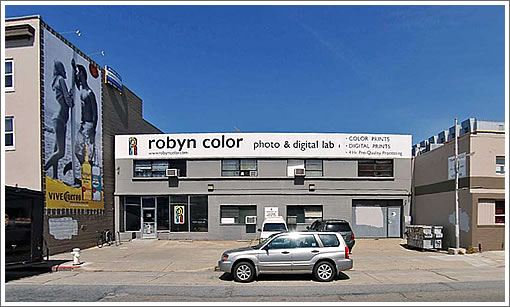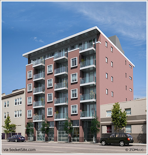
It’s a plugged-in tipster that notes the development of 870 Harrison Street by JS Sullivan was unanimously approved last week. Design by Leavitt Architecture, as rendered by ZŪM:

As previously summarized by us:
Twenty-six residential units (18 one-bedroom, 8 two-bedroom) over either 4,050 or 2,560 square feet of ground-floor PDR (Planning Commissions Resolution 17707 “allows for reduced PDR replacement requirements if 25 percent of the lot depth is dedicated to an at-grade rear yard”) and a below grade garage with 12 residential spaces, one commercial space, one van-accessible space, two car share spaces, and eight spaces for bikes.
And there’s animation to come (we’re told).
TRUELY UGLEEEEEEEEEEEE!!! A sububran transplant!
Looks similar to the 750 2nd street post put up yesterday on SS. I am beginning to wonder if the city has some pretty strict rules on what these architects and developers can do? Anyone know? Regardless this will really help that area out, not a lot of residential in the immediate area from what I recall.
How truly ugly.
Most developments in any city are boring. I see no problem with this one.
The only thing I don’t like is building so short. 85′ is allowed, two more stories should be added.
Agree this is not a thing of beauty, but, kudos for designing a little outdoor space (the balconies) for every unit… unless you’ve lived in a place without outdoor space, you can’t appreciate just how big a difference a whopping 50 sqft of the great outdoors matters.
Beauty is only skin deep, but ugly goes to the studs.
Perhaps if they chose a color outside the retirement-home pastel palette?
from the Beautiful renderings of the condos by the Ballpark yesterday… to this.
this building is an example of complete lack of imagination, style and forward thinking. it does truly look like a suburban retirement home. YUCK!
actually many developments in other cities are much better than the genera crap of SF. have you been to any other cities lately, anon?
in seattle alone.. much of the new development is more progressive and interesting. not all of it, but much of it.
and i disagree this building looks very little like the 2nd street building. this color might be the similar.. but the similarities end there.
At first I thought it was kind of comical, but it’s now become appalling how *every* new building in this town is designed almost exactly the same.
Yep, ugly. But at least it covers up the billboard on the building next door, so its not all bad (just mostly bad).
Is the 80/20 rule 80% o everything that is being built is truly an eyesore?
Wow. That’s an ugly one. As for the outdoor spaces, that stretch of Harrison is noisy and smelly. There’s a Whole Foods down the block open from 8AM to 9PM and a sex club in the next block open from 9PM to 8AM and the The EndUp, a 24 hour dance club, at 6th and Harrison. What more could one want?
Plus more homeless people you can shake a stick at.
Complain. Sarcastic comment. Complain. Sarcastic comment. Wash, rinse, repeat. It’s such a predictable refrain on Socketsite.
This is going to improve a not-so-nice block of Harrison with new construction and new residents. OK it’s bland, but so what? Sheesh…
[Editor’s Note: Of course you could choose to lead by example rather than complaining about others’ complaining…]
“Complain. Sarcastic comment. Complain. Sarcastic comment. Wash, rinse, repeat. It’s such a predictable refrain on Socketsite.”
This is what passes for intelligent debate in the instant gratification/everyone’s opinion matters online world. Spend any time reading the comments section of SFGate?
[Editor’s Note: See note above…]
@gabriel, just got back from Barcelona, where 95% of new development looks a lot like this. Boring but functional.
“This is going to improve a not-so-nice block of Harrison”
but where will I go to get my color prints?
The rendering is not helping the cause. More disturbing than the blandness of the rendering, the perspective is botched. Trace out the perspective lines of the neighboring buildings and you will see what I mean. These novice mistakes make a big (negative) impact in how a building appears, even when you don’t consciously realize why there is something wrong.
Help me out here — how can they have windows on the side without window wells? That’s not to code, is it? Or was my years of wrestling with SF DBI really just a bad dream after all?
What annoys me about this development is the fact that it just seemed sail through the BOS.
This is new construction replacing an existing OPEN business in an area of city that is less ideal for residential development.
Compared to the Haight/690 Stanyan development (underground parking, whole foods, condos) replacing a CLOSED cala foods and vacant parking lot that is not only an eyesore but draining dollars from the city. That project, which went through the usual BOS BS, was scaled back to just an interior gutting.
what a load of crap (architecturally and politically)
Is there ground floor retail? or are those openings just for parking garages? I pray it’s got at least one retail slot in there, otherwise, it’s just more dead space on the street.
Things the architects did right: brought the building facing up to the sidewalk alignment. Gave residents some outdoor space with balconies. Captured some energy efficiencies with cornice overhang (shade) and solid covering on exterior (not 100% glass).
Things done wrong: if zone is 85′ height, this needed to be taller. Agree that 2 more stories should go in. This city, and particularly that neighborhood, need increased density. Colors are blander than beige (but that’s fixable).
“Complain. Sarcastic comment. Complain. Sarcastic comment. Wash, rinse, repeat. It’s such a predictable refrain on Socketsite.”
This is what passes for intelligent debate in the instant gratification/everyone’s opinion matters online world. Spend any time reading the comments section of SFGate?
[Editor’s Note: See note above…]
Touché!
“Is there ground floor retail? or are those openings just for parking garages?”
In looking at the pictures on the development site it doesn’t appear that there are any openings to the garage on the front. Based on the pictures I think that the parking might be accessed from the alley behind the building.
Also if you had looked at the link you would see:
“Commercial: 1 space – 2300 sq ft or 4200 sq ft restricted for PDR business use (production, distribution, repair)”
Perspective clearly you have none yourself, no need to get into the details, you know what I am talking about. Troll.
@badlydrawnbear – this didn’t go to the BOS. Didn’t need to. It conforms to all elements of the newly approved Eastern Neighborhoods plan. The problem with the Haight/Stanyan project is that there is no neighborhood plan for the area AND the developer wanted variance after variance from what is allowed there under current zoning.
i really like this building. Should be 2 flrs higher but otehrwise, nice and simple design