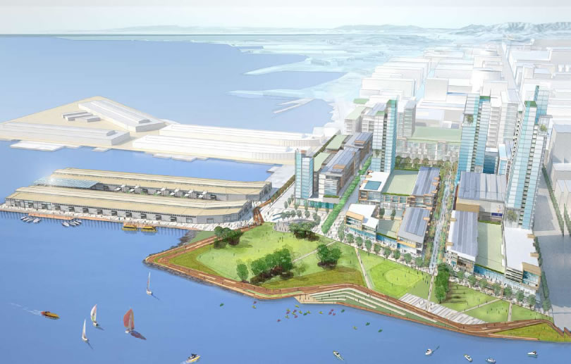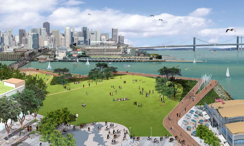
The one proposal for San Francisco’s Seawall Lot 337/Pier 48 (dubbed “Mission Rock“) by the numbers: 875 rental residential units; 2,650 parking spaces; 240,000 square feet of retail; 1 million square feet of office; 181,000 square feet of exhibit/event space at Pier 48; and 8.7 acres of public open space (including a 5+ acre park to the north).

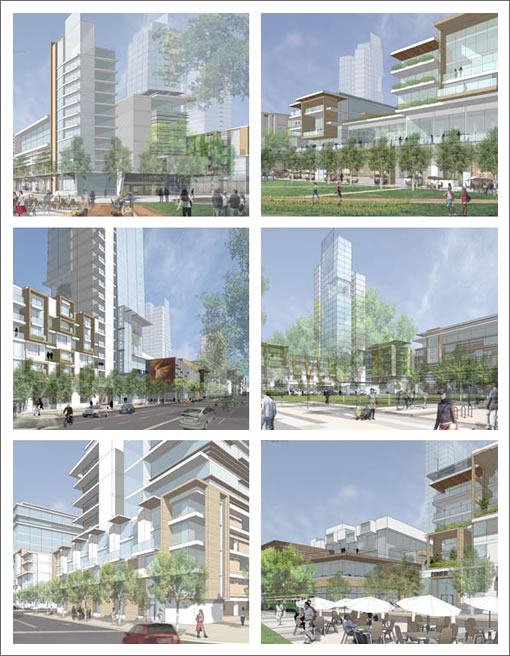
The one (big) development team: San Francisco Giants, Wilson Meany Sullivan, Kenwood Investments, The Cordish Company, Stockbridge Capital, and Farallon Capital Management. A few bigish buildings (max height of 37 stories/380 feet):

And how we got here in (more than one) links:
∙ Request For Proposals For San Francisco’s Seawall Lot 337 [SocketSite]
∙ San Francisco’s Seawall Lot 337 Design Proposals: In Summary [SocketSite]
∙ The Development Of Seawall Lot 337: And Then There Were Three [SocketSite]
∙ Joint Giants/Kenwood Proposal For SWL 337 Into Extra Innings [SocketSite]
∙ Mission Rock (SWL 337/Pier 48) Proposal: Executive Summary (pdf) [SFGov]
∙ Information on China Basin Seawall Lot 337 (SWL 337) [SFGov]

I love it and hope it actually gets done.
again, love it
This would be great! I I definitely prefer this to the earlier plans…what are the odds it actually happens, though?
build out slated for.. 2030….
(uhh. I hope they have lots of senior housing)
I’m impressed. This looks thoughtful and intelligent. A really nice place to be – if it happens. I hope it does.
I like this very much as well. I am also thankful that they did not try to do a “ye olde” San Francisco Victorian village type of nonsense. I am beginning to think I was born decades too soon. By 2030 we could have this as well as the Transbay Terminal and Tower, and high speed rail, or am I just drinking the Kool Aid?
I like this one as well. In particular, I hope that the highrises are as slender as they appear in the drawings. I feel like the highrises in SF are so bulky…I wish there were more skinny ones like in South America and Asia. Especially with land as expensive as it is, I’m surprised the parcels aren’t smaller. Anyone know why that is? I mean, there are tall, slender older buildings near Union Square but everything newer looks like a giant bulky block.
I have to agree that this is very nicely done. Slender towers. A sense of scale. Beautiful park. Really very nice.
Awesome! Beautiful plan. I echo all of the prior posts. Also, I have never seen so many people agree on Socketsite. It must be great.
What are the chances anything like this even gets started in this economic environment, with crashing residential and commercial rents?
Well, I think it’s a well thought out out layout and plan, and I like the overall architecture of it.
However, I am a little tired of the current trend in putting random horizontal and vertical edges that serve no function on the exterior of buildings. But, this will fit in well with the surrounding area, as just about every building at mission bay has them now anyway.
Has the ground lease rate or sale price been set for this land? If not, these developers and equity providers teaming up is not a good development for the Port in regard to maximizing revenue for the site.
@ rr “However, I am a little tired of the current trend in putting random horizontal and vertical edges that serve no function on the exterior of buildings.”
Those are docking ports for the flying cars that will be common by the time this project gets built.
It is a nice enough scheme on the surface, i.e. good generic plan and high rise designs.
in terms of feasibility is might happen in a rather long time from now –
1MIL sf office – no need for the next 10 years
900 resl units – no need for next 5 years.
retail here – maybe not at all
this plan is made for the expectations of last economic cycle.
one hopes that the developer keeps spending $$ to push this ahead, as wilson meany is a top notch developer –
they and stockbridge however are the group that purchased the old tel bldg on New Montgomery street — at the peak of the bubble — for $125 MIL and that project is stalled out.
“However, I am a little tired of the current trend in putting random horizontal and vertical edges that serve no function on the exterior of buildings.”
I’d rather have some pointless edges to give the facade some structure rather than the 70’s office building look of the watermark.
Where would we park for Giants games now?
This will be fantastic for San Francisco.
I really like the idea of the pedestrian-only shopping linking the neighborhood square and the main waterfront park. Converting Pier 48 into a mixed-use exhibition & event space with a festival square at the entrance is really exciting. The views from there will be phenomenal.
Looking forward to running loops around Mission Creek Park, Mission Bay Commons and along the waterfront at Mission Rock Park.
As for the parking, I guess they expect more people will be taking transit to the games by then, including on the new Embarcadero Muni E line. They do state “The project will contain a responsible amount of parking resources so that the ballpark and neighborhood can continue to operate effectively during events”
>Where would we park for Giants games now?
In one of the proposed 2,650 parking spaces.
Nice work, but I dont support any plan that doesnt include some kind of covered arena. There is no reason why SF shouldnt have something like the Oakland Arena directly connected to public transport and blocks away from the highest density of public transit lines west of the mississippi.
Looks nice .. the UCSF development, the new UCSF hospital, and this development … very nice.
The plan and building designs look more mature and urbane this time around. SMWM was the architect of the first proposal but they were taken over by Perkins & Will from Chicago. Is P&W the author of this plan therefore?
I agree with previous posters. Nice plan.
But I wish they would spring for one signature building
by a world-class architect. A Jean Nouvel or Gehry
building that would jump out from the tasteful, but
rather bland structures that have gone up in Mission
Bay so far.
For instance, look at the new Copenhagen Concert Hall:
http://www.nytimes.com/2009/01/20/arts/design/20hall.html?
keep in mind that they are not proposing actual architecture. it’s a master plan, not a proposal for the design of individual buildings, so architectural criticism is not really ripe yet.