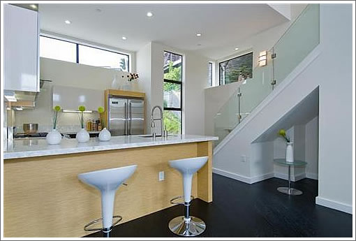
Seven months ago two for the four “copper clad condos” atop 17th Street hit the MLS. Listed for $1,399,000 ($774/sqft), 4588 17th Street closed escrow two months later on 5/20/08 with a reported contract price of $1,390,000 ($769/sqft). And at the time 4590 17th Street was listed for $1,349,000 ($785/sqft) but never sold.
Last week 4590 17th Street returned to the market with a new listing, an official seven days on the market, and now asking $1,299,000 ($756/sqft).
∙ Listing: 4590 17th Street (3/3.5) 1,718 sqft – $1,299,000 [MLS]
∙ Two Of The Four Copper Clad Condos Atop 17th Street Hit The MLS [SocketSite]
∙ Copper (And Wood) Clad And Coming Semi-Soon At 17th And Clayton [SocketSite]

noisy.
location, location, location. But try pulling out of that garage. Shhheeze. I can’t imagine.
It’s always fun to go back and read the comments from the prior posts.
For example, this one from the “hit the MLS” post:
These are priced right and will probably go quickly.
Posted by: Mystery Realtor at March 26, 2008 7:27 AM
One went for under asking (and who knows what ‘sweeteners’ were added to get that one to close) and the second didn’t sell at all.
it’s funny how the open house note says “Bring your clients as this property will not last long.” Apparently it did last, last time!
editor,
Can you open a section to talk about properties that are under 1M?
Its quite a discouragement that everything that looks ok is $2+m.
I guess that is just the reality in SF???
Ester,
You could probably get this for under a mil if it sits as long as it did last time!
Yeah, there’s a difference between $1M+ asking and $1M+ selling. The difference? Time.
https://socketsite.com/archives/2008/10/in_need_of_some_attention_in_more_ways_than_one_1773_15.html
Can someone explain the hospital bathroom look to me? The bathrooms in this unit look like they belong in a medical lab. I guess the “Zen-Spa” bathroom look is over?
I like the look, but, Oh My Gosh! I’m am an Architect and about all we do is hospitals. Could there be a connection?
I’m an architect too and the bathrooms look great; understated, clean lines, simple materials, elegant fixtures. what’s the problem?
What? a bathroom is supposed to look like the inside of a fast food restaurant? a french bordello? a taco joint in Barstow?
People; its a place to clean up, brush your teeth, shave whatever you shave, do your business, and get out the door to make some money to pay for this place.
That’s a great sales pitch, as long as you’re shaving your head so you don’t need any shampoo or product. Oh and you are not using shaving cream.
Noearch, I wish my clients were so easy to please. Some of our clients LIVE in their bathrooms and use them as places to relax. A project we recently completed near Calistoga had a master bathroom of over 950 sq. ft. with outdoor spa and shower with water feature. I find the the “white” bathroom in this unit too blah. Certainly they could have come up with a better sink solution.
Noearch, are your initials J M ? 🙂
Hey, noearch and anonarch. Do you know anyone in the area who is familiar with using Rastra for buildings? I was thinking of building something energy efficient out in Livermore and was thinking about looking up someone with experience to consult with.
I have never used Rastra myself, but I know it is popular in low-rise commerical office complex developements in the Midwest.
The firm I work for is known for larger specialty custom homes, mostly residences in resort areas. These clients tend to be not very “green” savvy.
not all the baths in these units are pure white. there are accent walls of colored tiles. I generally prefer white or off white, with some occasional use of color.just my design preference. not always easy to convince clients of that approach, but usually I succeed.
I would agree that some of the baths lack counter space. some have base cabinets.
don’t know anything about “rastra”..my concern would be why is it not more well known and used a LOT.
no, my initials are not J M.
Noearch, do you really think image 10 is a suitable bathroom for a + 1.2m condo? White is definitly the color of the moment, so who is to argue with the changing tastes of clients, BUT, maybe it is the picture, but the sink looks like something one would find in a hospital room.
Continuing on the bathroom snark, if you take the bathtub out of pic #14 it could be mistaken for half of a cell in Santa Clara County Jail.