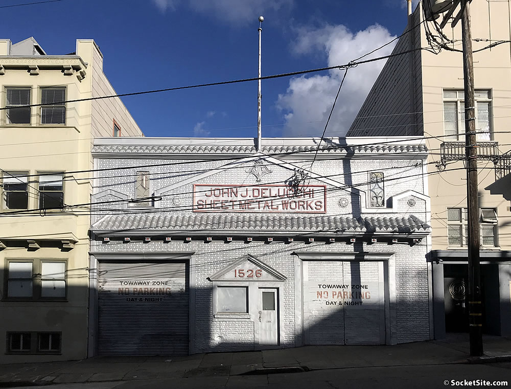
As we outlined eleven months ago, while plans to convert 4,000 square feet of the 10,000-square-foot Delucchi Sheet Metal Works building at 1526 Powell Street were drawn and approved back in 2016, the conversion of the historic building, which was designed to incorporate the building’s existing industrial fixtures and equipment for an authentic industrial aesthetic and dining experience, versus the “generic and heavily engineered rustic aesthetics as seen everywhere else in today’s restaurant scene,” failed to materialize and the sheet metal shop was on the market with a $3.5 million price tag and a 5,257 square foot lot that’s zoned for development up to 40 feet in height.
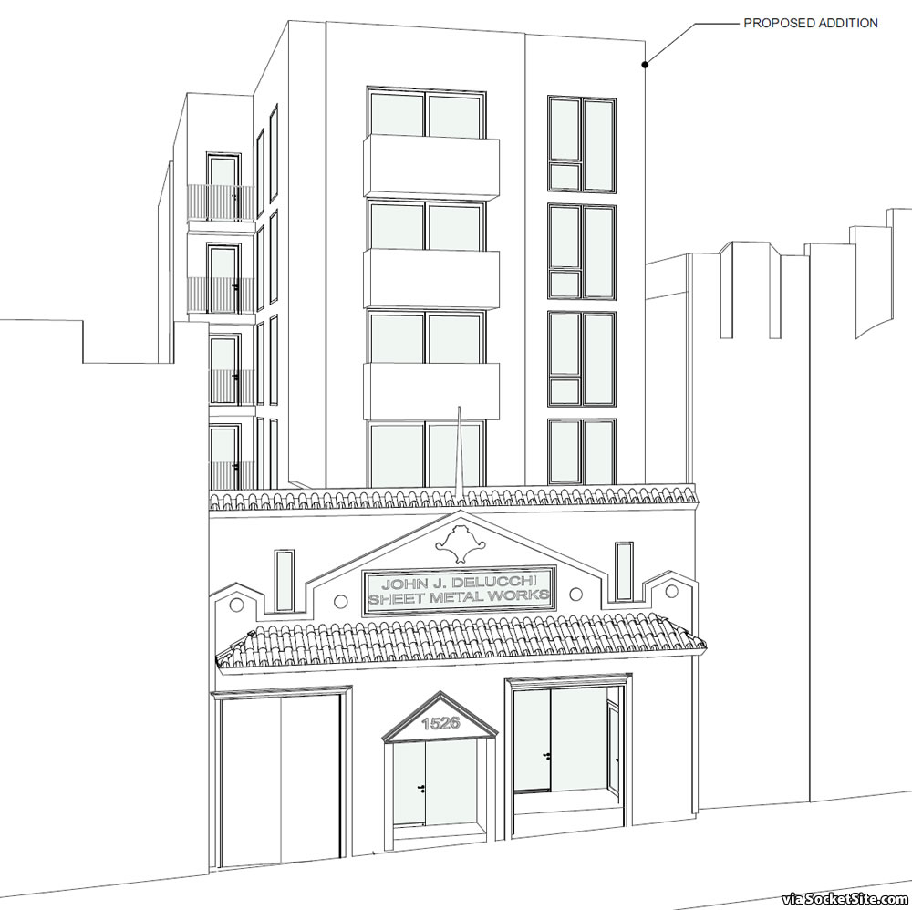
While the building hasn’t formally traded hands, a new set of plans for the site have been drafted. And as designed by rg-Architecture for JS-Sullivan Development, a 20-unit residential building would rise up to 67 feet in height behind the existing building’s sheet metal façade, leveraging a density bonus for an extra two stories and density as envisioned, with a 1,200-square-foot commercial space on the ground floor, a basement garage for 6 cars and 20 bikes, and a 10-foot setback above the new second floor.
Having been tagged as an individually-significant historic resource, the redevelopment of the Delucchi building as proposed would be subject to Preservation staff review, would require a formal Historic Resource Evaluation (HRE), and could require an Environmental Impact Report (EIR) to be prepared as well.
On a related note, Planning’s preliminary review of the plans for the site, which was just completed, found that “the removal of the existing “John J. Delucchi Sheet Metal Works” sign [and its replacement with an etched window, to provide the required light and air for a code-compliant unit] is not consistent with the Secretary of the Interior’s Standards for Rehabilitation,” but no major red flags were raised.


“the removal of the existing “John J. Delucchi Sheet Metal Works” sign [and its replacement with an etched window,”
But such doesn’t seem to be indicated on the rendering: is this a case of LIAR! LIAR!!
PANTST-SQUARE ON FIRE, or was the plan revised (already)??If you take a closer look at the image above, and its shading for glass, it’s actually rendered as such.
Technically, this is a line drawing with glass surfaces shaded … not a rendering. But hey, Happy New Year.
noun…a representation of a building, interior, etc., executed in perspective and usually done for purposes of presentation.
I will readily concede, tho, that you may well be correct that an Architect would narrow the definition.
And a Happy New Year to you as well!
Look more closely.
Hoping the developer will media-blast the brick back to its proper earth tones and mortar.
Hopefully not. The historic facade is actually pressed metal, attesting to the skills of the Works.
That is one of the saddest things I have heard in my career. The imitation of materials 🙁
If you actually thought it was brick, then I guess they were successful.
🙂
Is the metallic silver paint over the entire building also historic?
The city was frowning on these types of best of both world solutions calling it façadism.
It’s annoying as hell that they got permitted for a change to a restaurant and didn’t use it, now they’re attempting a bigger project.
UPDATE: Bonus Plans for Historic North Beach Building Progress