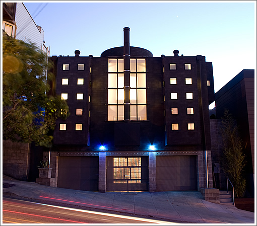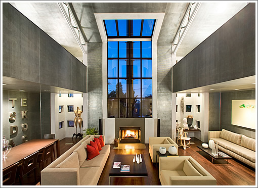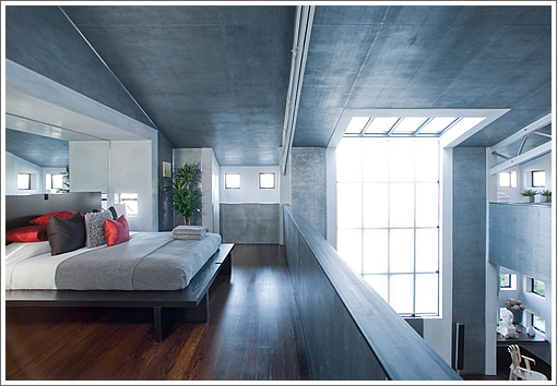
Designed by Daniel Solomon and built in 1989 for Kronos Quartet cellist Joan Jeanrenaud (one of the bedrooms was originally her rehearsal studio) and her husband, recording artist and producer Pat Gleeson (one of the bedrooms was originally his recording studio), the modern home at 610 Rhode Island hit the market in 2007 asking $2,300,000 and sold for $2,551,000 that August.
Quietly returned to the market in 2009 asking $2,500,000 and listed for $2,400,000 in 2010, the Potrero Hill property withdrawn from the market in 2011 without having traded hands. This week, the Kronos House will be listed for $2,500,000 anew.
Inside, acoustical perfection (credit John Storyk) and natural light are central themes of the design, with perforated galvanized steel (backed by wood) on the walls which absorbs sound (think big party with little din) and bounces light throughout the great room and loft:


The exterior of 610 Rhode Island which is clad in black shingles from garage to roof was characterized as “a blight on the landscape,” “the worst thing that’s ever happened to this neighborhood,” and “a disgrace” according to the New York Times in 1989.
The response from Ms. Jeanrenaud, who was unfazed by the criticisms: “People never like change; they don’t like anything new.”
Full Disclosure: The listing agent for 610 Rhode Island currently advertises on SocketSite but provided no consideration for this post.
∙ Listing: 610 Rhode Island (3/1) – $2,500,000 [610rhodeisland.com]
Whoever paid 2.2m for that piece of crap on 8th Ave must be kicking himself.
other than one bath and being atrociously ugly, great place.
It’s Hjalmar Poelzig’s lair/asylum/torture prison in The Black Cat!
how do you get approval for a curb cut the full width of a sfh?
I would love to go to a party here. Don’t think I would want to live here though, no privacy. Might work for a single adult or couple.
Oh, I love this house and loved living in it. It is a lovely peaceful airy environment….and very private! And black is beautiful, so I like the exterior too!!!
@Joan: if you are who I think you are, can you comment on how the interior spaces sound? I used to live nearby and always had a professional curiosity as to the quality of the acoustical environments.
Looks like a prison block on the inside. And I agree, very unneighborly to do a lot-width curb cut.
Whether you like it or not, it isn’t generic like most of the things we have seen around lately, particularly the Noe Valley stuff.
Yea, the Noe Valley “stuff” is so generic it usually sells for over asking. Almost ALL the time.
And this piece of classic brutalist POMO is actually listed for LESS than it sold for in August of 2007. I guess unique and cold appeals to fewer buyers.
Oh, so architectural and aesthetic merit is now being based on whether it sells at or over asking?
That’s like saying the Backstreet Boys were a better band than The Velvet Underground because they sold more albums.
Been a while since I watched the Joy Luck Club. I think I’ll revisit it before going to the open house. I bet I can put a real scare into my Chinese mother-in-law if I bring her along and pretend I’m serious about buying it. Please let it be showing by Mother’s Day.
@ Fishchum: Yes, absolutely.
Well designed (and assembled) houses DO sell for more than just cheap flips.
And to be more specific, this particular house is VERY design specific, and exudes a clear design aesthetic that only appeals to a small number of buyers, AND would be very difficult to remodel for more generic tastes. That’s what I mean.
Generic means it really appeals to a wider net of buyers; does not mean bland or cheesy. That’s why very neutral colors in a staged house are important, not necessarily what you would do as an individual once you buy it. Wider net of buyers means more buyers, more offers, multiple bids.
Nice backpedal.
No prob. But it is interesting that this property essentially is selling for the same price it did in 2007.
I would attribute that to the design.
I hope when sfgate.com has its obligatory slideshow for this listing they’ll remember to include that nauseating bit about it “boasting period details” because that’s exactly what this faux-modern Gordon Gekko penthouse caricature does. The reason this hasn’t increased in value is not that it’s not generic enough, it’s that it’s not timeless enough.
To acoustician…
The acoustics are great in the back studio that was my rehearsal room as well as a space for recording for which the other studio was the control room. John Storyk designed both spaces. He does incredible work! Currently my favorite local recording studio is ‘Trilogy’ that he also designed.
wow. both cold and dark and harshly reflective in one dated design (though the fireplace/window is nicer then i imagined on my many walkbys).
one of san francisco’s best features is the light from being surrounded by water. how can anyone with a license to design intentionally ignore this? i suspect acoustic requirements trumped liveability here. this a music studio masquerading as home.
perfect for an eccentric musician but an expensive gut job for almost anyone else.
kind of makes me crave navajo white.
Saw this place when it was on the market last. Much smaller feeling inside than the photographs make it look.
The Google Maps pic from May, 2011 (showing the “for sale” sign!) indicates *three* garage doors spanning the width of the frontage, thus calling for the full-length curb cut.
I’m going to use 1223 Bosworth as my yardstick (I know, many reasons not to: different neighborhood, style, etc) and say $3.05 million.
Clearly there is no accounting for people’s tastes, mine or anyone else’s. This is one of my favorite houses in the city…having been in it several times. Endlessly changing quality of light; open, flexible spaces in front and specialized rooms in rear; whimsey and delight in large and small ways. And it was not expensive to build originally, and as we see, not expensive to purchase now.
Since almost by definition, most people have generic taste. Thus, most people are well served by generic design.
I do think that taste specific homes give SF character and love to see more of them, but fundamentally if you want something non-generic you may well need to have it designed and built yourself. Knowing full well that there may be a significant cost in terms of re-sale value.
Wow, so it looks like PoMo has reached its nadir along the inevitable cycle of public opinion. Kind of like how the 60s sneered at Art Deco.
I’d love to live here.
Wow what a firestorm over the word “generic”. I think a lot of the Noe stuff is repetitious. That was what I was thinking with generic. This building, whether you like it or not is unique. The very expensive Noe stuff looks a lot alike. Not only is it four bedrooms, four baths, but beyond that it seems to be a version of a subdivision style of housing. Fake fireplaces in the back yard, oversized windows, too much open floor plan, shiny railings, not particularly kid friendly, etc, etc.
Maybe San Francisco has always had generic homes, whether they were Victorians, Edwardians, Marina-style, etc. IT is just a matter of which type of generic one prefers.
Unique does not mean well designed. This was trendy, bad post-modernism even when it was designed and built back in the late 80’s.
Show us where new Noe houses “look alike”. Not true.
What is “subdivision style” of housing? and where does that style exist in Noe? What exactly are “over-sized” windows? What is too much open floor plan? What’s the issue with “shiny” railings?
So this particular property is kid friendly? too open? do you see the prison-like interiors? Did you see the shiny, glossy kitchen? As if you are entering a walk in cooler.
The front elevation is an affront to residential design. The utter desolate sweep of concrete at the front is inhumane. Why no street side landscaping and trees?
You have no idea what the word generic really means.
I looked at this house in 2007. I’ve walked by a bunch of times since.
maybe a year or so back I saw that some of the small windows had developed fogginess and that some of the black shingle was fraying. there were upkeep and maintenance issues and I don’t believe the last buyer was there very much at all. maybe it’s been spruced up, since.
the photography of the place was my first lesson in how remarkably a lens can distort perspective when in the hands of a real estate photographer. e.g., the central shot of the couch and the living room would make you believe it was a expansive space, but it is not. likewise for the “bedroom”s.
so, yeah, there’s a lot of layout that isn’t great but you do get 2 nice studios where work could get done.
the kitchen surface was made out of a zinc material, I believe – and the material didn’t do well at all. maybe it’s been changed. it was so terrible, they had to have changed it.
there may have been some awkward layout issues. but perhaps I’m more inclined to live like an “eccentric musician”. I think it’s an interesting place. and that oculus thing in the middle was cool.
I’d point out that I looked at a large range of property that summer. I went to a bunch of the highrises too. I think I would prefer living in this neighborhood in a very real and unique house than a condo in a highrise with people manning a front desk. this is not a crappy property. perhaps there wasn’t much good inventory that summer to compare it to but at least this was one of the more interesting houses amongst the bunch.
as for the front of the building, I do not share futurists revulsion. but I never understood why the front door was hidden to the left. the center is left dead. why wasn’t a beautiful custom door designed for the center, between the garage doors? the center is a great place for an entryway. and some custom steelwork maybe. I hate seeing garage doors generally but here there’s so much play for symmetry I think it actually works.
it would have been easy to plant some rugged coenothus bushes at the corners and posts in the front of the property. they would have been well sculpted and robust by now, with hudreds of small electric blue and purple flowers in bloom this very minute. it would have looked awesome against the black shingle and proportioned windows. and they’re native and very drought tolerant. instead it’s still just that cinderblock.
Sold: $2,410,000