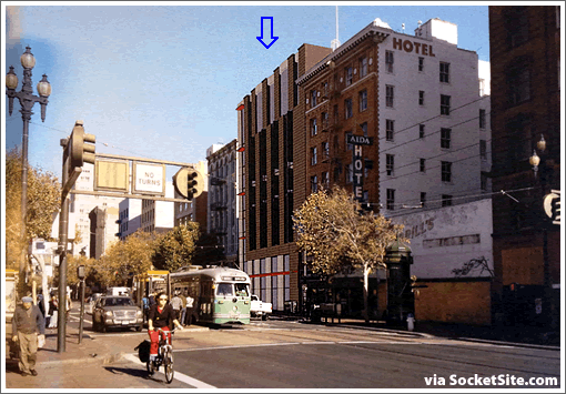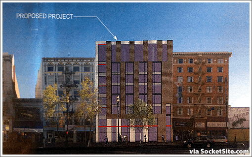
The design for the proposed 8-story building to replace the adults-only Market Street Cinema incorporates boxed windows spanning multiple floors to create strong vertical lines across its Market Street façade and materials to match the context of the street.

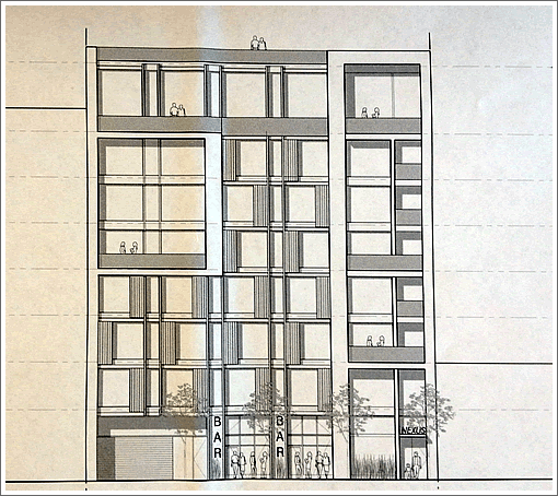
The Planning Department’s reaction to the preliminary design and a peek at the building’s proposed Stevenson Street façade which is a bit more dynamic:
The Planning Department agrees in principle with the project architect’s analysis and objectives of contextual response, and urges adding some of the energy and dynamism of the Stevenson façade into the Market Street expression while retaining the references to the context.
At the same time the Planning Department urges a stronger and more clearly defined base, middle, and top. The offset columnation of the façade to create a base, middle, and top may need to be augmented to give a deeper mottled and textured façade. The Planning Department recommends incorporating stronger horizontal architectural differentiation between the ground floor and second story levels, and at the roof termination. Consider using architectural detailing, such as a belt course or cornice, at the ground floor ceiling height to help frame the pedestrian space of the sidewalk.
The function of the thin ’brise-soleils’ are unclear, and may need further clarification. Any element on Market Street should be given some heft.
The Planning Department recommends more be done to modulate and articulate the façade at the intermediate scale. A building on Market that neighbors other buildings of stature should incorporate materials that relate to the scale or relate to other historic qualities that impart texture or craft of detail or material. Consider creating an intermediate scale by using window groupings, with deep reveals, intermediate spandrels, and further subdivision of windows by mullions.
The aforementioned Stevenson Street façade which includes the entrance to the development’s proposed condos, parking garage, and bar:

Stevenson side: Yes
Market St. No. Derivative junk. Sheesh Take a risk — and do something new.
Nicely done. I know some here will immediately call for more height, but this is nicely appropriate for that block – and certainly a big improvement over a ~2 story theater.
I wish they could re-use the theater marquee in some way like what is being done on Mission St. Shouldn’t the bar, or retail, be on Market St?
[Editor’s Note: The ground floor plans for the building include 6,500 square feet of retail space fronting Market Street in addition to the 1,000 square foot bar on Stevenson.]
The building is backwards.
A 1000 square foot bar seems pretty tiny, no?
Looks fine. I certainly wish that the building could be built to whatever height the market desired here (which we can’t know because of the height limits in place), but this doesn’t seem absurdly short as many other places require. Good mid-rises are needed across the entire city, including this location.
Looks much nicer from the back. The red lines on the front are cheesy.
How about a maternity store on the ground floor.
The Planning Department is schizo and insane. They want a more strongly defined base, middle and top… and they want to add the ‘energy and dynamism’ of the other facade to Market Street [even though the rear facade has almost no defined base, middle or top…] *and* they want more incorporation of materials and styles of adjacent buildings… but it has to have function! No purely ornamental ‘brise-soleils’ please!
Basically, make it more traditional, but dynamic, and use more traditional materials, but keep it energetic.
Love it. Hope it is all market rate. Suggest leaving a small porn shop on 1st flr
I don’t understand the problem. Lots of cultural references mix an urban lifestyle and red accents.
Needs 2 things:
1 – a small museum in the lobby, honoring the many great porn stars who performed at the former Market Street Cinema, who provided autographs and so much more in the private rooms in back.
2 – DNA collection from those back rooms, and a public announcement of the presence of DNA from all current and former SF politicians. 🙂
Can we all just stop for a moment and think about the simple fact that renderings for this area are being tossed around at all? I mean lord things changed FAST down there after so many years of false starts.
Echo the first comment by Invntiv. Looking at he Market St drawings, expect the new building to include architectural details from the two neighboring buildings and this is sadly lacking.
SAVE THE THEATRE!
Looks great. Just what we need in mid-market. Build it ASAP.
If I read one more planning document prattle on about context and base, middle, top, I’m gonna dump a truckload of manure at 1650 Mission.
It’s a bit difficult to be sure, but I think the Planning Dept wants the developer to build the building as it is, but lay it on its side…
UPDATE: Refined Designs For Condos To Replace Den Of Adult Activities.