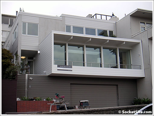
Listed for $7,700,000 in October of 2008 following a major expansion and renovation, the Presidio Heights home at 3577 Pacific Avenue quietly sold for $4,900,000 in July of 2009.

Today, the 4,264 square foot home returned to the market listed for $6,500,000 having been included on the AIA’s 2012 tour of modern San Francisco homes.
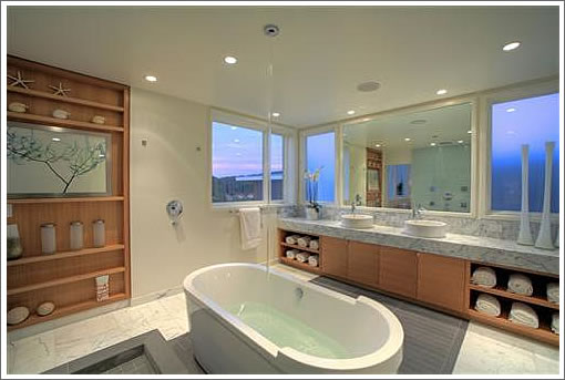
And yes, this is the one with the bathtub that’s filled by way of a spigot on the ceiling:

∙ Listing: 3577 Pacific Avenue (5/4) 4,264 sqft – $6,500,000 [pacunion.com]
Ah yes, the “Molex connector” house returns. You’ve gotta love how the bathtub fills from a spout in the ceiling. It is kind of like fitting a stock car with a spoiler, coffee can sized tailpipe, low profile tires, and ground effect lights. Except this is much Klassier.
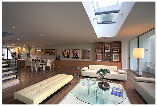
I do however really like that open plan LR+DR. It is impressive for what you do not see: the load bearing supports.
It looks fresh and fantastic! And it will for… 10-20 years maximum. Therein lies the problem with modern design.
@mdreaming: That’s always been a problem. Victorians didn’t look so great after WWI. Louis XV’s Roccoco fell out of favor with Louis XVI’s Neo-Classicism, only to be discarded twenty years later by Napoleonic Empire.
Remember Post-Modernism? Nothing stays in style. If it did, there would be no jobs for preservationists and no bully pulpit for NIMBYs.
@Rocco: True indeed. I think what makes it worse for modern design though is that it’s difficult or impossible to convert a building like this to another style. It’s relatively easy to convert Louis XV or XVI to another neo-classical style, but moldings and smaller function-based rooms will never go in this house.
Perhaps the next wave of design will start from this instead of classical forms.
The thing that’s different with so-called “modern design” is that it sees itself as the conclusion of design evolution; Francis Fukuyama’s End of History as applied to buildings.
I agree with mdreaming that that so-called “modern design” “looks fresh and fantastic” for a while, probably because the unornamented planes of wall (in the case of this pace) look so simple and bold shortly after completion, but then look dated — relatively quickly to everyone except the Dwell fetishists. Modernist structures don’t tend to take on a patina well, the way that mid-century modern, arts and crafts and even most Victorians do. Tasteful, sensitive more traditional designs tend to mellow with age.
Take a look at 11 Cook St. for example (one could argue that this is a contemporary). Do you really think that’s going to hold up as well as the best San Francisco Edwardians? I don’t.
I agree with Brahma: the resale value is the practical (and demonstrable) deficiency with these styles.
I clearly favor traditional styles myself, however, so everyone should take my opinion as merely a personal opinion.
On another note, it’s a great pleasure to have found socketsite, where the conversations are civil and informed! I’ve come from Curbed where the conversations are neither. Thanks!
There is also a difference between modern and contemporary cliche’. You can make a list of them: narrow, horizontal backsplash tile; big, black posters with the subway stops listed; vessel sinks; standing lamps that look like Hollywood movie lights; and, perhaps, stainless steel appliances.
In not too many years, people will look at these and say, “What WERE they thinking?”
The ceiling-mounted tub filler seems like it would be fun, but the fun would make a mess in an open room like that.
“big, black posters with the subway stops listed”
Thank you. I’m not the only one who finds this ubiquity boring.
I really like this house. Actually a great spot for families. Trades above ask.
@mrdreaming/brahma: The original, classic Post & Beam that this house replaced was built in 1951
and no doubt looked great when it was built, but fell out of fashion. The replacement will as well. We all die.
Modernist houses haven’t had a chance to get any patina- give them a few decades. As for Victorians, they’ve been reinvented as “Painted Ladies” in color schemes that never existed before, many of them with only the facade still standing. People here want Disneyland, but a lot of this comes down to taste, and probably the thing I dislike about comments here is the categorical dismissal of other people’s taste.
Although fortunately I’ll be long dead when the Suburban McMansion revival takes place.
@ Rocco
The phrase, “Suburban McMansion revival” make me shudder.
I have been hoping for a Pompeii-like eruption of molten lava and ash to bury these monstrosities.
1,000 years later, people will excavate them and say, “Wow. Our ancestors had terrible taste.” Then add, “..but the stainless steel on the appliances has held up remarkably well.”
I admit I hadn’t thought about stainless steel appliances in this vein, but now I can’t stop thinking about it!
The trouble is: what’s the alternative? It seems they’re inescapable. I suppose the way forward is to match the appliances to the cabinetry.
@ mdreaming
That’s what happens. A style seems ingrained in the current taste. But so was Avocado Green in the 70’s.
What’s the alternative? How about the entire front of a refrigerator becoming a touch-screen video display? It could show what is inside without opening the door, display kids playing in the next room, and eliminate the need for a separate TV in the kitchen.
This technology could happen in just a few years…..or sooner.
Make way for the iFridge.
I like it jlasf. Parents could virtually tape their kids digital art to the fridge when they click “like”. And of course the iFridge would come preconfigured with various “skins” which include retro avocado green and sunburst orange.
Hmm, that’s a good idea jlasf! But you don’t need a touchscreen to show what’s inside. Time for a see-through fridge start-up!
This resold for 8.75. Only mentioning because it was featured a few times here. Likely not an apple. Should check permit history. But comparatively good outcome in meh market.