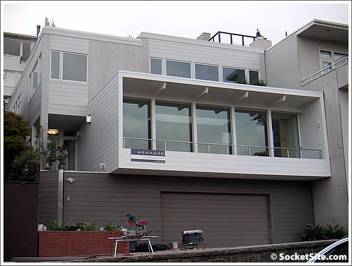
Listed for three days at $7,700,000, the asking price for the completely renovated 3577 Pacific was quickly changed to $6,950,000. But the change that caught our eye, “Addl Pics.”

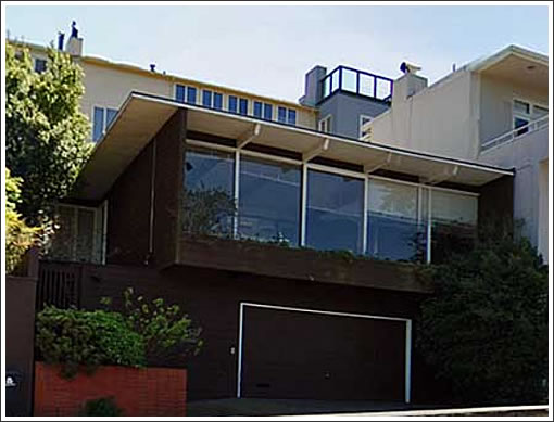
Purchased pre-renovation for $2,225,000 in August of 2005. We’ll let you do the math (and note the anything but apple additions).

Very slick renovation and cool space, but no views and still over $1,500/sf. Might have helped to have those photos up when it first came on the market too…watch for the next price reduction because just under $7M is still too high.
$2.25 M purchase plus, what, $1 M for renovation? $2.75 M profit?
for $7M I want a bidet!
I was about to write “there’s no way in hell they’ll get more than 4.5mill in this market”, and then I saw the pics. Not a big fan of the Dwell look, but the remodel looks top notch. Having said that, I don’t see how it’s going to fetch $1500 a square foot. Maybe 5.5 mill.
I really like this location, actually. It’s pretty private and that part of the Presidio is really lovely. I used to walk my dog there, so I watched this thing go up… and it went up fairly quickly. I’m surprised that it’s already on the market. Also, this definitely cost more than 1 million to do. Even though I don’t think they performed any substructure work, I wouldn’t be surprised if the total was well over two million – bare minimum $500 a foot.
As for the price: 7 million seems too high given the horrible market. Buyers who can afford these properties just had their portfolios eviscerated over the last month and aren’t in a big hurry to buy a shiny new house.
I was really excited to see this property as I watched them do the work on this property on my morning drive past Julius Kahn but when i saw it on Broker’s Tour I was fairly disappointed. The bedrooms were all so tiny and I thought the layout was fairly unusual. The fountain in the backyard was spraying water all over the ground where people were walking and there was still dust and cleaning supplies all around. They could have waited one more week to come on the market and finish cleaning the place up and made it look a little better.
This will sell with a $6 as the first digit. But it might be $6,000,000. Just don’t see this going for less. Someone will take it.
Sort of a bland front. Why not give it some of that natural wood finish that graces the inside. Too bad.
I am not a nature activist by any means, but why did they have to remove all the mature shrubs out front. They could have cleaned them up a little bit and it would have looked much better than what they put in it’s place.
I think they could have done something a little more unique with the facade. I like they grey tones but it looks a little dull from the waist up.
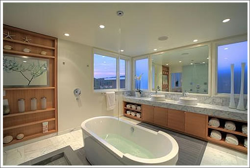
It would have been nice to have some floor plan porn. Master bath looks amazing and the skylight in the great room was a nice touch. With the whole second floor addition as you can see from the picture, the remodel had to be AT LEAST $500/psf but probably more. I wouldn’t be surprised.
a month ago it sells with a 6 in front of it…but not today.
I think it sells with a 6 as the third digit.
This is directly across from the playground at the Presideo and looks out to the park. Stellar location, tho maybe not $1500 psft any more.
Drag your mouse sideways on the photo to look around:
http://www.mapjack.com/?ZJBnWqAtbF4F
Places in this location with that much space in that good of a condition are pretty rare (half of it being new construction, and the size of that great room is pretty impressive). If someone needs it, they could very well pay it, but it might take awhile to find that person.
I remember seeing this in its “pre” stage. They did a great job of
opening it up. Beautifully done and staged. But the master bath has two of my pet peeves: the dopey water flowing from the ceiling and the shower without any walls or curtains. How does one take a shower without getting the entire room wet? Okay, okay. Add some glass walls and the problem will be solved.
Very well done, but what is interesting to me is the “industry” of refurbishing these type of homes. Will we ever return to a time when clients could purchase a property like this, hire professionals, and create a living space to suit their needs to create a HOME TO LIVE IN vs. a home to flip? Somehow, there is something rather cold to me about the interior that lacks any sort of unusual quirks that create a residence of originality vs. a product to be consumed. When designs are created only to “sell”, the residence ends up becoming a neutral stage of what is popular at the moment.
I toured this last week. The Menaged’s did a great job with this renovation. I must disagree with jlasf, I like “laminar-flow ceiling-fill” tubs, but must EVERY flip use Carrera Marble. Think outside the box once in a while…
Superb ultra-mod staging by Arthur McL.
Priced high, yes, but: how feckin’ cool is it that the tub fills from…the ceiling?!
Only in SF will suckers, sorry buyers, pay $7mil for a stairway opening right into your living space.
I agree with Anonarch’s comments.
Leave it to Menaged’s group for another ripoff project.
It would be more impressive if the tub drained by way of the ceiling…
I don’t understand all these open bath areas. It’s too COLD to take a bath in the open like that. Either you heat the whole room (and sometimes whole floor!) to 75 degrees or you freeze.
I want (en)closure.
Boy, Socketsiters, lighten up. I know for a fact that these pics were taken before the shower enclosure was finished…it wasn’t there for the broker’s party, but it was when I saw it. These guys did a seriously high quality job on this place – top notch design, great finishes, etc.
@ekeby this is no $1M renovation. I heard it cost much closer to $2M. Still very pricey, I think the developer is playing games, hoping for someone to come with a low $6M offer that he’d gladly take.
That “fill from the ceiling” feature in the bathroom reminds me of what you see on fancied up custom cars : big spoilers, wheel covers that keep spinning after you stop, and blue lights under the car that look cool at night.
In other words, stuff that looks impressive but has no practical purpose.
Good for the developer though, its fun to see stuff like this. And if they can get just one buyer who goes home after the open house thinking “Must …. have … tub fill from ceiling” then the money on this frivolous feature was well spent from the sales point of view.
I don’t quite understand the “temple of bathing” fad that’s been around for the past decade. Ya know : bathroom about the size of a Tokyo apartment, freestanding “statement” tub, shower with 5 heads spraying water on YOU, wonderful, magnificent you. I’d rather have a nice modest guest room suite (or an extra suite if the home already had one (or five))
I’m sorry, I’m sure it’s brilliant architecture, but that front view pic makes me wonder where the giant molex 5-pin cable is flopping around unconnected.
Or maybe I’ve spent too much of a past life leaning over the guts of a computer.
For this amount of money, one could buy a great old fashioned San Francisco house. For a little more, they could have the mansion on Divis between Pacific and Broadway, for example. But it is a matter of taste; many people like ultra-modern. Here it is, and with a great address and location. Could have a better view.
anonarch-
i’m an arch as well. guess what some clients just don’t want to wait 2 years to get a project permitted and built. some people would just prefer to move into a place that is pretty close to their requirements. some aren’t even that picky at all. btw, did you not see all the quirks in this place? seemed pretty ‘custom’ for a flip. wine cellar under the stair, the 3form panels, the custom stainless panel around the bath vanity plus the stair and rails were far from standard dets. i was pretty impressed viewing it from an archs perspective being that it was a developer project.
Anyone want to bet that this place will sell for a max of 5.5mil (if they’re lucky)?
In escrow
redfin lists the sale price as $4.9M on July 8, 2009.
[Editor’s Note: As does SocketSite: 3577 Pacific Recap: Withdrawn From MLS (But Sold Two Days Prior)]