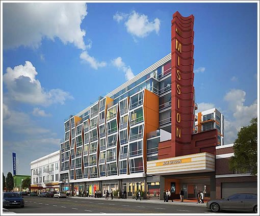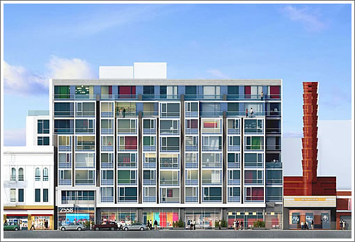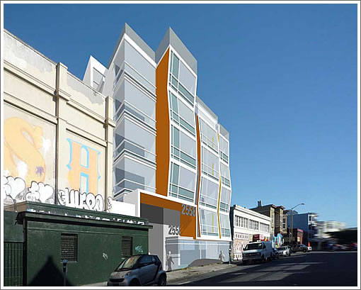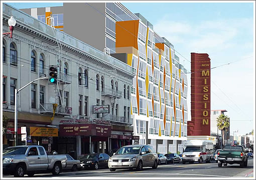
Plugged-in people have long known about the plans to renovate the New Mission Theater and develop the adjacent lot at 2558 Mission Street, upon which the Giant Value building currently stands. And now, the latest scoop for the modern Kwan Henmi designed eight-story building that’s proposed to rise on the project site, clad in metal, glass, and plaster with multi-colored panels and alternating inward and outward-angled windows:

As proposed, the 2558 Mission Street building will be approximately 85 feet tall (measured from Mission Street with a 15 foot setback for the eight floor) with 114 residential units above 14,750 square feet of ground-floor commercial space and 89 parking spaces in a below-grade garage with its entrance on Bartlett.

The ground floor would contain retail or restaurant uses, a mail area, a management office, building utilities, and two residential lobbies. The main lobby would be at the Bartlett Street entrance and a secondary lobby would be at the Mission Street entrance. The retail/restaurant space could house one large or up to three smaller tenants.

The residential units were designed to range in size from 520 square feet for the junior one-bedrooms to 1,400 square feet for the two-bedrooms. All 114 units (18 junior one-bedrooms, 45 one-bedrooms and 51 two-bedrooms) are planned to be offered for sale at market-rates. The city’s inclusionary housing requirement would be fulfilled by building below market rate (BMR) units on a separate parcel at 1296 Shotwell Street.
Of the eighty-nine parking spaces, eighty-six would be for the 114 residential units, a ratio of 0.75 spaces per unit. One parking space would be a car-share space and two parking spaces would be for the retail component. All parking spaces except for the car-share and handicapped-accessible spaces would be provided in two-level mechanical lifts. Parking for 41 bicycles would also be provided in separate, secure room in the garage.
Currently working its way through planning, once approved, the construction of the 2558 Mission Street building would take approximately 18 to 20 months versus 10 to 12 months for the renovation of the New Mission Theater.
Keep in mind that the Mission Anti-Displacement Coalition and a few others have long opposed the development of any market rate housing in the area.
As always, we’ll keep you posted and plugged-in.
∙ New Mission Theater Plans Moving Forward, Targeting 2013 Opening [SocketSite]
∙ Giant Value Housing Or Headache To Come In The Mission? [SocketSite]
Remember of course that the Antidisplacement Coalition consists primarily of trust-fund hipsters and anti-Caucasian/Asian (basically anyone not Latino) racists. So of course they’d prefer a pigeon-crap encrusted collapsing roof fire-trap to something that might bring new life to that derelict stretch of Mission. It’ll be a bright new day for the Mission when the Antidisplacement crowd goes back to their own unmortgaged lofts and gets back to their weed and tantric fingerpainting (or whatever else they do to pass their time). The revitalization of the Mission through these mixed use projects, which include BMR units for lower-income folks, is exactly what’s needed.
Love this….excited to see things finally happening along Mission itself.
I haven’t heard much about MAC recently, and I live in the Mission. I’m kinda hoping they’ve all crawled under a rock or otherwise gone away. They’ve failed repeatedly to “save” the Mission, which is a good thing.
That section of mission has never looked so clean. And do my eyes deceive me or is that street tree poking out of the corner of the render?
btw…quick websearch and I can’t find anything for the Mission Anti-Displacement Coalition since 2009.
I used to live a block from here and nothing would be better for this block than this being approved and built as-is. That said, let’s all hope that the tenent isn’t another $0.99 chinese crap store that seem to be proliferating in the Mission.
Not sure where all the colors are coming from (glass?), but we love it.
Looks great — will be a fun building to see and be around. Let’s have a few more by the same architects….
There’s no actual displacement if no one is kicked out.
In that case, there was zero housing before and 114 units after.
A rising tide lifts all boat as they say. New people in the Mission ask for better infrastructure and better schools for instance, and they bring the money to pay for it both in new business and taxes.
Now, the 99c store had its huge customer base, and this will have an impact. This is the only thing I can see.
I actually sort of despise the design – though most renderings look like ass in comparison to the real deal. I have strong distaste towards stucco and overtly “fun” facades. I think the angles for each floor is interesting, but maybe too much on every floor and facet. It’ll be interesting to see how so much glass and the height fits in with the neighborhood/corridor.
Overall, I think all of the weirdness that it purveys, adds a strangely comfortable vibe to the block.
Yay, finally someone are doing something to clean up that area. Can’t wait.
“Remember of course that the Antidisplacement Coalition consists primarily of trust-fund hipsters and anti-Caucasian/Asian (basically anyone not Latino) racists”
I hate to say this but here is my anecdotal comment:
My mother and her siblings are Latinos from the Mission. If you were a even slightly successful you left for other parts of SF or the Bay Area (my uncle lives by Stonestown, aunt in El Cerrito, mom on Peninsula).
At that time there was no reason to stay in the Mission as it was poor.
Those of her generation who remained in the Mission had drug and alcohol problems and were petty criminals living in their parent’s garages.
While I am a supporter of development, interesting modern design, and hope something gets built here,I think this design is horrific. It will look very dated very soon.
The angular window design is not pleasing to the eye and reminds me of another bad modern design structure that has not held up well with time which is the LGBT center on Market near Octavia.
This project could be so much better……IMHO
My memory of MAC is that it was founded during the dot com boom and was a fairly loose organzation of neighborhood based non-profits and activists. Eric Quezada was the head, and I believe was housed at Mission Housing Dev’t Corp (a housing non-profit). Many orgs, particularly MHDC, later stepped away from directly getting involved in opposing development…particularly since one of MAC’s greatest successes was “saving” the Armory. There was a lot of strife on the MHDC board during this period, and the then Exec. Dir. eventually left, as it was pretty unseemly self-dealing to advocate that no development but affordable development should occur. Eric Quezada died of cancer a couple of years back. In general, I think the confrontational approach to development in the Mission is over.
I love this and hope they build it as-is.
@Sidney W – I’m all for building more housing, but you should be careful about calling this stretch of the Mission “derelict.” Messy, poor, lots of immigrants, yes. Derelict, no. Redeveloping the New Mission Theater is a great idea, but let’s not kid ourselves about how it will affect the surrounding community.
The design reminds me very much of these:
http://goo.gl/maps/VJkBe
http://goo.gl/maps/wmLVy
But a bit more wavy. I’m eagerly waiting for this architectural “style” to pass. I’ll gladly take it over Brutalism (*shudder*), but why must every new development look like a Playskool toy?
That being said, I recently walked passed the shuttered theater and dollar store, thinking that there needs to be something new there.
On a side note, construction on the theater directly across the street (2558 Mission St) is under way. A gym and restaurant are slated to open there. And all though I do not live in the Mission, I’m hoping they keep the historical elements of the two theaters. Losing any history in San Francisco would be a pity.
If it’s polarizing it’s at least interesting to look at which means they should build it just for that fact.
*so* excited to see this built.
Next, I think we could use some large office spaces opened up along mission. With valencia street a block away and all the food and fun options, I bet you could fill a large building full of startups happy to be in the mission.
BigV
The whole Twitterland Vortex rising is a single-speed bicycle ride away. Valencia’s paths are starting to look Dutch — I’m there every morning @ 8. Whoa.
Gentrification comes to the MIssion, just as it has to almost every neighborhood in Manhattan, Brooklyn (according to the NYTimes), Paris, and central London.
A very good thing. Not the most beautiful building but certainly interesting.
Next, God willing, the Tenderloin, the most valuable piece of urban real estate still devoted to drug dealing and danger.
It didn’t take long for a few of the self-appointed armchair design critics to speak up and complain.
So to radar: I’ll throw this out: Why is the design horrific? and Why will it become dated very soon?
And to Rob: Why do you despise the design?
Please share with us your deep knowledge of architectural criticism and what you would propose.
Any more info about how far this has gotten through planning? Nothing in this article is really news; these renderings have been around for 6 months or more.
[Editor’s Note: The pretty pictures have been around, the details have not. In terms of Planning, a Preliminary Mitigated Negative Declaration has been issued, but the window in which it can be appealed has yet to close. As noted above, we’ll keep you posted as it moves along.]
Is Gus Murad still involved, and did they succeed in legally joining/redrawing the 2 lots at the back of the site?
I like it.
Thanks Editor. Do you know when that window expires?
The windows that tilt back at the top will be FILTHY.
Psyched for the New Mission Theatre portion, but I seriously hope the giant monstrosity next door gets trimmed down to size. 110+ units on that site is ludicrous. Cut it down to 3 or 4 stories and then it would be reasonably acceptable.
“110+ units on that site is ludicrous”
Agreed. Having growth on a major public transportation corridor is not only ludicrous but dangerously crazy. I mean, it’s insane. We should make all those people live in Oakland.
110+ units on that site is ludicrous.
Agreed. This site should really be 250 or more.
Not bad! Finally some housing design that, while probably not Pritzker Prize worthy, is way more interesting than the standard watered-down-by-planning/developer mediocre shlock we’ve come to expect in this town..
I’m glad Sydney W. was able to come by and take a dump on the thread from the very beginning, I thought the voice of entitled shitbags was going go unrepresented on this topic.
“Agreed. This site should really be 250 or more.”
Lunacy.
Futurist:
Your tone sounds a bit confrontational and vitriolic but here goes.
Everyone else here has given their opinion so why not challenge them on why they think this is such a great design ? Just because I do not agree with your opinion ? Aren’t you an ” armchair design critic ” as well or were you perhaps involved in this design and taking my comment quite personal ?
Whatever…………my personal opinion is that it is ugly because it reminds me of bad 60’s design and construction that has not weathered design through the ages. Like I said, check out the LGBT center which is ‘modern and new’ but is ugly and an eyesore.
Again, IMHO and can’t I have one in your world ?
I like the LGBT center. Not ugly and not an eyesore.
Ok, so now you gave an opinion as to why you don’t like it. That’s what I was looking for here.
But then when someone says a project is “ugly”, I can pretty much assume they will find fault with every new project proposed or built in San Francisco. It’s almost become cool and expected to be against ANY kind of design that is not safe and easily understood.
Thankfully the architects do not have to listen to every armchair citizen critic in The City.
I think this project is successful, design wise for a number of reasons: It picks up on the 60’s vibe of the original theater sign; it’s full of color and variety in the fenestration; it’s lively, it’s retro-cool. Among a few good traits.
Love the building.
A stone’s throw from Revolution Cafe, Old Jerusalem, Dianda’s bakery, Bart, Valencia.
It looks like cheap public housing.
Isn’t the New Mission going to be the Alamo Ale House?
Stands out initially, don’t love it, don’t hate it.
I like this. It is at least a little different than what is consistently going up.
Other thoughts: 89 parking places for 114 units on Mission near the bart seems high. While on Texas those 101 units will only get 40 some spots. That to me is bad planning, and not Transit First. Less parking near good transit, more parking where transit sucks, seems simple enough. Maybe we can start having some kind of cap and trade system, where the city take a portion of the money and it goes to transit where it is lousy.
But more importantly I hope this doesn’t make La Altena too busy. That would throw off my big soccer game/burrito lunches.
Radar, futurist is an architect and appears to believe that non-architects don’t have any standing to critique architecture. He has one HUGE chip on his shoulder. You said you didn’t like it; you also said WHY you didn’t like it. That should be sufficient for this forum, IMO.
BTW, Futurist’s architectural input can be valid and interesting, and I don’t mean to trash that. I just wish he had less attitude in responding to the opinions of others.
Sparky*b I was wondering the same about the parking ratio. It’s very odd that this should have more parking than that Texas location….it is a world of difference in transit accessibility. If that’s the current zoning for both (and not something grandfathered in) Planning made a big mistake in setting parking ratios.
Hey curmudge: Guess what? I have no chip on my shoulder, and zero attitude.I enjoy all kinds of opinions here, but let’s be clear: I appreciate WHY radar finally said he didn’t like it. That was my point. Too many commenters here just complain without articulating a few intelligent comments. It becomes a rant of “I just don’t like anything, and I’m entitled to say that…”
And yes, there are both very talented and mediocre architects in SF, producing great urban projects and some producing crap.
But the talented ones, like Kwan-Henmi designing this project are truly inserting a lively, colorful, interesting building onto a very important street in SF.
I don’t expect “non-architects” to think or talk exactly like those trained in the architecture and urban planning professions. Stop being so defensive when design professionals talk.
Do you get upset when your doctor talks like a doctor?
“I don’t expect “non-architects” to think or talk exactly like those trained in the architecture and urban planning professions. Stop being so defensive when design professionals talk.”
This comment just reaks of snobbery. The only thing I’d suggest is replacing “professions” with “professional arts.” Then you’re really smelling your farts!
Curmudgeon….
Thanks for the back story on Futurist. I don’t post here often for this very reason. Seems many try to attack an opinion just because it does not agree with their’s. I had stated in my first post that I supported development, liked modern design and hoped something would be built in that location and stated why I did not like it but evidently, that was overlooked.
Every reason why Futurist likes this design is why I don’t……………not a fan of Kitsch.
But it’s not “kitsch”. Is it?
In a way, one of the worst and best aspects of being a citizen of San Francisco is our all inclusive approach inviting everyone to the table on every issue that affects our environment.
I suppose that’s good. Although quite often I’m not sure.
In all honesty, most architects don’t listen a great deal to the opinions on the “street”, or on the blogs for that matter. And it’s not to dismiss or put down those opinions, but rather because those opinions are as varied and diverse as there are people living here.
They listen to their client, to the funding source, they listen to the contractor/construction manager, they listen to the Planning and Building Departments. They observe how great cities work and how to apply those principles to their own work.
Then they re-group into their team of design professionals, apply their particular design philosophy and architectural expression/parti and apply that thinking to the project at hand.
I’ll never forgive Kwan-Henmi for one of the biggest monstrosities in the City: the Paramount at 3rd and Mission. Rendering looked promising but the result was awful. They’ve done some OK things since, but trusting them with something big and visible is a mistake imho. Same league as Heller-Manus design-wise.
For the record Kwan-Henmi served as the executive architect on The Paramount. Typically that means a local firm is hired by the primary architect to handle the local design issues, planning issues and permits. They did a large part of the interiors.
The Design Architect was Elkus Manfreddi, a firm from Boston.
Typically, the executive architect is not in charge of the overall building design and massing.
Well, one armchair critic’s “varied fenestration” is another’s “cut-rate Jean Nouvel ripoff”. Personally, I side with the latter opinion. The design seems neo-googie to me, but not in a “retro-cool” way, more of a tacky way. It’s trying too hard to be funky, like someone who shops vintage but without the subtle good taste to pull it off. However, for the location, and given that Mission St has no architectural unity to begin with, my overall reaction is “sure, why not.” The developers must know that market-rate on Mission is somewhat lower than market-rate on Valencia…
I like the building. It’s modern, lots of light, appealing to the younger buyer. With the movie theater next door, and the new gym across the street, and great restaurants in all directions, the lively design is a good fit for its prospective buyers. It’s the right size. Parking could be less, but its buyers will want a garage space with the difficulty of street parking in the area, so you can’t blame the builder for trying to get a maximal return.
kitsch
[kich] Show IPA
noun
something of tawdry design, appearance, or content created to appeal to popular or undiscriminating taste.
YES, FOR ME IT IS KITSCH.
The design is better than most new buildings built in the Mission in the past two decades– which have been ugly stucco and boring boxes. And it is in a great location for more density. Build it.
I like some kitsch here and there.
Herr Doktor: 250 units is NOT lunacy…it’s a block from a BART station! The blocks near 16th/Mission and 24th/Mission should be upzoned for 20+ story residential buildings. Otherwise you’ll see the neighborhood gentrify faster than it already is (and the people in their $3M Noe Valley shacks can preserve their views)…which is exactly what will happen.
And Sidney W’s characteristics of trust-fund hipsters is simply brilliant…
This will be a welcome addition to Mission St.
As for the color, much of it appears to come from curtains and such. I’m sure by the time the HOA CC&Rs are written up, such colorful window treatments will be prohibited.