As we first reported two weeks ago:
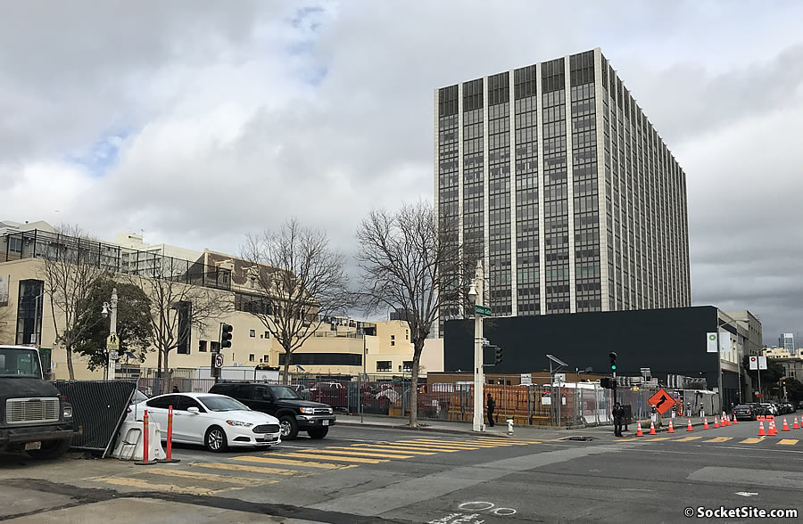
While the former McDonald’s site on the northeast corner of Van Ness and Golden Gate Avenue is likely to remain a construction staging area for the Van Ness Bus Rapid Transit (BRT) project through mid-2020 (versus late 2019 as originally projected), the plans for a 168-unit apartment building to rise up to 13 stories in height upon the 600 Van Ness Avenue parcel are progressing…
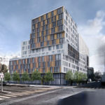
While the proposed building would reach a height of 130 feet on the corner, it would step down to 8 stories and 81 feet along Golden Gate Avenue, down to five stories and 51 feet in height at the corner of Van Ness and Elm Street, and down to 2 stories and 22 feet in height along Elm.
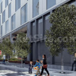
In addition to the 168 apartments, the plans now include a 103-car basement garage with its entrance on Golden Gate, 6,200 square feet of ground floor retail fronting Golden Gate and Van Ness, and a total of 26 new street trees.
Assuming the project is approved, the development is financed, and the ground is broken, the building could be ready for occupancy in 2022 based on a projected 24-month construction period.
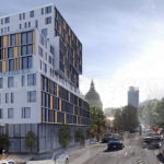
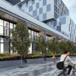
And as newly rendered by Iwamoto Scott Architecture and Architecture International below, the proposed development to eventually rise at 600 Van Ness could be approved by San Francisco’s Planning Commission next week.

The ghost of the Jack Tar hotel continues to haunt Van Ness!
Right on!
Exactly ..took the words right out of my mouth.
It’ll be like the Jack Tar Hotel never left us!
Ditto all the comments about the Jack Tar Hotel. It also looks like they are trying to copy that 70s monstrosity in the background. They sure as heck achieved it.
A little more color and it would be a Rubik’s Cube.
Wow! That is a phenomenally uninspired design. Is there an actual idea for a building within that enormous pile?
Well done – a design that looks dated four years before it will be finished.
Horrible! It would look nice if it were 500 feet but that is such a bloated eyesore (and I’m very pro density)
I don’t get the hating on this; i think the building looks fine
It looks fine, I don’t know what you are all talking about. Tasteful modern design. Way too much parking though. Would like to see projects like this with no parking. There will be BRT right here and a bike lane a block away. San Francisco is far from full in terms of people, but we are pretty full when it comes to cars and can’t continue to handle so many more.
Well said regarding parking and building spaces for cars, with the ensuing congestion and pollution this brings!
Agree with the comments re: parking. We are a city that grandstands on our policies regarding Transit First and Vision Zero but lack in their execution. As far as aesthetics I am ok with it but it would in fact benefit from additional height. It’s a shame the site isn’t zoned to do its part to block the ungainly mass of the Federal Building hulking behind it.
Totally agree.
Comparisons to the Jack Tar does a disservice to the Jack Tar. What was daring a different at the time now is just tired and cheap looking. The architects are using every gimmick in the book to make what is essentially a bunch of boring stacked rectangles look like they are not and doing a bad job of it. If you think it looks bad now, wait til the bean counters get a hold of it and value engineer it down further. But, at least we won’t have to look at it til 2022 at the earliest.
It’s got some pretty brutal facades on Van Ness and GG streets.
I’m less concerned about utilizing the basement foot print (below ground) for the 103 parking spots – they’ll get used – it’s more about the “ground floor” retail that going to sit vacant and won’t “activate” the street. Maybe a community center at the base?
Depends WHAT retail but you are probably right based on what’s likely to go there.
I live in this neighborhood, as do an increasing number of people: Enough, I think, to support a quality grocery source of modest size. There’s really no good corner market and walking to the places on Polk or even TJs on California is a hike. It’s also a long way to a hardware store and most other neighborhood retail.
We don’t need another bank and restaurants along this part of Van Ness have historically struggled though they weren’t the sort of places that really served locals (more seeking a lunch crowd from the Civic Center offices and dinner for performing arts audiences). There’s never been a place for breakfast or an inexpensive non-fast food lunch without hiking to Hayes Valley or a number of blocks up Polk (unless you want to join the line at Brenda’s).
Derivative and Boring! Van Ness and the Civic Center area deserve much better!
Well I’m not a fan of the “yellow” fad in architectural facade panels since it came to SF in Mission Bay a decade ago. So I at least wish it were some other color and, ideally, either all-glass or with masonry rather than metal panels.
Neutral beige is the way to go, along with dark anodized fenestration.
Maybe this building will look retro in 2030 when it is finally built, considering it has to wait for the Van Ness BRT to be completed…
What happened to the historic light pole and fire hydrant on the corner in the first rendering? And no street lights at all in the second rendering? Granite block crosswalks and sidewalks? Really narrow sidewalks at that!
It’s almost like the architects renderer never actually visited San Francisco much less the site….
But we need the housing, so hopefully the commission will use their imagination to fill in the blanks, and approve this 1960’s revival.
The historic light poles are all going to be removed as part of the BRT development. New lighting will replace them.
I thought it was the just the light poles on the medians? It’s absurd that they are removing these lights.
Yep. It’s absolutely absurd. It’s also why a large portion of the City’s population doesn’t trust the politicians to be honest and up front about impacts of ‘ improvement’ projects. Sigh.
Looks good to me – at least it has a little personality!
i like it, but wish it was taller and had less parking
Assault on the skyline and on the street – apt description for this tedious, off-putting design. De riguer for the city that “knows how”. The “assault” comment comes from a recent article on new urbanism and on skyscrapers. Not all skyscrapers – just many of the current breed – and it used San Francisco as it’s point of reference. A photo of the atrocious LinkedIn building accompanying the piece. The city has a reputation for bad architecture and architecture that is inhuman for the people who live or work in these building and those who pass by at street level. This design is a perfect example of all that is wrong with SF architecture.
In order to fully duplicate the Jack Tar, they’d have to include the musty, damp smell of the lobby.
Reminded of the scenes in the Jack Tar in Coppola’s movie, The Conversation.
I like it, but I wish it was taller and had more parking.
The building would have a much better appearance if it were taller with a tapered top. I suspect the height limits for the street are behind the odd massing necessary to reach the desired density. Grant a variance and allow the building to be taller with a series of better spaced setbacks and it could look quite nice.
Also, I think either more glass in the facade or more stone would look more pleasing. The mixture shown in the sketch gives the impression of an office building. The facade would look better with taller windows and less weird stone framing, or else a more elegant full stone facade.
A major reason San Francisco gets these sort of bland buildings has to do with all the restrictions about what can be built and also all the pushback developers typically face from “concerned neighbors.” When you design by committee, you get a building that looks like it. Or, perhaps, you can say San Franciscans get exactly the type of architecture they want and deserve.
I don’t think that height restrictions have much to do with the appearance of this. Have a look at 101 Polk and 77 Van Ness. Buildings can be made to look beautiful at any height; we’re just stuck in a lull where architects for the most part have given up.
I agree that more glass and stone would help this building.
Vomit. But it retains the precious and historic ugliness characteristic of the neighborhood. There should be no parking, and no apartments, either. It should be a piece of urban sculpture, like the Vallancourt Fountain, paid for by the City out of free magic money. People who need to use cars do not deserve to live in this Paradise. Young, single Uber riders wearing headphones while gaping at a screen are what really builds a sense of community.
UPDATE: Appeal of Proposed Van Ness Corridor Development Withdrawn