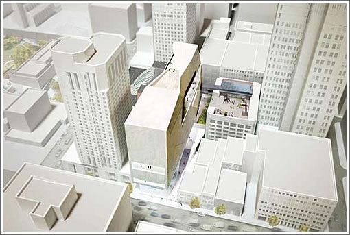
Snøhetta‘s design for the $250 million expansion of San Francisco Museum of Modern Art (SFMOMA) has been revealed. From the Business Times with respect to the designs for the 195-foot building on a site zoned for 320 feet of potential hight:
On its east side, the building will feature a sweeping façade and an entrance in an alleyway that is currently hidden from public view and largely unused. This will be achieved through the creation of a mid-block, open-air, 18-foot-wide pedestrian promenade running from Howard Street through to Natoma Street that will open a new route of public circulation through the neighborhood and bring Natoma Street, currently a dead end, to life.
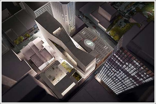
The public promenade will feature a series of stairs and landings terracing up to an entry court that extends from the new east entrance, providing additional public spaces.
The building also introduces a façade on Howard Street that will feature a large, street-level gallery enclosed in glass on three sides, providing views of both the art in the galleries and the new public spaces. At this time, the museum is also exploring the creation of a number of outdoor terraces, including one on top of its current building.
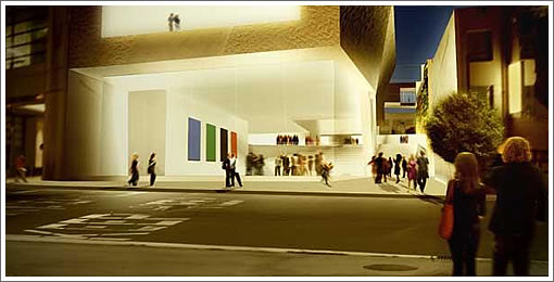
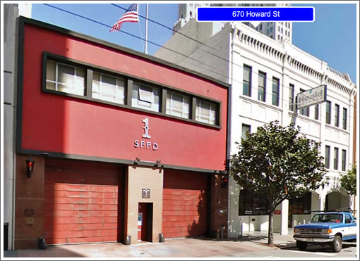
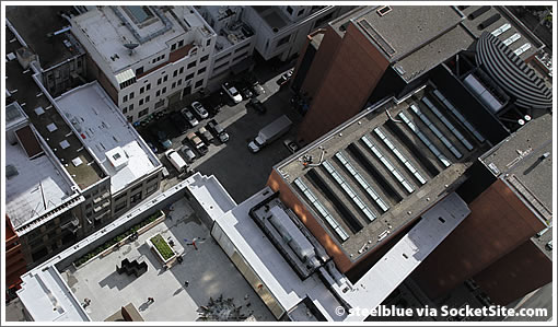
On Howard Street, the glass-enclosed gallery and pedestrian promenade will be located on a site currently occupied by Fire House 1 and its neighbor at 670 Howard Street.
As the site currently appears from Howard Street:
And from above:
∙ Let It Snø! (Snøhetta Snags SFMOMA Expansion Project) [SocketSite]
∙ SFMOMA Expansion, Fire Station Relocation And…Housing Project [SocketSite]
∙ SFMOMA expansion design revealed [Business Times]
∙ SFMOMA Expansion: Four Firms (Including A Foster) In The Running [SocketSite]
I recently read someone’s comment who praised Snøhetta because none of their designs are alike. This one however screams “Snøhetta!” with its soft obtuse angles and expanse of white surfaces.
I like it a lot. Fantastic idea to enlarge the public space on this corner. What a great infill project.
Pretty but I think the design is functionally very annoying. The floor plates are very narrow and the whole thing is vertical. One or two wide floors would be far superior.
This should have been built on a site that provides sufficient space to do the collection justice….perhaps even one of the piers along the Embarcadero.
Narrow and tall is aesthetically more beautiful than short and wide.
Wal Mart vs. a row house.
Roseanne vs. Heidi Klum
One of my favorite buildings in the city is on the SE corner of Market and 2nd st., because it is so narrow and slender. Completely disagree with anon’s comment.
WAIT!!! That firehouse looks remarkably similar to the North Beach Public LIbrary!!! Call Nancy!!! CALL AARON!!! We’ve got to stop this architectural abomination from ruining our City’s heritage!!!!!
yummy. Bring on the wrecking balls.
hi,
I dont know anything about architecture, but I do know that I am reflexively opposed to anything more than 3 feet tall. I also love to throw out another option that is completely unviable and hasnt even been vetted to make it seem like I am THAT much smarter than you.
That is all
SF, looks are one thing, livability/usability is another. How many row houses in SF I have been to that are around 3-4 stories high, 15′ wide, and 75′ long. Pretty much the must absurd floorplans ever, with way too much space used on stairs and hallways, with every room being tiny.
Think Versailles vs. One Rincon Hill.
“15′ wide” ??
Not too many.
L.A. gets the Getty and we get this? For a smaller sized city like San Francisco this is a nice attempt however, and a clever use of the site.
Overall I like this, and clearly the site is very constrained. I have to admit, though, that I will miss the view from Yerba Buena which has the PacBell building rising directly from SFMOMA. This addition will now add a horizontal wedge into that view between the two buildings (this view was pictured in the Chron this AM).
I’ll get used to it, and I certainly like having the Fischer collection at SFMOMA.
I don’t understand. For about 20% more cost, Chicago was able to build this wing 270,000 sq. ft. wing by a world class architect http://www.artic.edu/aic/collections/exhibitions/modernwing/overview
Is the cost of construction THAT much more in San Francisco?
The rendering makes the new building look much bigger than it actually will be.
One reason for this optical trick could be the “Flores people” that look like 1/2 size compared to the real deal.
Or is there anything I am missing?
Perhaps the EIRs drive up prices in CA?
UPDATE: Two new perspectives, one rendered and the other existing, have been added above.
The floor plates are very narrow and the whole thing is vertical.
Like the Guggenheim?
Dear commentators: Let’s stick to reality, the real location, the real client, the real budget, ok?
1. The property they are building on IS narrow and long. They are NOT going to build anywhere else, including one of the piers.
2.This is not LA. This is not The Getty. This is SFmoma.
3. This is not Chicago. This is San Francisco. Yes, costs REALLY are higher here than in Chicago.
That said, the conceptual designs look very exciting, very promising and a great way to expand their collecting. Looking forward to seeing more as it develops.
Thanks for the new images. Now it is clear that the new annex has two roof decks. Also I didn’t realize until now that this new annex will require demolition of the north wing of the existing SFMOMA.
I wonder what the owners of the W think of this. On one hand having a larger museum and that extra public space is a positive. On the other hand a bunch of their rooms lose their north facing views.
A few numbers to back up my “Flores people” statement.
The lot is 40-45 foot wide tops based on my guesstimates. The people shown here are between 5 and 6 foot tall, which makes the lot appear 60 to 70 foot wide. There’s at least a 40% discrepancy.
I’d like to see the W demolished. One of the more ugly high rise hotels in SF.
The shadow in the first image neatly defines the soon to be cut rate rooms at the W hotel.
And the bell begins tolling for the Heald College/Gold Club building…Academy of Art is probably safe for now.
The Firehouse lot is 40′ wide, and the adjacent lot (Heald College building) is 57′. The scale is correct for an 80′ frontage and 18′ alleyway.
Oops. 2 lots. Almost 100 feet. This is indeed pretty wide.
Oh, it’s taking Heald, too? Interesting. All the stories focus on the firehouse.
Read the chron article today by John King as it explains how the view of Telephone building is maintained behind the MOMA by “tapering down” the center of the addition’s roof. Also the need for stairs up to the side entrance is to maintain the Natoma easement to allow necessary service vehicles for MOMA and the W to come and go below.
Call me crazy, but didn’t they just turn the de Young Museum on its side.
Oh well, I don’t understand what you’re having trouble understanding. Chicago built a 20% larger wing for 20% more cost, in a non-infill location. Seems like we are getting the better deal here!
I love this design. It will add a lot to the neighborhood.
Absolutely love it. Will be a great improvement to the neighborhood.
I am amazed how many people think this building looks like a 250 million dollar structure. Look at some other museums online to see what that cost can produce in museum construction in other cities. 250 million is more than enough to build a signature “world class” building with far more going on than what this shows. It is a good design, but not a great design. Show me where the money is going because I cannot see it.
I never thought I would say this, but I am beginning to miss the CAMP design. At least visiting that structure at that location would be a memorable unique experience. Sigh.
(Noearch- Construction costs in San Francisco are not THAT much greater than union work in Chicago or Los Angeles for that matter)
Architect did a deft job fitting a complex programmatic requirements in a very difficult site. Great job. Snohetta is known as an excellent problem solver and it shows. The carved out the open roof spaces were done very elegantly and the skinny but wide mass frames the older museum nicely as an arresting backdrop.
Yes construction is more expensive than Chicago. The budget probably includes a certain amount of renovation and integration cost with the existing museum. Like with most project, I assure you the budget will grow north not south.
The site logistically is very difficult to build. There is NO where to stage your construction material and you can not stop pedestrian & vehicular traffic to off load with out a permit. On a project around the corner, Muni charges $10,000 a DAY to reroute Muni traffic for a big delivery. This cost can really multiple fast and expensive.
Overall this project will be an enhancement to the area. Yet to be known is how well the interior spaces work.
SFMOMA should buy, or if necessary take by eminent domain, the three small and historically insignificant buildings to the east on Howard, and then create a great museum for the ages.
This new addition is too small for the current and Fisher collections and will leave little room for expansion.
@ ncyder: great comments. Totally agree. The Snohetta firm is a talented group of architects and this will be a great building and a great addition to San Francisco.
You are right. Construction costs are much higher here than in Chicago. And yes, the complexity of the site and the remodeling issues all add to the increased costs, and totally appropriate.
@ohwell: you might want to wait a while longer before making a strong judgement against this project. These are conceptual designs only, with NO detail. Take time to understand the long, complex design process and you will see it evolve into a spectacular structure, with the associated costs being completely understandable. You don’t know that it’s a “great design” because it’s not designed:
YET.
acutally EBGuy, they just took the federal building, removed the skirt, then pinched the top.
@noearch, I am actually more in agreement with Conifer. My problem is not that this might not be a clever solution, it is instead with the program itself. Why restrict ourselves to such a small site? The addition should have a much larger property to build on, and I think that “SFMOMA should buy, or if necessary take by eminent domain, the three small and historically insignificant buildings to the east on Howard, and then create a great museum for the ages” (from Conifer’s comment above)
This is not some infill project in Midtown Manhattan or Amsterdam, and there is plenty of opportunity to create something more memorable. Trust me, Renzo Piano worked with the same budget, and the same size requirements and came up with a stunning memorable structure in Chicago.