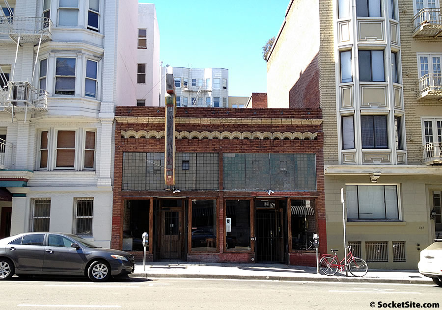
Speaking of building up in Nob Hill and additions to historic properties, plans to add five new floors atop the brick Key Klub building at 850 Bush Street, which is currently home to Hopwater Distribution, have been drafted and submitted to Planning for review.
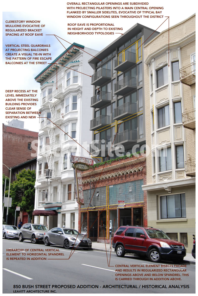
The proposed addition, which includes twenty (20) new one-bedroom apartments and parking to twenty (20) bikes, would be setback and finished in non-masonry materials to distinguish it from the original structure which was constructed in 1922.
An overview of the proposed addition by Leavitt Architecture:
And while the majority of the ground-floor level would remain a commercial restaurant/bar space, it would be reconfigured and slightly expanded, which means Hopwater would most definitely need to find a new home.


Not keen at all on the design. The generic-looking balconies have no relationship to the existing building. Hope this gets improved.
Maybe that’s the point.
Still don’t really understand what would be so disastrous about building out to the same envelope as the building immediately next to it. Why the setback?
*building, ugh
Agreed. The 35′ setback referenced seems actually self-defeating.
What if we apply the same logic to other professions? “You must match the technique and thinking of 80 years prior to be successful”. It’s a thoughtful diagram, but it should have to be created.
The thinking is: the new building must distinguish itself from the historic base, but match the neighboring context. So dumb!
anything to classify it as a remodel.
that metal looks terrible. just clad it in copper. maybe gingerbread? it’s only a few stories and would make the building a faux landmark and put it on the tourist maps.
“… evocative of typical bay window configurations …”
sorry, no it isn’t… the reason bay windows work is because they have the angles and the added interior space allowing you a little more view and maybe catch some sunlight. making it completely flush with the exterior wall is evocative only of ordinary construction that you find everywhere else.
“… vertical steel guardrails at projecting balconies create a visual tie-in with the pattern of fire-escape balconies …”
those are just basic railings you find anywhere else. fire escapes are not visually appealing they were necessary additions because of substandard interior stairwells in older buildings, i am not sure why one would want to ‘tie in’ to that.
Oh, I don’t know. I thing they’re rather evocative of fire escapes.
It’s thoughtful but as inferred above, it might be more appealing if it at least “matched” the bottom chromatically. that red-orange building at mission and 10th, for example, employs prefab panels that deliver color economically, for example. matchy-matchy isn’t always a bad idea. the setback would probably create a more private experience for the occupants (and lend a pleasant aloofness), but a flush facade might look better, even if something old, something new; brides do it all the time!
Love the juxtaposition of the understated modern over the old, messy brick. Great use of underused space.
That deep recess between old building and new will be a perfect spot for pigeons!
Can’t believe they are comparing the eave of the new building to the old. Sure, they both stick out the same, but they are nowhere close to being the same. Maybe adding some cornices would help, but it still looks no different than the mid-century box apartments that plague the city. If they did a building similar to the one building done on Battery and Pacific, then it would look great. This is just… there.
Bland and ugly, but at least they’re keeping the old building.
I like it. Clean, contemporary yet it blends with its elderly neighbors.
UPDATE: Pushback on the Plans to Build atop Hopwater’s Historic Home
We don’t want it. Have you notified the neighborhood. Please advise!
Take your 5 floors and add it to the fairmont. Enough building. It probably isn’t affordable and who needs another building. Disgusted by the amount of construction going on. Noise pollution, and it’s over a restaurant. Perfect haven for vermin in apts above a restaurant. STOP
Not perfect, but a good addition that respects both the block and the original building below. So much better than many of our recent buildings.
Are you commenting on the latest proposal or the one from five years ago?