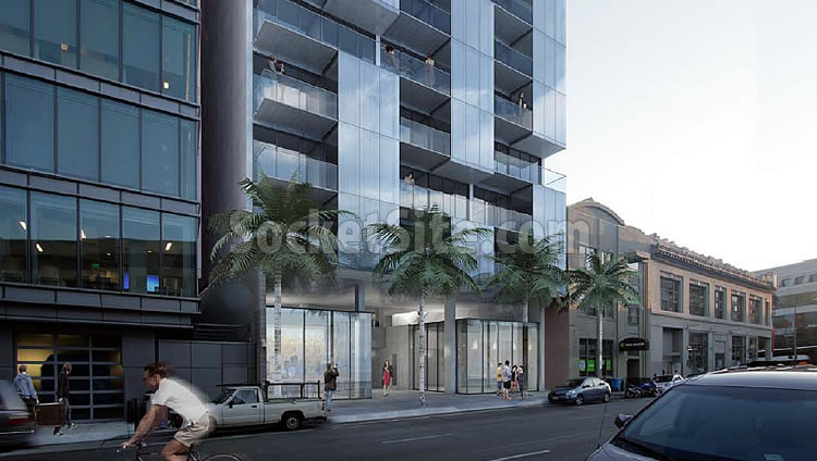
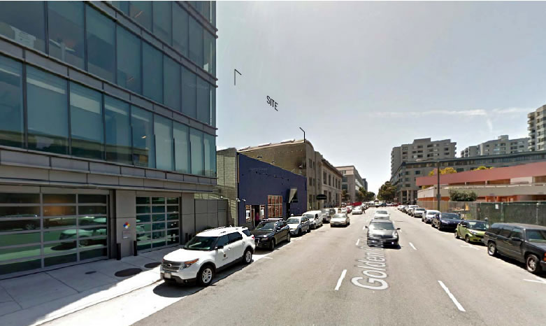
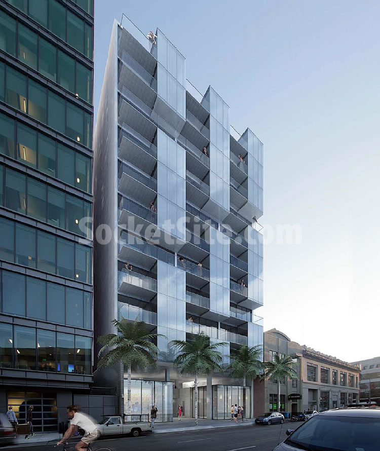
Plans to raze the former Stars/Trader Vic’s/Maestro building turned Empire Room at 555 Golden Gate Avenue and construct an eleven-story building on the site are moving forward.
As proposed by JS Sullivan, the revised plan for the building, which is being designed by Natoma Architects, now includes 58 condos, an underground garage for 34 cars and 64 bikes with its entrance on Redwood Alley and an open passageway between the two streets.
And while the original plans for the development didn’t include a retail component, three small retail spaces have been added on the ground floor.
The Empire Room’s lease ends in 2017.


Survey says…DING!
I like the design and hope that more rebirth comes to the extended Civic Center area.
This block has been, for a long time, the worst in the immediate area. As I mention below, McDonald’s attracted the homeless as did the vacant lot next to it. The rest of that side of Golden Gate is poorly maintained buildings housing English language lessons and a Central American consulate that too attracts a poorer crowd (many undocumented).
With the redevelopment of this lot and the McDonalds and vacant lots, the whole area will be pretty much mid-price condos and fully “reborn”.
Boo!
I have always been a fan of BTinSF. It began on the Skyscraper pages. We both live in the same city, I believe.
Unwitting satire.
I wonder if the “penthouse” will sell at $1.9 million or less.
With the homeless magnet aka McDonald’s across the street (and the long-term vacant lot next door to that) now soon gone, maybe this block has a chance for retail to succeed but it would be smartest to orient it to the immediately surrounding residents’ needs. Something like a 7-11 would be nice.
Me likey 🙂
How come when I hear Trader Vic’s I immediately think Queen of England?
I remember back in the early to mid 70’s, a photo of Diane Feinstein and Queen Elizabeth entering Trader Vic’s on Cosmo Place. The photo appeared on the front page of the Chronicle and showed the Queen in a most human and relaxed state of being. I often wonder why that photo hasn’t circulated more widely, or maybe now that I think of it, I just answered my own question. Still, a wonderful photo.
Very nice design. Love that they are doing (or at least planning) an open passageway between the two streets.
The open passageway is an interesting design feature but I presume that it will become an area for homeless to get out of the inclement weather unless the building has on site security or a doorman. We’ll see how the design evolves.
agree. it will be full of poop and needles in no time
Well, that didn’t take long for the homeless obsessives to weigh in. Are the homeless part of the manic episodes as well?
I grew up in the TL, perhaps it’s just stating the obvious. A covered open passageway is an invitation to camp overnight. Sorry thems the rules. Something that may be a nice design gesture that looks good on paper but doesn’t take into account the realities of that location will ultimately be judged as a failure by future tenants and casual observers alike.
“perhaps it’s just stating the obvious” Yes, ad nauseam.
The homeless are in open areas of buildings, under freeway underpasses, in doorways, in Golden Gate Park, etc., etc., etc. The issue is do you make designs that are so unfriendly for everyone else just to keep the homeless away? Those kind of design decisions will simply push the homeless around the corner. So you wont encounter them on the shortcut through the block because that wont be part of the design, but you will encounter them on the corner on your longer walk around the block. Problem solved?
yes, I would argue that you do design to keep away the homeless, especially if you want people to live there. a homeless encampment is a public health hazard. UNfortunately its a way of life here because the city has let it fester so long.
Is that a jumper or a shooter on the top floor?
Retail on the first floor is a vast improvement over the concrete cavern of the original proposal.
Guess I’m the exception to the rule on this one – I think it’s hideous. And in a few years it’ll be all dusty dingy glass and (seen from the outside) mis-matched drapes and window coverings. No one ever depicts that sort of thing in the renderings…
What’s your suggestion? A fenced off plot of dirt?
Holy god, how do you go from my saying I don’t like the design, to suggesting that I’d prefer a fenced off plot of dirt?! I’m getting so tired of the polemic commentariat on the web – treating everything as black and white (when in real life virtually nothing is), and people are actually allowed to have opinions.
Arata Isozaki has tons of renderings of his buildings in ruins (namelink).
But that’s much more romantic than renderings looking dated and neglected ten years on.
The poured concrete should age better than a lot of materials used recently, and look less instantly dated than the orange/white monstrosity going up at Franklin/Bush.
Funny, when our Muni bus passed that Franklin/Bush project last night, I thought “wow it’s really coming together fast, and looks great”. So, different strokes indeed.
Not Franklin and Bush. That looks nice. Franklin and Pine. It’s panels of stark white and orange with the facades of the 1920s shops still there. The design is kind of a nod to the early 60s, but it’s not going to patina well. I called it a monstrosity Bc it feels bulky and massive there.
I think most materials without maintenance or cleaning end up looking dingy in the city. The horizontal wood siding so popular will fade (personally I like the soft silver/gray look natural wood gets) and the pervasive stucco tends to look worn around the edges where metals tend to stain, or water infiltrates or settling causes cracks.
I was just in front of Saitowitz’s Yerba Buena lofts and thought it was holding up pretty well – I mean yes it could have used a power washing, but otherwise looked good. The window coverings were all flat and consistent so didn’t look trashy.
oh heavens how callow can SocketSite be? the true beloved Traders Vics was of course located on Cosmo Place alley in the ‘upper’ TL for 40 years. a true classic.
the attempted new edition at this location never jelled. but instead this spot was the home of Jarimiah Towers’ legendary Star’s!
where majorities of various city commissioners would often meet and drink in flagrant violation of the Brown Act back in the day.
sigh.
Thank you. The idea that a tower is going there is grotesque.
Yes, nice design. Anyone concerned about where ESL schools and homeless go?
Is this project displacing the homeless?
we can only hope
UPDATE: Golden Gate Development Redesigned, Slated for Approval