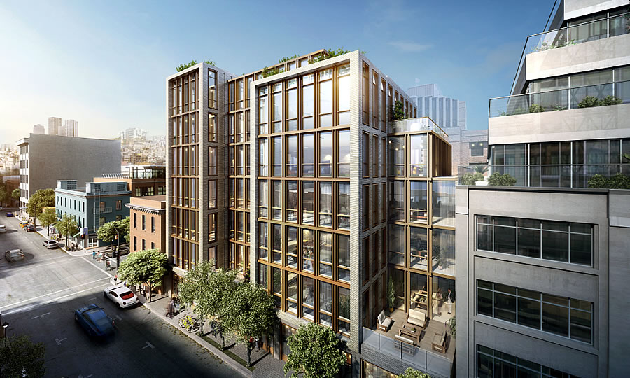
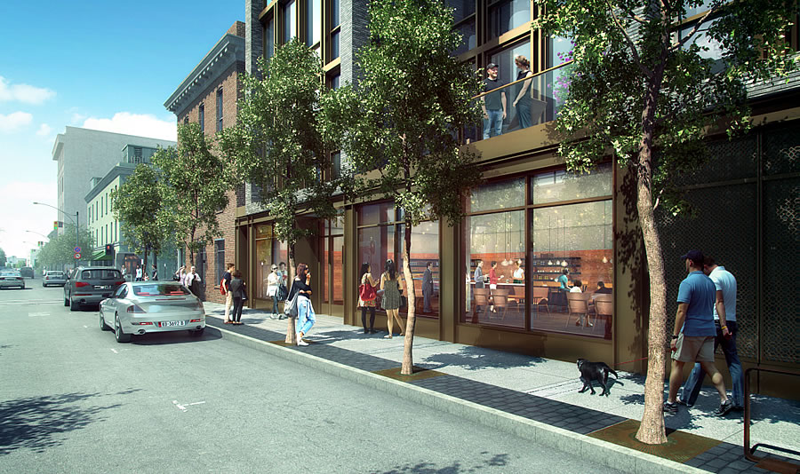
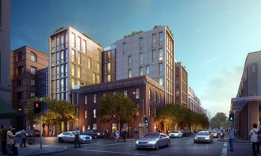
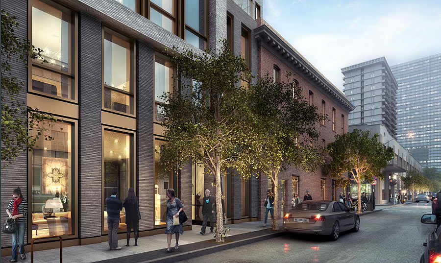
With an approved plan for mitigating the environmental impacts of the proposed development and preserving any archaeological finds having been inked, we now have a couple of fresh perspectives and updated renderings for the proposed 240/288 Pacific Avenue project, which includes 33 condos over 2,000 square feet of retail space, and a garage entrance for 35 cars, fronting Pacific.
The proposed development, which could be approved by San Francisco’s Planning Commission tomorrow afternoon, would wrap around the Old Ship Saloon building at 298 Pacific which was built in 1907, prior to which the saloon on the site was literally an old sailing ship, the Arkansas, which had run aground on the then-waterfront parcel and was converted into a makeshift bar and boarding house.
As designed by Handel Architects, the new development’s main entrance would be at 720 Battery, the current parking lot parcel across from The Battery club.
And if approved, the development will take roughly 18 months to complete once the ground is broken, not accounting for any archaeological finds that require additional care to recover or document.


This is a handsome building that complements the existing surrounding buildings quite nicely.
The new renderings show a bronze/brown finish at ground level on one side. Perfect blend with the adjacent brick building. The other side seems to be a sandstone type façade. Complementing the red brick next door but different from it enough to make for a nice, interesting and intimate streetscape.
This is good urban architecture. Kudos to the design team.
Second above, the design team had a excellent view/scale/proportion/materials.
Only question is transit. F-Line needs to be extended and more frequent for capacity issues around the waterfront.
One of the E/F lines was supposed to be extended to the Marina though that old tunnel, but Marina residents shot that down, I believe.
Any clues as to the foundation type??
Really like it too. Downtown living however is not for the faint hearted… Lots of quality of life issues to deal with.
In that area? The proximity to Broadway might be iffy, I suppose…
Why are these rendering always so fake (the Warriors vid was particularly egregious): they show people walking along w/ eyes looking in front of them, or interacting with other people, etc…..we all know everyone nowadays has their eyes glued to a screen, and they stop every few seconds, oblivious to everyone else.
But other than that: yeah, I like it too, modest sensible scale w/o gratuitous design features or convoluted shapes.
Not too crazy about the bronze mullions. Hope the bricks aren’t lick-a-brick or precast panels.
The bricks look to be essentially tiles. Doubt they are actual brick. But have to give them credit for actually trying to complement the surrounding structures. This is a development that looks quite attractive. Too bad not every development can aspire to at least try and look good.
Traditional brick cavity walls will not perform well during an earthquake. Precast or thin-set is the way to go for seismic conditions.
Golden Gateway.
Superstitious asians will probably shy away due to the negativity associated with the address number….
there are only white people in the pictures anyway, so assume that’s all that will live there…
Gorgeous building. Wish we could see more of those in SF. Seems like NY gets al the nice buildings.
Love the fact that it is walking distance to Safeway, Ferry Market, Bay Club, Downtown, North Beach.
Really? I think its absolutely hideous. But then one peek at reality TV and its clear to the world there is no accounting for taste. Sigh.