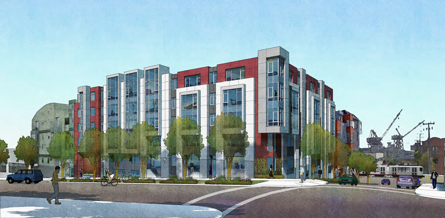
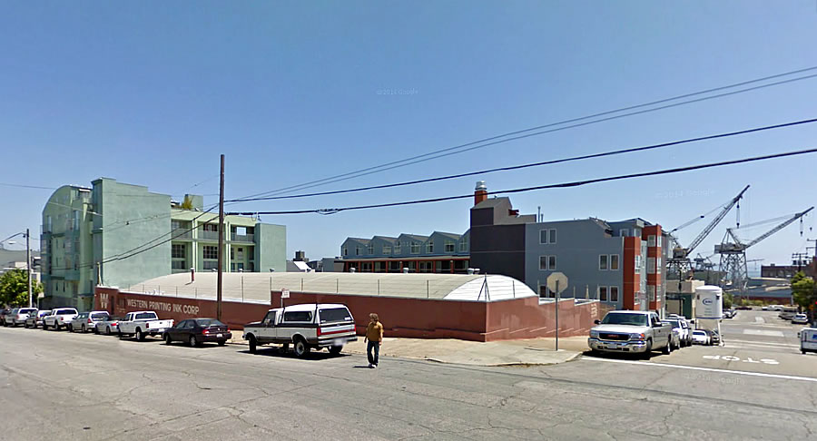
Facing a bit of opposition from a fellow architect and neighbors who reside in the Dogpatch building to the north at 755 Tennessee, a building which was designed by Sternberg Benjamin as well, the proposed five-story building to rise on the northeast corner of 19th and Tennessee is slated to be approved by San Francisco’s Planning Commission next week.
The development of 777 Tennessee, which was originally designed to rise up to six-stories, would replace the low-slung Western Printing Ink Corp warehouse on the parcel with 59 condos (one studi0, 34 one-bedrooms, 19 two-bedrooms, and 5 threes) over 50 parking spaces and a storage room for 59 bikes.
From the opposing architect, concerned about the loss of direct sunlight to a number of the neighboring building’s ground floor units and surprised by 777’s “fully loaded” design:
“And as architect for 755 Tennessee, you knew exactly what you were doing! This is shameful.
I also pity the new residents, double loaded corridors like a cheap hotel and no cross ventilation. Was not Roger Sherwood’s Modern Housing Prototypes on the reading list of your architecture school?
This design seriously impedes both the quality of light and the quality of life for 755 Tennessee St.”
San Francisco’s Planning Department and the Dogpatch Neighborhood Association support the project as proposed. The public hearing for the development is scheduled for Thursday, with the neighboring architect vowing “vehement and justified opposition.”


The existing building is about the least friendly urban space imaginable. The redevelopment of this site has been overdue for a long time. We need more housing.
That said – I wonder how our current SF code compares to New York State Tenement House Act of 1901 for light and air….
This is the vision of San Francisco some on this site push. Low slung buildings so we can preserve the superficial “Charm” as viewed from the street, translating to loss of interior courtyard space and all around quality of life, stuffing people in squat shoeboxes instead of building higher and preserving our open spaces. No thank you.
yep
This is going to be very interesting. I tried to see if 755 Tennessee had pix but I wasn’t able to see them. I did see that 755 was built in the last dot com battles in 1998, What I did se was that there was not much of a design difference between these two buildings, the one coming and the one previously. Both are boxy and not very attractive places.
I’ll hand out the popcorn to everyone in the socketsite audience though.
As usual, banality reigns supreme in SF multifamily design – why is this schlock continuing to be built on every other corner in this city!?!
Because people need places to live?
It’s not schlock. It’s not banal.
It’s what get’s built today with tight construction budgets, keeping costs low, and the heavy involvement of the Planning Commission ( who attempt feebly to design).
What design aesthetic would you suggest?
Frank Gehry! Every condo a masterpiece of swooping, leaking, edgy, curves. Maybe clad in titanium angled to beam concentrated sinlight right into the windows of the leading NIMBY????
One-hit wonder.
Futurist: I’ve listed over and over again on socketsite (literally for years) all the cities / countries that put SF to shame in terms of design quality in multifamily – must I really do it again for you?
Brian M: It has noting to do with Frank Gehry – it has to do with simple high quality architectural design, rather than formulaic mediocrity repeated again and again…
Because they’re efficient designs that planning approves.
So …what you are suggesting, in essence, is that tight ( really?) budgets, expediency and high profit margins are incompatible with imaginative, individuated, site specific design practices …. how convenient …. further to your point, what preset aesthetic, program, floor plan et all can we pull put of cad and rivet to fulfill the preset design promulgated by our insightful and astute dept. of Planning.
If you really educate yourself on the design and construction process, you will learn that early on the budget is a driving force as to what will get built. Nothing wrong with that. It’s reality. It affects materials, inside and out, structural forms, planning layout, ease of construction and timeframes.
And no, there are no “preset” plans that some magician just pulls out of AutoCAD. Seems to be a constant myth of the general public.
And really, does it matter that the design aesthetic attempt to satisfy the masses? No, it doesn’t, because they don’t understand design, except to only complain about it.
We want more housing; this is good fit. just build it.
For a city facing an insane housing crisis, what we need is less design not more. Stick the architects and their over inflated egos into a windowless room and throw away the key. Let the builders build cookie cutter 5-6 story, efficient, double loaded buildings as cheaply and quickly as possibly.
What we need is the same manufacturing oriented process that makes all other consumer goods affordable through standardization and mass production. What we most certainly do NOT need is a customized twee box on every street corner designed by an architect.
Glad you weren’t around circa 1907.
Pretty sure folks like him were. That’s why the city was able to rebuild quickly, using mostly kits and standard pre-fab housing designs.
Yup.
Some of those lovely Victorians the NIMBYs love to swoon over – well, in the Victorian era, you could buy those plans via mail-order catalog.
Or mail-order, with added customization for a modest fee.
In the early 20th century, you could even order one from a Sears-Roebuck catalog.
Actually, he was–most Victorians are cookie cutter, but such nice cookies!
Anybody building Victorians in 1907 was using an outdated cookie cutter.
It’s a perfectly fine mid-market residential building, and perfectly appropriate for the neighborhood’s ongoing transition – certainly several levels of magnitude better than what’s there now. Build it, and let’s move on.
Yes it is.
Absolutely agreed.
Double loaded walls are not the end of the world. This is former commercial/industrial, so what is the big deal. Plenty of time for other under built areas to go higher.
Decent Muni and Caltrain in addition to freeway options. Walk to dogpatch amenities or a slight hike to 18th… Farleys for coffee with attitude if that’s your thing.
Coffee with attitude? Are we still glorifying face piercings in this manner?
There’s nothing interesting about Farley’s, least of all their coffee.
“Fully loaded” is now an architectural adjective? What does that mean? You get a sunroof and the trim package? How does “fully loaded” compare to “luxury”?
I’m so confused.
“34 one-bedrooms, 19 two-bedrooms, and 5 threes” – that’s a terrible breakdown for any one buying the 3 bed. Surrounded by 34 single people with their dirty single-people comings and goings. College dorm for tech-workers. Christ I’m old and jaded…
I agree. The horrors of living near “single people”. I won’ be able to hear my own shrieking children bawling or the sacred family unit next door as they undergo yet another full volume “challenging marital even” at 3:00 a.m.!
And, given that some of the tech workers are “furrin”, what kinds of terrible kitchen smells will be permeating the building?
Ther HORRORS
If the single people are in the 40’s and/or 50’s, there won’t be much dirty single people comings and goings. Just a lot of self-loathing, self-doubt, and self-comforting measures. And with each overheard child’s shriek or challenging marital event, the singles’ doubt will subside while a calmness ensues that their choice is a correct one.