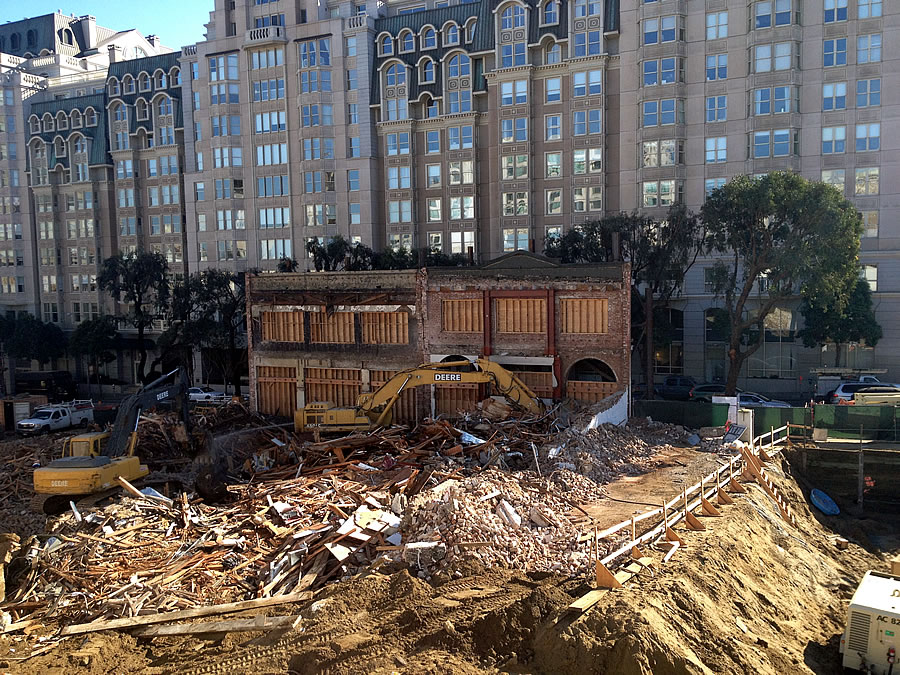
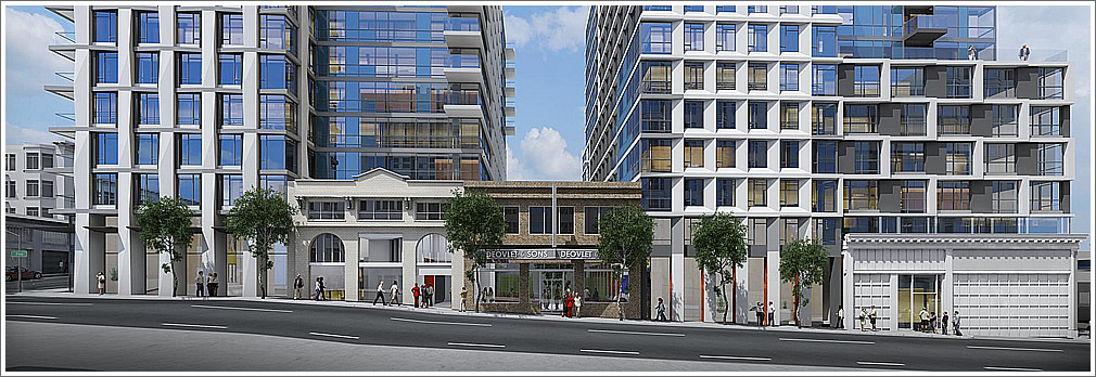
Left standing like a Hollywood set, two thin brick facades are all that remain of a pair of historic buildings on the north side of Pine between Franklin and Van Ness, clearing the way for two 13-story towers to rise on the 1634 Pine Street site.
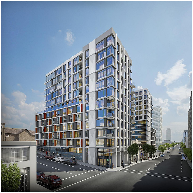
Dubbed “Rockwell,” the development will includes 260 condos over ground floor retail and an underground garage for 201 cars. And to the chagrin of San Francisco Heritage, but approved by Planning, the two surviving facades will be incorporated into the new development in the name of preservation.
So silly. smh
That looks ridiculous.
The world is now safe from modernity. Yet another example of the intellectual bankruptcy of the historic preservation movement.
So tired of people bemoaning preservation, while simultaneously applauding the gut jobs of the single-family Victorians all across town. It’s not hypocrisy, but it’s clear that these historical architectural elements have value in real dollars, or nobody would want those homes. So what’s the problem here?
I agree.
People gut renovating Victorians are preserving the exteriors because they can’t get the approvals to start from scratch. People buying them don’t have the option of buying new construction SFHs because there aren’t any in SF. People want new housing. They would pay just as much, or more, for new construction.
I like old buildings too but people like me bemoan preservation when it’s done only because it’s required by a city where everyone minds everybody else’s business and is always allowed to throw in their two cents, and the end result is pointless preservation of nothing substantial.
I really, really doubt that the exteriors are only being preserved because the City requires the preservation.
Victorian exteriors are, overall, better detailed, more humanly proportioned, use more color and delightful form. Interiors? Too gaudy and dark and gloomy. Hence the weird combination of modern interiors (with their light and usable rooms) and colorful, characterful exteriors.
If you REALLY want a modern tract home exterior, the lovely fields of San Ramon and Solano County beckon.
I want a modern exterior in an urban neighborhood. Please let me know where those urban neighborhoods are in San Ramon and Solano County.
Try San Jose, Walnut Creek, Sunnyvale, Mt. View, Emeryville, etc. as well.
In this case. I support the preservation of the facades of these two small buildings. They create a small scale variation in the larger facades. This is not a bad thing.
I’m with you. This one is a nice facade and it adds favor to the large development.
I totally agree… The street-level feel should be very inviting. I’m all for blending the 2 (historical and modern) and feel that this is completely appropriate.
Completely agree – if the alternative was no development – OR if the alternative was yet another block of large plate glass windows and cheap metal mullions – then this is by far the better solution.
Having reviewed more renditions at the architect’s website, I’m coming around to appreciating retaining the buildings which were historically on site though I wish the towers were more dissimilar to make the whole more “organic.”
I’m confused, why could they not preserve the rest of the structure and build from the inside? I’m assuming it’s likely because they still have to dig a foundation/garage. Although smaller scale, the Gas Light Co. building on Townsend preserved most of the building.
Most of this era’s light industrial buildings were constructed as a simple blank masonry box topped with a steel or wood trussed roof. Aside from the facade there’s not much real value in the structure and the required seismic retrofit can be more expensive than just tearing the box down and rebuilding with modern materials.
Good point; thank you for the information. However if the building were structurally sound (say it were reinforced masonry), could you leave it in place? Or would that impede construction of the foundation/garage/etc?
I doubt that the masonry walls built nearly a century ago were strong enough to meet modern seismic codes. I’ve seen buildings from the 1970s that could not meet the 1990s era UMB requirements and were razed instead.
But you bring up a good point. Even if the shell were up to modern code, the builder probably would have found a demolition faster and cheaper than integrating the old shell into the modern building.
Agreed. Ridiculous architecturally, and mars an otherwise attractive modern design.
I like the recycled facades as well. Piecemeal and token, perhaps, but they make a respectful nod at what was, and give the place a certain character and sense of place. They give one a sense of life 100 years ago; that there was another era, when facades like this were commonplace. They’re like relic fountains: Lotta’s fountain comes to mine.
Well said! Sometimes I think the recycled facades look ridiculous, and I’d hate for architects to always be required to keep them, but I think these two work very well. At least in the rendering. I wonder what will be behind the facades? Will people be able to walk through and enter into a building? It might be nice to see retail or coworking or restaurant space there.
I like the way the two facades on the left help to form the podium between the two towers, and create the feeling of a more dynamic street scene. It is the third old facade which forms the garage entrance that feels wrong because of how it makes the construction above it feel insubstantial.
[Editor’s Note: Take another look at our second picture above, the “third facade” was razed.]
It’s like, one midget in a show is a distraction.
Two midgets in a show is interesting, dramatic even.
But three midgets in a show? I mean c’mon.
Have you guys been to Boomtown in Reno? You’d love the varied old timey facades.
You clearly have no idea what you’re talking about. You have no concept of historic preservation.
Historic preservation is bunk.
*snicker*
Im a bit confused about this (to the editor’s note). Why would they demo that facade only to rebuild it, presumably from scratch?
What’s most sad to me is that the overall fit and finish / quality level of the San Francisco of Ed Lee is not even at par with the disaster of the 60’s. These things are cardboard shoe boxes.
The current mid-century revival will age about as well as it did the first time around. A few classics but mostly cheap boxes made of prefab panels.
i don’t care about the preserved facades. i just can’t stand this mishmash jumbling of facades. i count at least 5+ different patterns and random assemblages in each picture. it doesn’t “break up the mass” it looks messy. just pick a strong skin and stay with it. also, while i often like orange metal panels, i’m worried they’re going to date buildings much like salmon and teal do with the 80s. criticism aside, i’m just glad to have more housing here.
Agreed. This building is a jumbled mess.
Agreed! One facade type preferred, two max.
It looks kinda like a Sim-City-Las-Vegas casino/hotel built around a stubborn land-owner who held out too long…
funny and agree
With careful selection of the shoring contractor that facade could be fully integrated with the debris pile in one night. Perhaps a Port Commissioner knows a guy that knows a guy.
I think there’s a guy on Twin Peaks who’s an expert at making sure preserved historic structures don’t mysteriously fall down…
The only thing that distinguishes many old commercial buildings in San Francisco is the facade. The rest of the buildings are usually simple boxes. Therefore saving the facades are a good thing to add a sense of continuity.