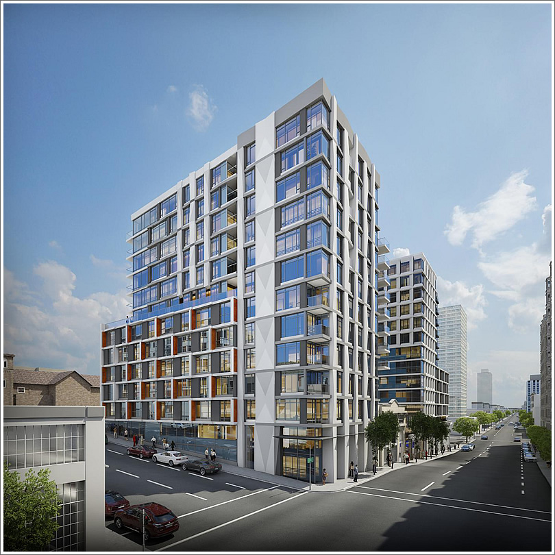
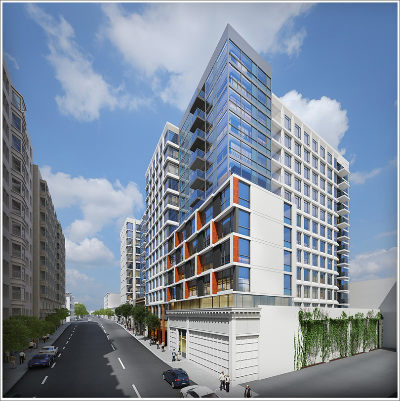
The latest renderings for the proposed development of two 13-story towers with 261 condos, ground floor retail space, and off-street parking for 201 cars on Pine between Van Ness and Franklin will be presented to San Francisco’s Planning Commission next week, seeking the Commission’s approval for the 1634 Pine Street project as designed by Kwan Henmi for Oyster Development.
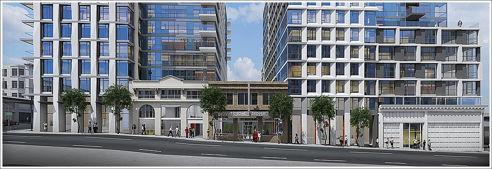
As proposed, the facades of three historic buildings on the site will be saved and integrated, the execution to which San Francisco Heritage “strongly objects” but Planning supports:
The Cathedral Hill Neighbors Association will be urging San Francisco’s Planning Commissioners to approve an alternative design for the site, “which blends into the surrounding blocks and allows space for light and air to permeate onto Pine Street,” with only 100 units and 40 parking spaces.
The newly rendered view of the development from the adjacent Whole Foods parking lot:


WHOLE FOODS PARKING LOT!
Does San Francisco have the least imaginative architects of any major city?
i like the building overall, i just don’t like the approach of having lots of different types of facades to break up the building. it looks messy. they just need to clear the lot and build ONE nice building with a nice facade. i’m worried this is going to look dated in 5 years.
What a mess.
Well, at least the “build anything” crowd will be happy. With only 40 parking spaces, the car haters should be happy as well.
The loser is the city of San Francisco.
[Editor’s Note: As reported above, 201 off street parking spaces as proposed (and opposed by the Sierra Club).]
Nice looking building. Clean lines and good proportions.
What’s up with the preserved building on the right? Is it planned to be a nightclub or something, with its total lack of windows?
[Editor’s Note: That’s the entrance to the garage on the right, a corner of a larger retail space on the left.]
The facades are broken up nicely into different massing and fenestration. I like how the scale is broken down small between the two large buildings.
Nice way to preserve the character of the older buildings.
Good, modern urban solution.
Idiot NIMBY neighborhood association. Worried about sunlight “permeating” onto Pine St. This is on the NORTH side of the street!
Maybe at 7 AM on the summer solstice the sidewalk would be shadowed about five minutes.
I have no issue at all with this , it preserves the old facades , has a modern look, is not just one big bulky building , and it adds another 261 units of much needed housing 1/2 a block from Van Ness ,
this so needs to be built !
OMFG! Good enough design, but here we go AGAIN with the staggered vertical patterns! stop it! no more! enough of that! every dang project in teh city for the past four years has a staggered vertical window pattern/fins/whatever. Find a new theme!
Facadism is never an answer and it certainly does not work here . . . Very “bush league”! I am very surprised that Kwan Henmi would allow this act of stupidity.
When I first glanced at this top picture I thought ‘Oh, a story on the Trinity complex on Mission and 8th?’ And the first clue that I was wrong was that what I thought was 8th was going the wrong way.
Yes, all these new buildings look that much alike.
I have a lot less issue with the look of the proposed building then some of you , in fact I sort of wish we were getting 1/2 a dozen buildings with this design with heights in the range of 30+ stories in this area if only because of the strong impact it would have on the skyline ,
Have you guys even seen the Marlow at Van Ness and Sacramento? In my opinion it’s by far the best looking of the new buildings that have gone up, so YES, I will take an even larger/taller version again, happily.