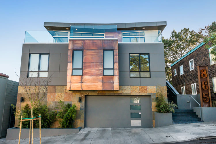
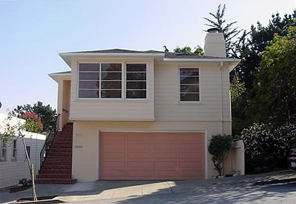
Having been foreclosed upon in 2011, the once nondescript Noe Valley home on a large lot at 865 Duncan Street was listed by the bank for $1,295,000 that November and sold for $1,280,000 in April of 2012.
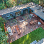
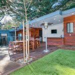
The buyer was James Gallagher, the founder of Achill Beg Construction. And along with Shatara Architecture and designer Amy Sullivan of Sullivan and Associates, the property has since been transformed into a 5,400 square-foot designer home with a 700-square-foot guest house, garden, and outdoor “leisure area” out back.
And here’s an exclusive peek inside and behind the home:
Now home to Mr. Gallagher and his firm, the property is not on the market and we’ve been told there aren’t any current plans to sell. But in the words of Suzanne Gregg, the Paragon agent who advised Gallagher on the buy, perhaps if he was presented with “a crazy offer” he could be persuaded to move. Like that ever happens in San Francisco…
Randall Museum chic.
What number is that house?
hahaha
Funny!
I live around the corner from this house. They did many things perfect, but if I did that address sign in my first year of architecture school, I would have been given a D+. Really?…yep a builder, not an architect….
as a developer I think the architect did a good job, Sure it’s not perfect but it’s a flipping house not a brand new house…. In SF It’s not just about you have a great design… It’s about how to get over the building code and get the permit done to turn an ugly boring house to a nice place to live in.
What’s the deal with the brown house on the right? It isn’t in the before photo. Is that the guest house or just a new neighbor? Pity all that greenery next door was lost. And too bad about the partially blocked view from this place.
Sour grapes, LOL.
The house to right has always been there, but trees have been blocking its view
cubist bull
This is not a cubist design. Here are some examples of the cubist style. That last place houses my favorite cafe in Prague.
can you see the bull?
can you touch the cubes?
can you open your mind?
Your incorrect use of a term means that others need to open their minds?
I used English words in a comment on a blog, not a formally constrained term in a math proof.
he didn’t say it was a cubist design. he made a quip and it was kind of clever. I do see a cubist, as in Picasso, bull
Could we know who the architect was? It would be interesting to know…in addition to the decorator listed in the article…how this 5400 sq. ft house was built/remodeled with Building Permits totaling $298,001 (or $55.19/sq. ft) and the rear office (aka “guest house”) with Building Permit for $15,000 ($21.43/sq. ft.). Yup, any offer would be “crazy”. Building Department, Assessor, please help us understand.
a few things. 1. the post tells you who the architect was. 2. why didn’t you read that, if you took the time to look up the permit? 3.why is it that posters like yourself cannot internalize the fact that there is a formula for building costs at dbi, and it most certainly was applied?
[Editor’s Note: The architect for the project was missing when our peek was first published, since added as noted above.]
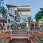
wow, thats the ugliest use of mixed materials on a facade, how did this get through planning? Those house numbers are ridiculous
I think the architect was trying to make almost a modern-rustic facade. After all this is San Francisco the people are diverse and so are the homes.
It has gone from modest, reserved and kind of ugly to huge, loud and more than kind of ugly.
Progress!!!
I agree, facade is major fuggles…yikes!
Weird and flashy. I’m not feeling this house. It’s kind of an eyesore …
Kindofa…eyewhore…
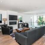
The exterior is not bothering me (much, other than the unwarranted prominence of the loading dock door) but for my taste the Apple Store interior is just terrible. The only explanation is this builder doesn’t know any carpenters, or doesn’t appreciate their craft, or owns shares of the Windex company.
I love it! This looks very simplistic and modern geometrical house with smooth texture stucco or flat. Very luxury modern european house.
Really, this is considered an improvement? Will this architecture be relevant in 15 years? While the current owner will say “I don’t care about resale value in the future” if the design appears obsolete, believe me as a Realtor of many years those won’t be his words when his agent gives him the bad news. All is it missing is some horizontal wood planking on the exterior to complete the look….
There’s loads of that horizontal planking on the outbuilding / guest house. The 8th picture (inadvertently) shows how effective that structure is at catching tree litter. I guess you have to pay some guy to sweep your roof constantly.
Hey man, Im one of James’s neighbors. From day 1 he told me that he would build this house for his 4 children and wife. I asked him when it was finished if he would sell it, he said no. He doesn’t care about if its worth 1,000,000 or 10,000,000 he just said he wants to make his family happy. Also, this architecture will always be ”relevant”, the San Francisco victorian architecture will always be relevant as well! Age does no matter one bit. Architecture is Architecture.
Not feeling it. IMHO, it’s the 70’s look all over again. Contemporary is tough, and throwing materials at a building doesn’t make it good design. Designing and constructing a building doesn’t mean good architecture. In my opinion this house won’t “age” well. Just look at some of the 1970’s wooden structures in Pacific Heights and elsewhere.
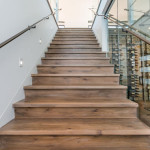
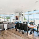
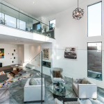
The view is amazing, I understand the reason for all the windows. Why would you build walls when you captured a view like that. I love the uncapped railing detail leaves it light and airy. The combed oak floors and the tread detail are beautifully finished.
Looks like the big windows up top gave the house some killer views. That’s worth somethin’!
I love this modern house. This unique design has a lot of natural light and a beautiful view from the kitchen. Great for having guests over weather you want an elegant dinner or a great back yard BBQ! I agree, it has a very modern luxurious European style.
what a mess…lots of poor choices in materials and furnishings…spatially OK though
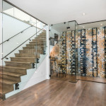
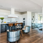
I don’t know about you but I would die for that wine cellar
Because direct sunlight is always such a desired feature in a wine cellar?
It’s Not! the door is not bringing much light at all. The restoration of these photos if you can tell are exposing more artificial light then the original photo
Artificial light is damaging to wine too. This “cellar” (i.e., glassed-in portion of an entryway with some wine racks in it) is a stupid gimmick from someone who doesn’t know anything about wine.
The purpose of most purpose-built wine cellars is to make a statement rather than to store and preserve wine. Most wine fans simply store their good wine in an unused closet or the basement. Zero pretension but 100% quality taste.
Not in my experience. All of the serious oenophiles I know store their good wine in large purpose-built wine refrigerators (the 250-1,000 bottle ones, not the little under-the-counter things), though those often are in a garage or basement (and additionally tinted or otherwise protected from light) — or offsite at a professional wine-storage facility. You’re going to get major temperature variation just sticking your wine in a closet, something you’re not going to want if you’re planning on aging for decade-plus periods.
gee. think they might have opened a door to take a photo?
yikes
I’m pretty sure the door was closed take it that it is in the photo gee just a thought -_-
Agreed. The wine cellar is pretty cool, though definitely more for display than functional storage.
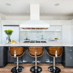
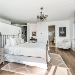
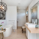
Some serious TLC went into this house, which you can see alone from the continuity of light fixtures from the bathroom to the living room. Every fixture in this house is a conversation starter without overwhelming the eye and keeping the general aesthetic clean and simple. Going to be some lucky kids growing up in that house!
Quiz How many bottles of wine, does that wine cellar hold?it looks more like a rack to me.
Yeah I’m pretty sure the owner is not a Italian drunk who gives a crap about how much wine he has.
Since only classless people would want to devote space to an actual wine cellar rather than a light-exposed, glassed-in portion of an entryway with a handful of 12-bottle wine racks mounted to the wall.
This article fails to credit Shatara Architecture for the remodel and design of this house.
[Editor’s Note: Not intentionally and since updated above.]
cool throwback design of the Shatara Architecture website, late 20th century motif enhanced with simulated dialup pageloading times. Even has a mapquest link.
I love the interiors, and the view is breathtaking
Large piece of poo- live around the corner at 28/douglas— the rusty (not patina RUST) exterior and the BILLBOARD that is the street numbers – this is a teardown now that they have an occupancy certificate….
but hey- if they are happy then go with the bad-aesthetics-gods
The house is ugly. The floor tiles on the exterior wall are weird. This is an uber, tired exercise, not a home. (note, not even a place for one book in the house, who’s surprised?). Loss of touch with reality but who needs to hear oneself even think in a structure like this? Ugh.
right ??!! funny dude
Super ugly
Yikes, so much controversy. The owner likes it, he’s not selling, you’re not buying, chill.
Awesome outdoor space, though I wonder how much use it gets in chilly SF. Also, will the ample wood decking and siding last in its current form? I went to Bardassono in Yountville a couple years ago, and all their wood siding/trim had faded at different rates and it didn’t look natural, it actually looked kinda crappy since it clashed with the modern look. A modern outdoors space and then the potential for differential weathering in all that sleek wood means OCD shellacking each year. But I presume a builder is going to be alright with that.
the backyard is south facing and protected via an uphill neighbor to the west. it will not be “chilly.” it will be sunny.
I’m from LA. SF is always chilly, even when sunny, except for 3-4 heatwave days. Sigh, give me (s)undress weather and I’d be au naturel on that deck.
frankly, i would think that deck would be too hot at least 2 months out of the year. I live in the inner richmond and use my roofdeck about 8 months out of the year. no in june and july and jan and feb. but sitting on it right now and its pretty toasty. i honestly cant stand being up there in late sept-oct in the daytime because its too hot. nice at night though:)
the outdoor space is truly the best part of this house.
Oops I do love the courtyard concept in the back. Forgot that. Doesn’t redeem the structure tho.
it is criticism not controversy.
I live nearby. The decks are awesome. The backyard looks like it will be fun. The “wine cellar” won’t hold many bottles of wine. Why bother? The worst thing is the house number. Oh, well. Overall, an improvement over what was there before. This is truly custom. The previous iteration was cookie cutter.
There sure is a lot of glass that will have to be carted away after the first big earthquake… not to mention whomever might be on the stairs or raiding the “wine room”. Good luck!
what sort of glass is it, Bay Guy? what rating? you must know since you made that comment.
I like the butterfly roof line and the airy openness of the spaces. It’s an asset to the neighborhood in my opinion.
If it’s not for sale, why did they have it staged?
So bad. “Designer” is subjective term.
I put the over under on one pro-house person commenting under 6-7 shill names and 1-2 anti-house names posting under 3-4 shill names.
Just list the house if you want to sell it.
[Editor’s Note: We wouldn’t suggest you make or take that bet, and that’s based on a review of the IP addresses (which we do check and flag behind the scenes).]
I had the same though, at least with respect to the aggressively defensive pro-house comments from assorted “Anon”s and never-before-seen names. Hard to imagine how anyone could enjoy the mixed-materials facade, and the tiling in particular, but to each his/her own.
I was the only cap A “Anon,” and I admit to being catty toward people who dis things without knowing what they’re talking about. Same sort of canned stuff. “see glass must insert earthquake comment,” “see DBI permit estimate must scream bloody murder,” “see outdoor space in SF must insert comment about cold weather” — it’s all really stale.
You know more than we do, I suppose, but my phone has a different IP address than my PC and when I am on the wi-fi at Starbucks my tablet’s got a different IP address there too.
Lola “I love the interiors, and the view is breathtaking.”
James Bond “I don’t know about you but I would die for that wine cellar”
JasonBroz “I love it! This looks very simplistic and modern geometrical house with smooth texture stucco or flat. Very luxury modern european house.”
Fred: “The view is amazing, I understand the reason for all the windows. Why would you build walls when you captured a view like that. I love the uncapped railing detail leaves it light and airy. The combed oak floors and the tread detail are beautifully finished.”
Pioneer: “I like the butterfly roof line and the airy openness of the spaces. It’s an asset to the neighborhood in my opinion.”
[Editor’s Note: Again, we wouldn’t suggest you take that bet. But if you’d like to, we’d be willing to wager…]
Here is a clue about me and I have been flagged. My other monikers have been Live Smart, Beatrice Plotter, and now, anon. Some monikers have been deliberately gender neutral, one has not. See Sheryl Sandberg’s Op Ed piece on bias in social media based on perceived gender differences. Similar issues from another study 20 yrs. ago by Dr. Victoria E. Rand (UCSF) on gender differences when it comes to evaluating medical school residents.
At least he won’t have to worry about those pesky curb number painters painting the house numbers on the curb then demanding $15 for their services.
The only thing I like is the courtyard/backyard concept. The rest is a hot mess. I’m surprised there’s an architect attached to this, the slate tile facade screams Bill Door design.
Ok, so the furniture and art are horrible.
Not exactly my style, but if it makes the family happy, more power to them. Just glad I haven’t built anything in the city with my hard earned money, only to be picked apart by so many arbiters of good taste.
very nice deck, awesome interiors, congrats
A real plus. Your focus is now on the interesting third floor not the orange garage door.
de gustibus non est disputandum
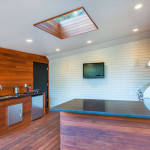
Digging that wrap around bar/porch thing! Wonder if it’s a permitted structure or falls under the less than 100 sqft not requiring a permit?