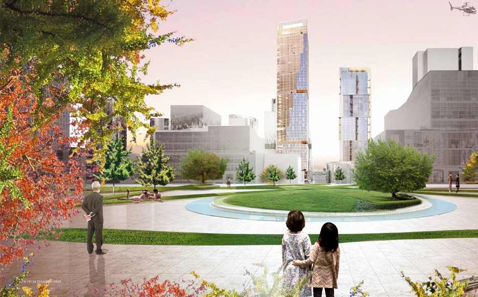
Believe it or not, that’s a slice of San Francisco’s not too distant future skyline rendered above, a view from the elevated Transbay Park, looking south towards the 550-foot tower of Transbay Block 8 (which is in the works) and the 400-foot tower of Transbay Block 9 (which is already rising).
From Fougeron Architecture, the architects of Block 8’s mid-rise and podium buildings:
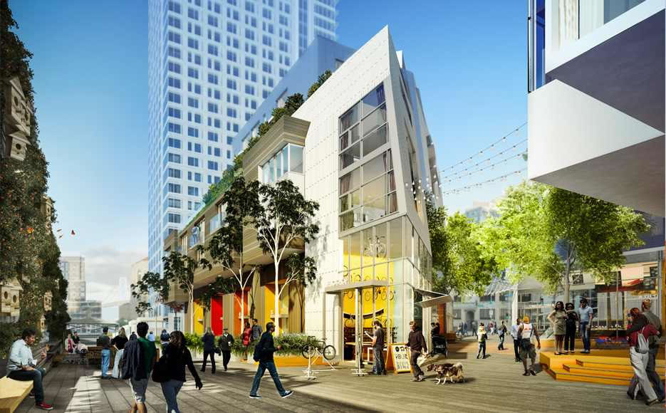
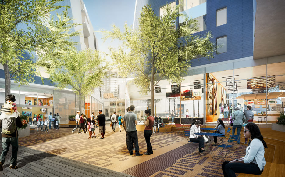
Block 8 begins with an urban gesture to the neighborhood and a desire to open the site to the public. Introducing a mid-block passage between Folsom and Clementina activates the interior open space and creates a paseo for both Block 8 residents and neighbors alike. The paseo lends a sense of discovery, respite and community just steps away from the vehicular traffic of First, Fremont and Folsom.

The Folsom Street side of Block 8 is filled with retail shops and residential lobbies creating active edges as well as porosity around and through the site. The porosity is further enhanced with the paseo. At the podium level, the buildings flanking either side of the paseo gently slope back to enable more light and air and invite Block 8 residents and any neighbors to wander into the open space.

The open space, or urban living room, is surrounded by retail shops, a resident community room serving the affordable housing population and residential lobbies. These diverse program elements will create a blend of users to activate the space day and night. Pedestrians can pick up a bite to eat, read a book, meet friends, or take a shortcut to pick up their two-wheelers at the bike kitchen. The urban living room may transform into an outdoor cinema under the twinkling Tivoli lights. The paseo might be filled with pop up market stalls to host a farmer’s market or the Clementina pocket park might host a block party.

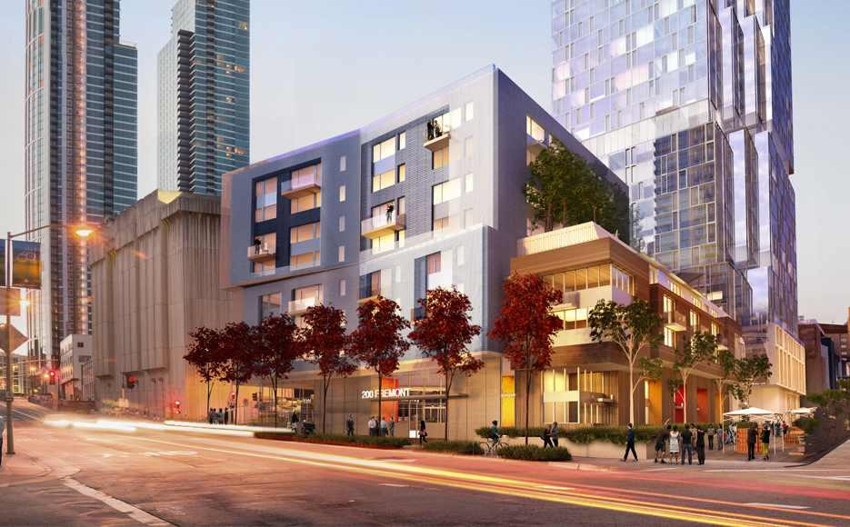
On Fremont, the folding planes of the podium building along with the dynamic massing along Folsom Street create a lively streetscape and playful podium.
The architect of the modern Block 8 tower is Rem Koolhaas of OMA.
In the renderings, I don’t see the homeless people who will doubtless be laying around in all of the open spaces of these projects.
Active edge…porosity…such slick terms! But the renderings look promising. Kinda reminds me of the walkway between market and mission that goes by the Jewish museum and towards Yerba Buena. I’m down with this.
If they used the word “paseo” one more time, my lunch was going to “paseo” back out the way it came.
Cliffs Notes version: The folding planes of the playful podium enhance the porosity of the paseo.
What are they going to do with that substation? How charming, lol!
Maritime Hall?
The substation is so ominous, I kind of like it… Lol.
It’s a blank canvas for some killer artwork
where is the sh*t on the sidewalk???
I like it! Two towers designed by world class firms SOM and OMA. Only if there were more towers like this.
well said
I wonder if it will end up like the elevated portions around the Embarcadero Center. I hope it doesn’t. They’re all essentially dead except for the bit around the movie theater.
People are always on those walkways.
Two awesome examples of how all the transbay buildings should look.
SF is a world-class destination and should have world-class architecture.
The only thing they should have done was to allow both transbay blocks 8 and 9 to be a lot taller and more pronounced on the skyline. I cringe at the likes of 45 lansing and 340 fremont with extremely cheap architecture.
All looks are excellent. I hope in my lifetime I can take the train that stops 8 blocks from my house to the TransBay terminal to this view.
I like the great urban park that has been created behind Target. If that can work, I don’t see why this one can’t work as well.
Being elevated and not integrated into the streetscape is a big strike against it. Parks do best when they can be casually encountered. If you can’t even see it, you have to go out of your way for an unknown reward.
And sometimes the unknown reward can be a great surprise. Not everything urban has to be “easy” and without some challenge.
Sounds more like the newer/younger generations want everything handed to them, without making any effort.
Nothing has to be anything. But easier is better.
Your generation ran up the debt.
Nah, it’s a legitimate point. Elevated parks don’t work, unless they are the Highline in NYC. And this ain’t no Highline, futurist.
Nahh. it’s a valid point. This park will be used. it will become a nice oasis for lunchtime. Even the Highline in NY you have to climb UP to.
And for those who are too “lazy” to make the climb, all the better for us to enjoy it quietly.
Homeless folks will make the climb no doubt. The point is to make sure that there are lots and LOTS of other folks around. It might work if we actually build some decent density in all of SOMA rather than the piddly five story crap that most of SOMA will be saddled with.
Re: the criticism “being elevated and not integrated into the streetscape is a big strike against it.”
Yes, that’s what Jane Jacobs would say about this, you get points for that. But I’m convinced that, were she to be brought back to life today and moved to San Francisco, she’d be appalled at what the homeless untreated schizophrenics and derelict drug addicts have been allowed to do to the public spaces in S.F.
If ‘yertle’ is correct and the owner posts private security guards at the entrances, and they take their job seriously, I think it’ll work just as planned and everyone (sane) will benefit.
“what the homeless untreated schizophrenics and derelict drug addicts have been allowed to do”
Surely you’re not attempting to place the blame on the people who aren’t given a choice or much help and instead are marginalized, ignored, forgotten, and then told to disappear, are you?
The beauty of Yerba Buena Gardens – which *predate* the Target by almost 2 decades – is that they flow down to the street, and have several access points at both the street and at elevated levels.
The elevated park at Transbay would benefit if a larger group of buildings around it had easy Acess
Yes! This! I’d think the City would make connections to it obligatory – instead they seem to be doing the opposite, limiting access points from neighboring buildings. Stupid, stupid, stupid.
What does this post actually mean? Can you re-compose it and more clearly prose it? From what I hear, this whole project has gone Greyhound with a thin tin skin and a balding roof. Are you pitching a toupee, Chaunte?
People who go onto websites such as this wondering about the absence of pieces of poo and the homeless in architectural renderings should question their own sanity on a daily basis.
This will be a privately operated and owned park (which is why towers will be allowed to shade it) so the homeless will be allowed to be scuttled away to whence they came by security. Many of SF’s privately owned public spaces do not have a homeless problem.
I’m disappointed that 50 first street will not be designed by SOM like originally proposed.
Here’s an article about a new elevated park in DC. Hopefully the transbay park doesn’t include similar mistakes.
I think the transbay park will be a lot better than the one in DC not only because the building is a major transit hub, instead of a parking lot, it will be directly connected to office buildings and include restaurants and cafes and I’m sure they will include a lot of signage.