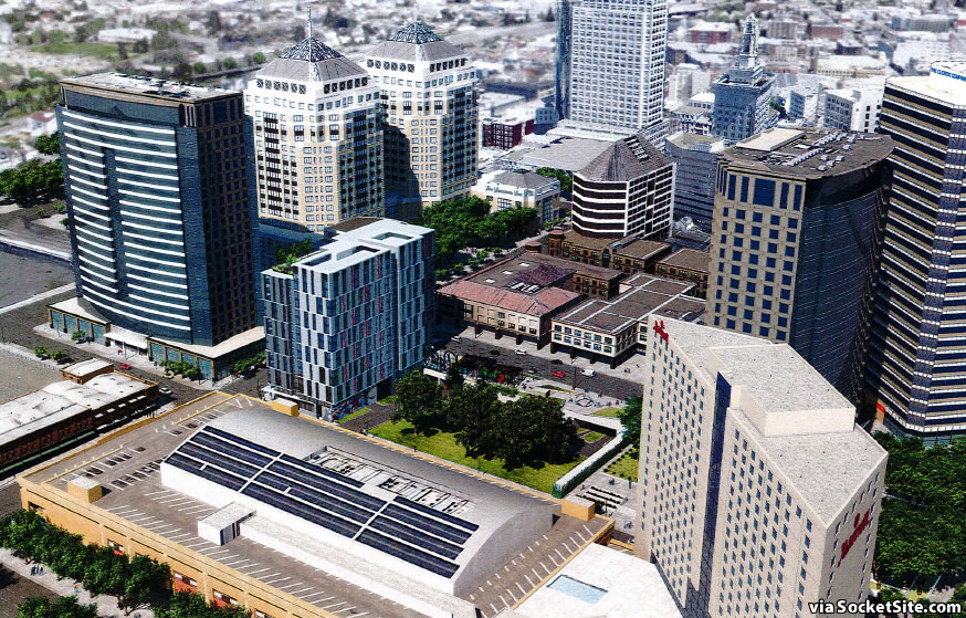
As we first reported last week, the Strada Investment Group is seeking permission to increase the density of the approved development to rise at 1100 Clay Street, between 11th and 12th Streets in Oakland’s City Center, from 262 apartments as approved to 288 as envisioned.
And once again, the increased density would be achieved through changes to the building’s floor plans, with relatively minor changes to the 14-story building’s approved footprint, layout and mass.
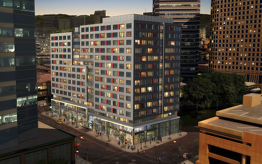
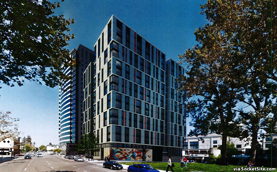
But the proposed look and feel of the building, as originally designed by Arquitectonica, has been reworked by Kennerly Architecture and Planning:
While the approved materials and colors of the building are generally unchanged, the revised design varies and elongates the arrangement and pattern of the materials “to emphasize height and break down the boxy mass of the building.”
At the same time, the revised design incorporates subtle variations in height and recesses to arrange the building in three distinct masses and reduce its perceived bulk while accentuating a sense of slenderness and height.
With respect to the thoughts of Oakland’s Planning Department: “Staff finds the proposed design evolution and refinements to the project to be an improvement over the approved project.” And the department intends to approve the proposed changes administratively.
The development of 1100 Clay Street, which is also known as the first phase of the “T5/6 project,” includes the construction of an adjacent 13,000-square-foot public plaza fronting 12th Street, above the existing parking garage entrance on the site, and a second building fronting 11th Street which could be residential, hotel or an office use as originally envisioned and entitled nearly two decades ago.


“arrange the building in three distinct masses and reduce its perceived bulk”
Why? This is a downtown area….buildings are supposed to be bulky. The revision looks like one of those “Super City” models from the 60’s (the 500 piece set I couldn’t fit under my bed).
both of these options are pretty bleh, but this building will not be noticeable on the skyline (too short) and will blend into downtown oak pretty well, and created needed housing infill so i still think its a net positive.
i also didn’t realize this was already approved, so hopefully it gets going soon.
the cracks in the economic cycle are growing, and with so much approved in DTO I really hope they get construction going on at least half of the (I belive its 10 or so) approved but not yeat started projects downtown before things start to freeze up again.
I don’t think history is going to be very enamored with these digitalist skinned buildings. They _already_ look like junk and they haven’t even been built yet.
Better than the Marriott or the Clorox Building, and much better than the truly terrible Fed building.
The existence of horrors in other styles does not reduce the horror of the digital style.
Like it or not, at least the latest design is easily distinguished from the surrounding buildings. Wish it were going to be twice the height.
Better than previous design. Is this to equal out 1100 Broadway going the other direction?
Definitely should be taller. In that first picture you can see it dwarfed by all the buildings around it
The building on this site should be taller than the surrounding, not shorter. It looks out of place.
Just returned from Manhattan. Boy, do SF and Oak have a long way to go in architecture. Where is the imagination?
Imagination follows the money: why waste your time on something that’s never going to receive recognition beyond the blathering of John King, when you can have the “Style” Section instead?
Exactly. Not just NYC, but Chicago and the dreaded LA are generally doing much better in terms of architecture. If one travels around to other cities one can’t help but be jealous at times in terms of what they are doing architecturally that is not being done in the Bay Area..
So they traded a routinely bland ugly for an of-the-moment ugly.
Why would you want to bother reducing “the perceived bulk” of a building that is already unaccountably and inappropriately squat in its context? Why do they imagine replacing one cheap skin for another cheap skin (in a different color! And a different pattern!) is any kind of improvement for the longer term of a building’s life?
I’m starting to think I could better do the Oakland Planning Commission’s job in my free time. Given my credentials and drinking habits, that’s not good.
I’m guessing they’ll be switching out walk in closets for a series of the changed into micro furniture apartment from NYC fof ADA and old age long term safety , and no bathtubs as the walk in shower is popular and with the new water saving shower head and toilet.
Definitely an improvement. Oakland Planning is probably taking cues from Socketsite.
It moveth forward. Still a pity a prop swap w/ Shorenstein couldn’t have been worked out to keep the offices together, but no crying over dug dirt, I guess.