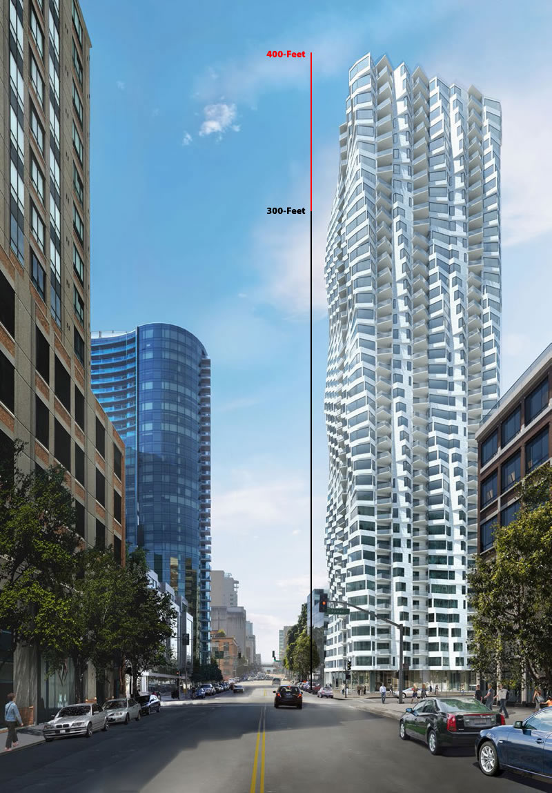
The first public hearing for the proposed amendment to the previously approved Redevelopment Plan for San Francisco’s Transbay District, an amendment which would raise the height limit for Transbay Block 1, a block which is currently only zoned for development up to 300 feet in height but upon which Tishman Speyer has drawn plans for a twisty 400-foot Bay Tower to rise at the corner of Folsom and Spear, will be held this afternoon.
If the amendment, which is facing some local opposition, is approved by San Francisco’s Commission on Community Investment and Infrastructure this afternoon, it will then head to San Francisco’s Planning Commission. And if approved by Planning, San Francisco’s Supervisors will then vote with the dynamics of the Board having recently changed.
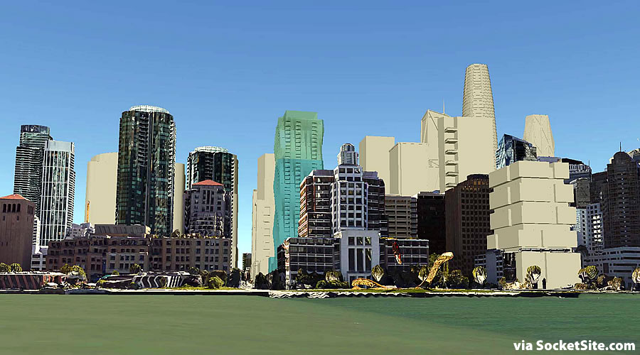
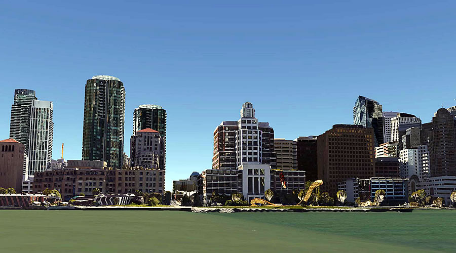
The proposed Block 1 Tower is but one of the project’s in San Francisco’s development pipeline which will forever change the skyline of San Francisco’s waterfront.
As the city’s northern South Beach stretch looked circa 2013:
And as it will look in the not too distant future, rendered with a 400-foot tower at 100 Folsom, the greenish fourth of which represents the extra 100 feet:


Everything looks so squat. The downside of strict height limits is the inability to have soaring roof lines. No Chrysler / Empire State Buildings. No Transamerica Pyramids anymore. Thank God we sacrificed notable architecture and a skyline for those deadly shadows!
Transbay Tower will be taller than the Chrysler building, which is only 925′ to roof and 1046′ to spire. Now, if you want to see a truly transformational change in a skyline, well…
NYC’s skyline is very exciting. However, my point wasn’t about height, rather about vertical proportion and buildings that looked like they were finished on top. None of these buildings have crowns. They all have flat roofs. Some Art Deco ones in the city do and the Transamerica Pyramid does, but all the recent stuff looks truncated.
Correction: the New York City skyline used to be “very exciting” until about the 1960’s when all that was so wondrous began to be obscured and overwhelmed “high rises” the worse of which was WTC I. I’m not so sure the current frenzy of ultratalls (which so very unfortunately are primarily being clustered just south of the Park) are going to save it.
correction? how arch. silly.
Not to mention the lower Manhattan skyline. Glass boxes, all of approximately the same height and built on or near the water, obscure the classic art deco towers of the 20’s and 30’s.
ohhhhh cool link, my kids loves the NYC skyline. thanks for sharing!
totally agree. the low height limits make everything look so fat
At 300 feet it’ll look like they ran out of money or steel before building to its proper height. (Which should be at least 500 feet.)
The 300′ version looks much more appropriate to me.
The 400′ version looks much more appropriate to me.
It will look squat and uncharismatic at 300′ ft. SF should think about the legacy of its skyline rather than the minimal increase in shadows.
That second rendering of the waterfront makes the opposition look like a bunch of whining babies. If it were built at 300′ they would still have their view (which they don’t own) blocked by the significantly taller buildings going up downtown.
400′ all the way. Hoping that by the time this gets built it at least resembles the renderings. Arguably one of the few buildings as of late that looks good.
Frankly, I find this whole process absurd and this city stuck in some mid 1950’s utopian mindset.
Who cares how F-ing tall the buildings are…. they could be 2000 feet for al Il care.
It amazes me the hysterics people go into regarding this issue
find a hobby for gods sakes and stop your whining
Agree completely. Having a building higher OR lower does not, in itself, make San Francisco any “better”. In fact, it’s absolutely irrelevant to our future.
Even 400′ feet is an embarrassment to Jeanne Gang. Why use her as the architect?
I would prefer 600′.
As a Soma resident, with no interest in real estate other than a love of beautiful, dense urban architecture, I say, let it soar.
+1
I think SoMa residents have this in common. Yet Telegraph Hill residents interfere and make sure their perfect views remain unchallenged as the best in SF.
Ding ding ding ding ding!
Any city USA
Truly, I don’t see how one can say that. How so? Not if you take the bridge and the water into account.
even the Green water in this rendering?
Talking about renderings in a literal sense is silly. But no, factoring green water, then neither would it be “Any city USA.”
They look like the bases for real buildings. SF, the only city that is afraid of its shadow.
donjuan is right on. Try to build anything tall near Telegraph Hill and watch the “Dwellers” grab their pitchforks.
But that’s got nothing to do with this. It’s the current condo dwellers that oppose it.
At least Art Agnos is apparently on the verge of reversing his opposition given some further concessions being proposed by the developer.
300′ looks ridiculous. 400′ minimum, if not higher.
get rid of the tornado twister top building… it looks like someone is wringing out the city, with profits instead of public design interest in the skyline…… The ground floor is a poor addressing of street scale as well. Why allow it to continue any higher…
the twisty part of the building is what makes it interesting and appealing for the current boring skyline of SF.
With the economy turning this rendering of the near future skyline is likely, if it ever happens, a bit more off than near.
moto mayhem needs to go to a architecture 101 school and learn about the principles that make good buildings. I know its difficult to comprehend when you don’t understand buildings, but the accepting of the “twisty-part” as good design, your missing the entire issue of what makes good architecture, your being swayed by an image, and not the actual buildings design and integration in the community. Which is why the telegraph hill dwellers usually oppose such monoliths when they ignore the understanding of good architecture.
Perhaps read about urban design a bit, make a few thoughtfull critiques about what is proposed, and not just play lovey-dovey with every little image shown on this site which is real estate and bank driven, not critical enough on the actual proposals.
The existing renderings are expressing only a single concept in the elevations and materials. It lacks an understanding of how skyscrapers are designed, and how they should integrate into the base level, and height. of the skyline. The visual aspects go beyond what is shown in the image and should take into account the aging of materials, concerns over the detailing, and possible “value engineering” that may still take place, and really look closely at the base and top levels for a design change that may make the building 100% better, or at least more palatable to the public….
I’m pretty sure Studio Gang understands something about good architecture, and how skyscrapers are designed. We are all armchair-critiquing a few renderings. The Telegraph Hill Dwellers (who aren’t involved in this fight) also oppose reasonable new buildings that block or alter their existing views. That is the main motivation of the “Save Rincon Park” opposition, too.
Aaron. whats your certification? YEs, i am responding to it aesthetically as a SF resident who will see it almost daily, which i think it what architects want. I find it beautiful, interesting and think it fits very well into the “new” skyline being developed, that is thankfully replacing the old boring skyline of a small tourist city
Undergrad BA Architecture 5 yr, MS Advanced Architecture Design 1 yr, working over 15+ years in the architectural profession, and a local resident and native SFer…
Mr. Goodman! Good morning. Great ad hominem attack on moto to open up this morning. I’m sure you’re architectural opinion is much more valuable than that of another contributor. Your analysis, ” it looks like someone is wringing out the city, with profits instead of public design interest in the skyline” is clearly objective and without bias. Thanks for sharing!
I’m really struggling as to what and who to comment on here: Should I mention that both Goodman and soccermom cannot figure out the difference between your and you’re, using proper grammar.
Or should I comment that Goodman is not terribly educated on what makes “good architecture”. Many factors do, and while I’m not a big fan of this trendy “twisty” thematic solution by the architects Gang, et al, I believe that firm knows what they are doing professionally and can, in fact, produce good architecture.
Thanks Futurist, well-deserved that for the typo. U R the best.
Well…I don’t know about that but YOU’RE welcome. (sort of).
As for the proposed building by Studio Gang, I’m hoping they continue to refine the design to achieve the level of architectural strength of their Aqua Tower in Chicago. The brilliant part of that building is the undulation and variation of the façade as it climbs skyward, and variation of EACH elevation. At this point, the San Francisco building is lacking in that richness and variation. Right now, it appears to be just a continuous repetition of one singular “bay window” shape, without any change to the shape, depth or other nuance as it repeats itself to the top.
My confidence in that firm remains strong.
I’m a big fan of the Aqua tower. I also find the systematic, mathematical regularity of this tower to be interesting in a different way. As traditional architecture uses the repetition of geometric forms, so does this, but in a 21st century idiom. It’s a refreshing variation on the organic, undulating “Gehry-ish” style, more closely related to Calatrava’s Malmo tower.
Good points. I tend to agree, only wondering if there is enough variation and change going up the façade as the Aqua tower shows. My concern is that the SF tower has the same façade on all 4 elevations, where the Aqua tower is quite unique as you move around it.
If were gong too start critisising all typoes, than thes coments will B verry borin.
I blame all my typos on my self-driving car. Should have never gotten the big hands model. Good for tire changing and flipping off the roadraggers, but those fat fingers are teh wrost for dictation. Or maybe itz the cheap blueteeth mic. Or the wetwear.
Looking at this design with the window washers in mind, I wonder: “how long would it take to shave those legs anyway?”
In all honest, do you really believe they are “typos” or actually lack of knowledge of the correct usage of the words?
And yes, I get that it’s not VERY important to the subject matter at hand, but intelligence should count for something today. It doesn’t have to matter to you, but it matters to me.
In all honest[y], I think they are just typos. Happens a lot with homonyms (in ad hominem attacks . . .)
There is no possibility that soccermom simply does not know the difference between “you’re” and “your” (and “y’all’s” and “all y’all’s” and “you guys’ ” and “youse guys’ “).
Also, as spellcheck and autocorrect have improved I’ve become a much lazier typist and proof reader. The one in this comment editor wouldn’t know a possessive from a preposition.
Besides, most of us devolve to nit picking grammar or word usage in a post when we already don’t like something more of substance in the post. Why cast stones when you can focus your energy hurling boulders bolder?
Never said my opinion is any greater than anyone else’s, we also well know the extent and push of SPUR and SFBARF in pushing for more density, at the expense of existing citizens in SF. the concern is that with all the pro-development responses, we seem to forget that TIDF was nixed, and taxation of such edifices, is nix to ensure transit and community spaces are kept and maintained. Pay to play is the only game in town, and that is a problem, for many existing residents.
The increased tower heights, and constant push for density with questionable architectural designs, with no relation to street scale, or skyscraper design aesthetics, is what I was questioning. I sent a picture sketch to the SocketSite editor, which would look seriously at a taller base series of floors, with more vertical accent, and possible spire, or gothic styled crown, more filegre at the top…
Please tell us you’re not serious about the spire/crown/filigree you would propose adding to this very modern high rise by Studio Gang! That’s all we don’t need in 2015 is a throwback to Post-modern crap and bowing down to the junk produced by the fake historicist Robert Stern.
Modernism in pure form needs no decoration. Ever.
Let’s add some gargoyles too. And how about a bell tower?
The added height is pure profits, for the developer and tax benefit for the city, the question from a public perspective viewpoint is what they are paying into the PUBLIC REALM benefit wise for the added density and height. If the architect’s goal is to create “forms” that do not relate to the public design realm than we should ask questions as to why we cannot seek changes in the design and not accept it “as-is”…
Every Architect understands critique and the need to adapt and change their design. I am sure Studio Gang can look at the base and crown of the design and make it work better with the surrounding neighborhood. That’s not too much to ask if we all will look at it for years to come…
as a longtime SF resident, i would be happy to look at this building in the future vs. whats there now
The crown seems nice to me. I like how it creates the appearance of crenellation while still being flat. The profile changes depending on your vantage point. As to how it relates to the street, I suppose they could cut a grand entrance into it, which would serve the residents with a fine lobby. Otherwise, ground-floor retail seems like a neighborhood improvement to me.
World class architectural firms like Studio Gang do not EVER do crowns. or crenellations. or decoration. Ever.
If you want a crown, give the Queen a call.
You ask what’s in it for the public in exchange for the height increase? The enhanced aesthetics is quid-pro-quo enough for me.
That twisty architecture is going to make the MEP numbers much higher but it is still a great looking building.
The quid pro quo for the additional height, according to other news stories, was substantially more affordable units.
Where do I start a petition to start the process of collecting signatures to tear down the Gap building? Ugly………