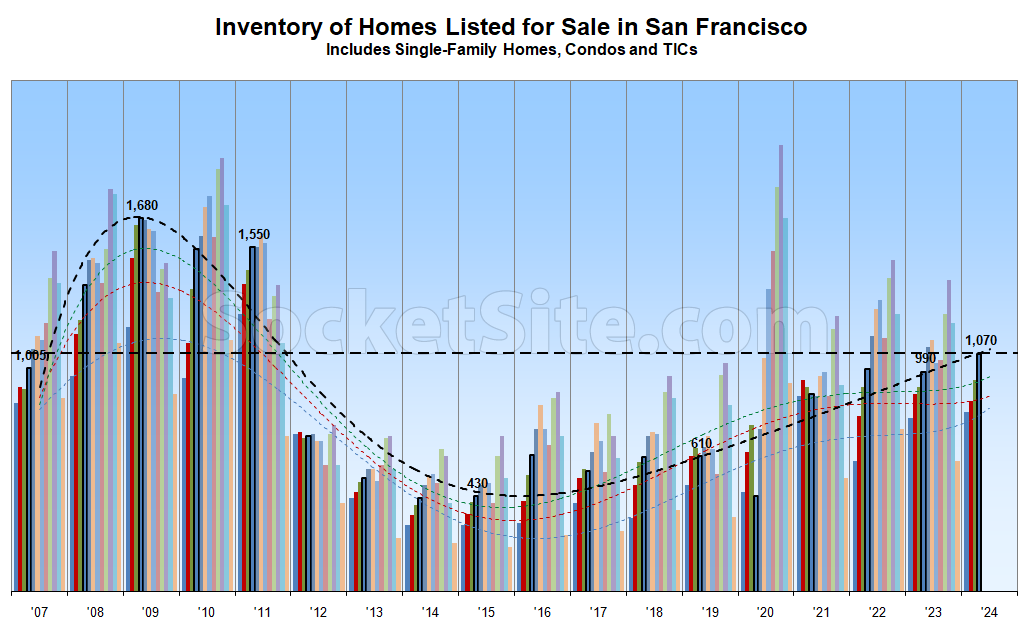
Having hit a 13-year seasonal high last month, the net number of single-family homes and condos on the market has since ticked up another 13 percent with new supply having outpaced demand, despite continued misreports of “low inventory” levels and a “surging” market.
As such, there are now 8 percent more homes on the market than there were at the same time last year, with 20 percent more inventory on the market than prior to the pandemic, 60 percent more inventory on the market than average for this time of the year, and 150 percent more homes on the market than there were in April of 2015.
At the same time, the average asking price per square foot of the homes on the market in San Francisco remains lower than at the same time last year, not higher, and over 10 percent below peak, with the benchmark 30-year mortgage rate inching up towards 7 percent, none of which should catch any plugged-in readers, other than the most obstinate, by surprise.
Expect inventory levels to keep rising over the next couple of months, putting additional downward pressure on prices, before taking a breather in August. We’ll keep you posted and plugged-in.
Is there a legend to tell us that the dotted lines or colored bars are. Is that horizontal line the uh, 17 year average or something? The text is useful but beyond “number go up” it’s hard to tell what you’re trying to tell us with the graphic
Insofar as there are twelve such colored bars per year, it would appear they each represent a month (and the wavy line is the rolling average for that month(‘s color)..the idea being, presumably, removing seasonality from the numbers).
It does seem a bit spartan on explanation, I agree.
Each of the twelve bars correspond to one of the twelve calendar months.
The current month series is outlined in black for emphasis and the trendlines are polynomials, based on known inflection points and trends, not simply point-to-point lines, with the trendline for the current point-in-time/month rendered in black and prior year-to-date months color coded to the corresponding bars.
The flat dashed line is a marker for current inventory levels in the absolute, sans a seasonal adjustment or averaging.
Thanks for clarifying
The narrative that ‘house prices remain high because no one wants to move if they have great/low mortgage rates,’ is correct. However, prices will eventually weaken by the accumulation of ‘natural’ inventory as a result of Death/Debt/Divorce and other non-elective sales.
I expect continued softness in residential real estate, both in San Francisco, and the tertiary second home markets where all the flush office people fled during covida loca. How much better to have money earning 5.1% in T-Bills than in depreciating real estate in an inflationary world?