As we outlined back in 2014, a surprisingly spacious and contemporary four-bedroom home was constructed on the little Eureka Valley lot at 135 Yukon Street, at the base of Kite Hill, and hit the market priced at $3,249,000 but didn’t trade for another four years.
Returned to the market priced at $3,198,000 in early 2018, the 2,721-square-foot home ended up selling for $3,140,000 that November, which was officially “over asking!” according to all industry stats and aggregate reports as the list price for 135 Yukon was reduced to $2,995,000 prior to its sale.
And having returned to the market priced at $3,195,000 two months ago, a sale at which would have represented total appreciation of just 1.8 percent since the fourth quarter of 2018, the resale of 135 Yukon has now closed escrow with a contract price of $3,000,000, down 4.5 percent on an apples-to-apples basis, below its value six years ago, and despite the fact that the widely misrepresented Case-Shiller index for single-family home values in “San Francisco” is “still up 29 percent!” over the same period of time.
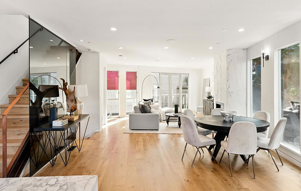
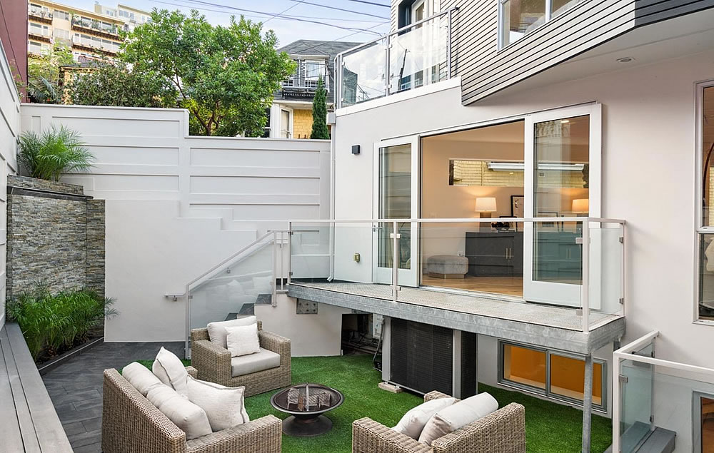
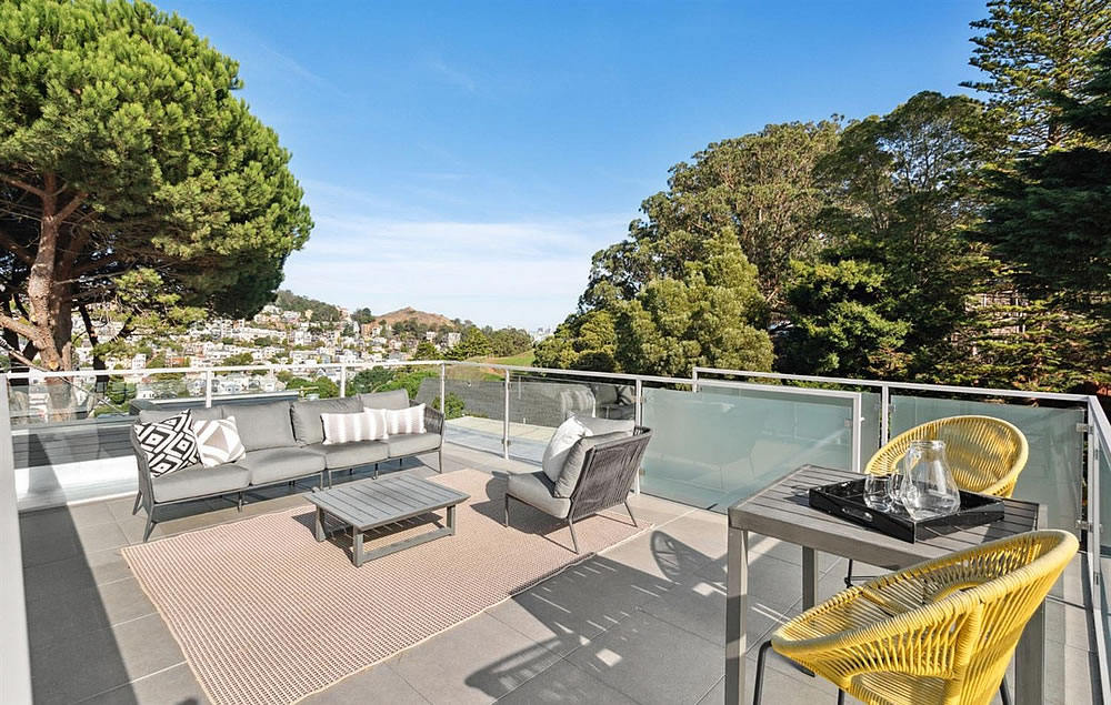
This feels like a great value to the buyer. The floor plan is a work of art in proportions and features: nicely sized bedrooms but not overly so, walk-in closets, perfect number of bathrooms, excellent “Great Room” for entertaining, and the optional au-pair / long term guest level. My only gripe is W/D in the garage but I give this floor plan a solid A. Roof deck, two car garage, all of this for $1,111 a foot? This is an excellent value. I’m jealous. Backyards are overrated anyways in SF when it’s 63 and cloudy most of the year. Bravo to the architect and congrats to the buyer.
Perhaps the general arrangement of rooms on each floor is good, but this is not a good floor plan.
Main Level + one enters into a sunken 4′ x 4′ vestibule and then one step up to the main level. It’s a tripping hazard – especially with guests.
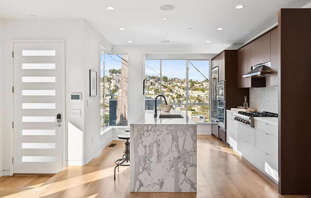
+ view of the kitchen – do you really want to see dirty dishes first thing as you come in?
+ the powder room – in the conversation area opposite the fireplace … seriously?
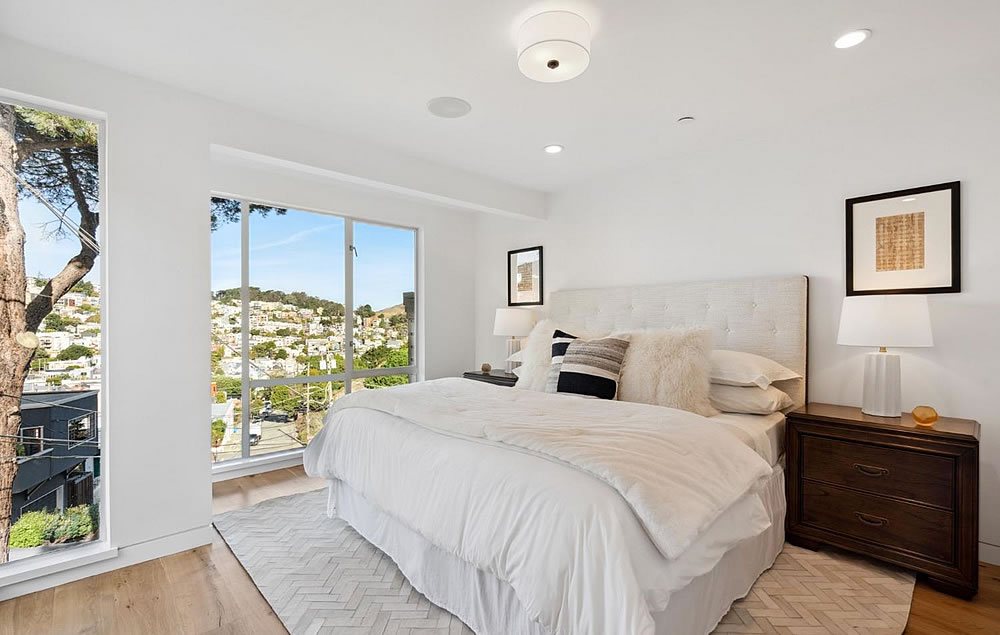
Upper Level + primary bedroom has only one closet and the entry door bangs up against it. No particularly good bed wall either.
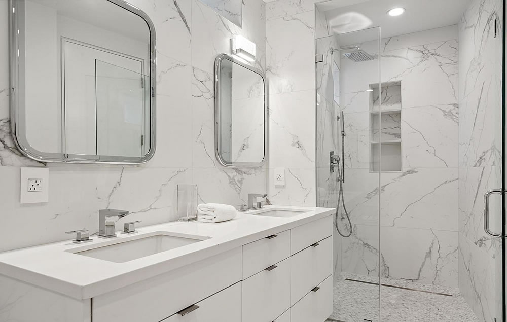
Lower Level + no access to the bathroom without having to pass through bedroom 4.
+ half of the walk-in closet should have been devoted to a laundry room or powder room.
Lots of demerits – I give it a C
– My guess is the 4’x4′ couldn’t be avoided. I doubt they tried to build it that way.
– I have no problem with the kitchen being there, but I agree that the sink on the island is never a good idea.
– Totally agree about the powder room. That is pretty bad. I missed that.
– On the primary bedroom, furniture can be added to augment that. Perhaps they shouldn’t have built that many windows? Seems like almost a curse in this situation.
– Lower Level – I prefer it that way as it’s ideal for a long term guest. If you’re ever watching a sports game during the day, you can always walk in. I don’t mind this.
Good criticisms by you, but I’d be willing to bet the next ten homes listed on Socketsite with floor plans available, this one is the best overall utilization of space per square foot. See you in the comments? 😉
“…but I agree that the sink on the island is never a good idea.”
I’ve seen this comment a few times in different threads. The reason why you almost always see a sink on the island is because it’s much easier (and more effective) to ventilate the cooktop when it’s on the wall. As for the dirty dishes… isn’t that what the dishwasher is for? I guess it depends on your habits (and how/what you cook), but I give my dishes a brief rinse and stick them straight in the dishwasher.
“but I give my dishes a brief rinse and stick them straight in the dishwasher.” Which, swinging from an island sink to the dishwasher, means annoying drips on the floor, no? I suppose a rug’s in order that hopefully doesn’t slide around underneath your feet.
So, long story short, at $3mio and 2,721-square-foot, the kitchen space should be wide enough to accommodate the full kitchen arrangement left to right.
Or, the dishwasher is in the island, which seems to be the case here.
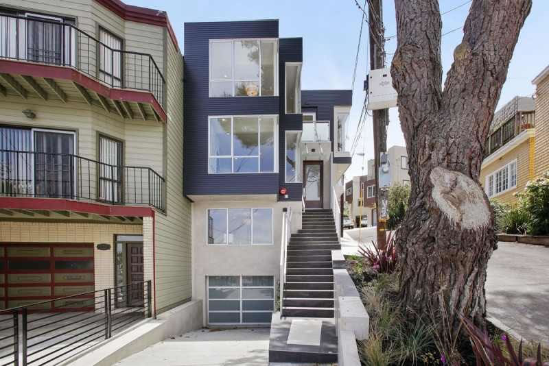
The front steps make me queasy, as they don’t seem to be level: the problem is most visible where they give access to the road (at right) and while I might be able to overlook it if if was b/c it drained toward that, it seems to actually tilt left (so drain away from it; or maybe the whole drive – it actually is Yukon St – serves as a giant flume, so some defense was necessary). Also, at the bottom, there seems to be a large unguarded drop-off into the drive (which slopes down steadily to access the garage); it may well be code compliant, but I don’t think I’d like it, all the same.
So if you and I were looking to tour this, you’d def have the edge as I wouldn’t make it to the front door…I wouldn’t even make it off the sidewalk…literally.
The lowest step appears tilted that way because the entire image was photoshopped to make the driveway look like a gentle grade, instead of the steep dive that it shows on google street view (click on my name link).
But that’s not the step I was referring to: it’s the step about a dozen up, where it abuts Yukon Street. I find the whole stairway awkward, as I would find any that requires someone to shift laterally as they ascend. It’s not as bad as that one a rew months back that virtually narrowed to a slit, and the designers perhaps did the best they could (given the peculiarities of the site), but still one’s entrance should be welcoming, not challenging
I think that step is an artifact of the fact that they also photoshopped the stairway to make the door appear farther back so that the stairway didn’t appear as steep as it shows in the google street view image.