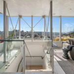
Having been “exquisitely renovated…with the finest materials, fixtures, and finishes, including the meticulous preservation of period details,” the 3,225-square-foot, four-bedroom Russian Hill home at 45 Glover Street, which includes a wraparound, top-floor terrace with two private patios and views to the Golden Gate Bridge, hit the market priced at $5.895 million in January of 2019 and sold for $5.6 million that February.
Returned to the market priced at $6.5 million this past August, a sale at which would have represented total appreciation of just 16.1 percent since the first quarter of 2019, or roughly 4.4 percent per year, the re-sale of 45 Glover has now closed escrow with an actual contract price of $5.55 million, down 0.8 percent on an apples-to-apples basis while the frequently misreported Case-Shiller index for “San Francisco” home values is “still up 28 percent” over the same period of time but dropping fast.
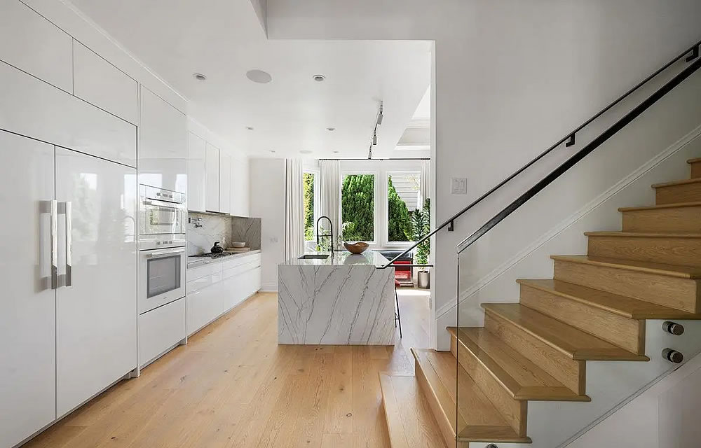
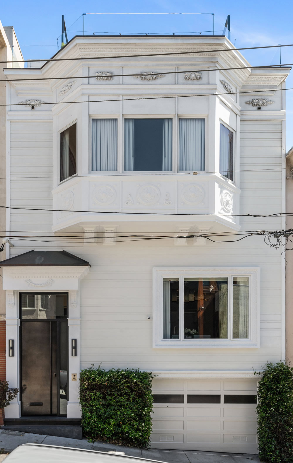







Enough with the white already…..
Wow, someone sure did obliterate the charm out of that house.
Have a couple of ironic 6ft nutcracker figures flank the doorway until you can figure out how to take the edge off
Yeah, “exquisite”ly bland – except for the gaudy decapitation dining chandelier…
It’s a very disjointed remodel. The modifications just look cheap compared to the finer original details. They had the budget for crafts people, but not the knowledge of when and where to use them.
What are all y’all talking about. They did it in black and white. That’s the thing, right? 😉
I would spend every moment on that top floor.
Are there really two showers, side-by-side, with a glass separation?
That’s two photos of the same shower spliced side-by-side.
Looked at the website photos and, yes, there are two showers side by side with glass separation and separate doors (“don’t let your water touch me!”. Not to mention the door to the bathroom opens over one of the glass doors so it’s more annoyance to get into that shower closer to the door. Very odd design. The spliced photo on the left is from another bathroom; easy to confuse because it looks like they did the matchy bathroom thing for the three bathrooms by the bedrooms, which just feels like bulk material discount to me, personally. Little details about this place makes me feel this is not a $5 mil place (yes, I know, some people obviously do, multiple sales at that level), but amazing top floor.
You’re right. They are so close in design and materials it fooled me. They are even staged with the same towel over the same rack. And the transom is even tilted at the same angle. Weird.
After looking at the website floor plan, I think the “shower” to the right is actually a “water closet” – the toilet being just out of camera view.
You’re right and that makes way more sense. Keep the smell in, as it were.
Ohhhh. Thanks for clearing that up. I’m glad I wasn’t the only one confused.
i’m coming to the defense of that chandelier. b***h – it’s fabulous. change it out when it becomes too much but i think it brings a lot of pleasant energy to that space. but change the blinds to an earth tone.
as for the bland kitchen, yes, but the stone is good and just replacing the cabinet fronts and personalizing the kitchen overall is probably expected
the shower stall walls should’ve been done with mirrored slabs of veiny Calicata marble. if your house is 6m, don’t be cheap in the bathroom.
“the meticulous preservation of period details”
No doubt they are referring to the “meticulous preservation” of the little thingies on the facade, as there are no period details left inside. This sort of total destruction will continue, as I have said previously, as long as there is profit. It will end only when they get less for doing more. There is a premium for original interiors in both London and Paris, not only in sales but also surprisingly in rentals.
I’m guessing the period(s) we’re talking about in London and Paris are different than the one this house comes from.
If people start paying a premium for them then they will come back. But people keep paying a premium for modern.
But as I have said many times, often the original details were removed long ago and not by the newest iteration. That is changing the 70s-80s what have you work. Plus any house with the details you are describing doesn’t have code wiring or insulation, but does have lead and asbestos. And it will need sprinklers. So you might get a replica of the old finishes if that look starts paying a premium.
Wow, they put the Russian back into Russian Hill – what a mess of a remodel with all the shiny objects. Lucky to have recovered $5.5M
bad Russian joke aside, what are you trying to say with the they are lucky they recovered $5.5m?
Location on narrow alley street, around the corner from tunnel. Frontage has limited curb appeal. Pano view from top must have sold it. Remodel doesn’t explain it. But who cares if the buyer is happy.
“Location on narrow alley street”
Glover has always punched above its inherent weight as an alley, because of its location near the top of Russian Hill at Vallejo and Jones, and going east. There are Willis Polk and other architectural treasures. But Fact is correct in his implication that it is just an alley with homes originally intended for modest workers. Somebody thinks it is worth $5.5mm to live here now. The interior could be in Houston or Atlanta.