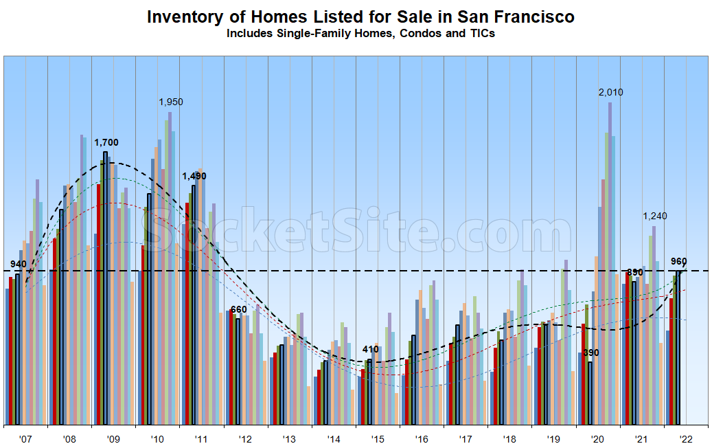
Having hit a 10-year seasonal high last month, the net number of homes on the market in San Francisco (i.e., inventory) has since ticked up another 3 percent, driven by a slowdown in the pace of sales.
As such, there are now over 50 percent more homes on the market than there were at this time of the year prior to the pandemic; over twice as many as there were in early April of 2015; and the most, on a seasonal basis, since 2011.
And in fact, inventory levels are now higher on a year-over-year basis for the first time since May of last year and list price reductions are on the rise, trends which are related and shouldn’t catch any plugged-in readers by surprise.

Any chance you could put out a legend explaining what the different colored bars mean?
Each of the twelve bars correspond to one of the twelve calendar months. The current month series is outlined in black for emphasis . And the trendlines are polynomials, based on known inflection points and trends, not simply point-to-point lines, with the trendline for the current point-in-time/month rendered in black and prior year-to-date months color coded to the corresponding bars.