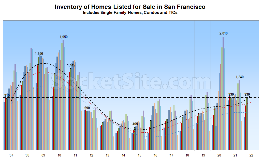
Having ticked up another 5 percent over the past week driven by a slowdown in the pace of sales, which is down year-over-year, the net number of homes on the market in San Francisco (930) just matched last year’s mid-March levels, equaling a 10-year seasonal high which should soon be surpassed.
As such, there are now 20 percent more homes on the market in San Francisco than there were prior to the pandemic and over twice as many as they were in February of 2015, a trend which shouldn’t have caught any plugged-in readers by surprise.
Once again, expect inventory levels to continue to climb in the near-term, driven by a seasonal increase in new listing activity, despite some misanalysis making the rounds at the end of last year, along with the return of properties that failed to sell last year and were quietly withdrawn from the MLS in order to be re-listed as “new” in the spring. We’ll keep you posted and plugged-in.
Curious as to how the current tech RSU bloodbath and rising mortgage rates will impact housing this year in SF. Facebook workers just got 50% poorer with regards to RSU income versus last Fall as one example out of many.. CRM,TWLO, etc.
Feels like the early months of 2000 currently in tech
its even worse in biotech than tech. many names down 70% since Oct, and the entire 2021 IPO class (record year by far) and most of 2020 IPO class are underwater
Just like last year!
Except it’s not (and neither are the month-over-month trends).
something like 30k new units over the 10 years right? Shouldn’t the expectation be that the amount of available units goes up
There were nearly 15,000 units built between 2009 and 2015 yet inventory levels, which are a function of both supply and demand, dropped with positive net absorption. Inventory levels rise when supply (listings) outpace demand (sales) and vice versa. That being said, without a shift in the demand curve, one would expect baseline inventory levels to rise with the addition of new units and turnover going forward.
But it is like last year on the chart, right?
930 homes available in 2021 and 930 in 2022?
Aren’t we looking at the green bars?
That’s correct. And none of those people have been in your kitchen.
It’s just that when we get a ten year high at the same level as the preceding year’s 9 year high, it’s easier to say “unchanged year over year.”
I am often confused by this chart when it is posted. The confusion is specifically with the trend lines.
The red and blue trend lines makes sense as they correlate to the red and blue bars representing Dec and Jan. They also pass the eye test for what I think the trend of the underlying data would look like. I assume then that the black trend line correlates to Feb even though the color isn’t the same. Not an issue. What is odd is the shape of the trend line. And while I’ll admit that it’s a fools errand to put too much emphasis on the most recent datapoint in a historical data set, i just cant figure out why the trend is shaped the way it is.
There is a very clear trend starting in ’14 of an upward trajectory. Why does the trend plateau last year when the underlying data inflects even higher and then why does the trend rise sharply when the underlying data has plateaued (albeit for a single month). Am I mistaken what this trend line is?
The trendlines are polynomials, based on known inflection points and trends, not simply point-to-point lines. The trendline for the current point-in-time/month is always rendered in black. Trendlines for past calendar year-to-date months are provided as well and color coded (in this case blue = January, red = February).
UPDATE: As projected, the Number of Homes for Sale in S.F. Just Hit an 11-Year Seasonal High.