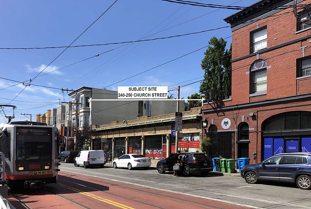
As we outlined last year, while plans to raze the former Sparky’s, and current Thorough Bread and Pastry, building and build up to six stories in height upon the 240-250 Church Street site had yet to be approved, they were working their way through Planning.
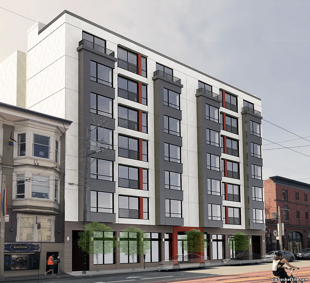
Since then, an extra floor (for a total of seven) and ten feet of height (for a total of 75) have been added to the plans, as newly rendered below by Schaub Ly Architects, additions that have added four (4) condos to the development as well (for a total of 24, including 18 two-bedroom units, over 2,000 square feet of new ground-floor retail space and a storage room for 24 bikes).
As the site is principally zoned for development of no more than 45 feet in height, the project team is planning to invoke California’s Density Bonus Law for the additional height and density. And as we noted last year, “while the existing building/facade on the site is a century old, its latest survey resulted in a non-historic rating (Category C).”
And with all that in mind, the proposed project has just been granted a Market and Octavia Neighborhood Plan-based exemption from having to complete a more intensive environmental/historical study and has qualified for a streamlined review and approval(s). We’ll keep you posted and plugged-in.


Yet another contestant in San Francisco’s “Most Boring Facade” competition.
Blandtastic!
I mean, could you imagine trying to get interesting architecture though the planning department? They’re worse than the comment section here!
The harsh, bright red is jarring to my SF esthetic. Please replace it with a dark brown or gray.
Does the rear mass not extend to the northern property line? The first rendering gives the appearance of a slab about to fall forward; the second rendering (looking north) shows an additional mass that makes the building feel more solid.
Insipid design, wish they would keep the yellow brick facade; who cares, just build it…
Seriously, I wish progress looked a little more inspiring 🙁 Also, I guess we’ll need to pour one out for the Thorough Bread back patio.
Actually…in addition to a 1,920-square-foot rooftop open space for the building’s residents, the plans include an 1,100-square-foot rear yard/patio behind the retail space as well. Whether Thorough Bread ends up leasing the new retail space, however, is another matter.
But when you yeast expect it when the lease comes up they might still baguette.
How droll !! 🙂 Artisan you clever: forsaking your place in the food pyramid… and rising to the occasion.
That’s awesome news! I’m glad to hear it has potential to be more interesting than a typical one-ended retail cave space. I guess I’m assuming the outdoor spaces would be tied to the retail space and usable by customers…
Whether they renew or not is on a knead to know basis. I’m sure it’ll cost a lot of dough.
I toast to your puns.
I’m gonna go out on a limb and say planning comes back with a request to make it 25 units
Yes definitely missing some character!
Why can’t they make the windows more like a Bay window shape, with light coming in from 3 sides that would increase natural light in the units and also resemble the classic SF style. I am sure there is a reason…
Love love love that there is no parking. That should be celebrated..
Came here to say this. The facade may not be the prettiest, but people walking to Muni and biking – that’s beautiful.
Here, here!
This building on this street in this section of upper Market is a perfect serving suggestion of the toxic cocktail of San Francisco planning. That there is no plan. Rather there is this one-off disjointed dyslexic mishmash. That section of Church, a key Market Street interchange with a thousand opportunities for improvement instead just sits there and lags. No streetscaping. No trees. No sense of esthetics. Eventually the Safeway, on its patched together (from multiple privately owned parcels) slab with a legal street running through it, will go, as will the Potrero Center. The opportunity to plan and make this area every bit as lively and happening as Hayes Valley is major. But the will is nonexistent. The one story brick building to be torn down is one of several great little snippets of vintage architecture that in the right hands with even a semblance of vision could make this a great, great spot. This new building, like the hulking and confused Muni stops, Riddler-designed right of way (better described as a no-way) just adds to the error. It is not an enhancement, it is a dreary urban confinement.
Good point, the Safeway should go. Even better, we could put it in the basement of a new residential tower. Mmm tower.
If you live in the neighborhood you should be on the DTNA Land Use Committee.
This area doesn’t have the potential of Hayes Valley. Church St is too wide and not pedestrian friendly enough. The area lacks parks or a common meeting space (a la Patricias Green).
The density of commercial storefronts is not there. Market St cuts through it. It’s a very convenient transportation hub, but has limited upside potential.
Patricia’s Green is busy because Hayes Valley is busy, not vice versa.
Is Church any wider than Mission or Valencia – much busier (from a ped perspective) streets? And if so, then narrow it like was done to Castro a few years ago, to make more ped-friendly sidewalks.
Many streets should be narrowed. Apparently in the 60s sidewalks were narrowed across SF so more lanes could be added. We need to reverse all of those and then some. Divisadero is desperate for wider sidewalks and slower streets.
So much this.
So your solution is to build absolutely nothing until all of the nearby parcels suitable for upzoning/infill can be assembled and built simultaneously as a single cohesive project? That sounds great in theory, but here in the real world it is completely implausible to the point where taking this position actually just means you’re against any densifying at all.
I think it’s absolutely charming! And for those ‘whinenwingers’ who keep blabbing how we should be more like Paris…we are!
So you’re touting the degradation of Parisian architecture as a reason to support uninspired construction here?
No I’m mocking the cluelessness of people who pick some city and say “we should be more like [that city]” without knowing what’s going on there. As for the building itself: I’ve seen better, seen worse.
It’s as bland as Sparky’s omelettes.
As colorful as a Breda streetcar. Sad.
Why should the Safeway be replaced? It is the heart of the local neighborhood. Provides for the many who must walk to the grocery store and to those of us uphill a necessary nearby place to drive with parking. I know every one hates parking but it does keep us driver from having to drive around to get our groceries. And do not forget it’s pharmacy which is essential for so many of older folks. I totally agree the local corner has the need and the potential for improvement including new apartment buildings. I will miss thoroughbred bakery but keep our Safeway.
Here’s what should happen to the Safeway site, IMO.
– Keep Safeway and its ground level parking.
– Build retail around the exterior ground floor perimeter to “activate” Market St.
– Build a set of multi story apartment buildings above it all: probably one larger tower that’s 20+ stories, along with a 10 and a 5.
Agree! Though I would also make room for a small park as well, a la Patricia’s green.
Planning’s Conceptual Strategy for The Market Street Safeway Site circa 2012 (and Safeway’s response).
Gosh, even out here in the provinces they’ve figured out a way to put parking underground or on the roof of grocery stores.
Heaven forbid there be a break in the canyon walls of Market street. Not everything has to have apartment buildings plopped on it.
Are you calling this section of Market Street a canyon? Seriously?
“Are you calling this section of Market Street a canyon?” Not yet.
But this 75 ft. tall building, which is not actually on Market Street, is going to transform it into a canyon?
I was responding to Herb’s Safeway comment.
Impossibly hideous.
UPDATE: The bonus-sized plans for the 7-story building to rise on the 240-250 Church Street site, as rendered above, are slated to be approved by San Francisco’s Planning Commission this week.
what is the deal with the brown? why do buildings all over sf feature this? and the orange? is there a brown and orange mining operation somewhere? design in sf is nonexistent.