Purchased for $9.75 million in August of 2016, the interior of the fully renovated Nob Hill home at 1230 Sacramento Street has since been made over by Jonathan Adler, blending “the timeless and elegant original architectural details” of the Beaux-Arts residence, which was designed by Arthur J. Laib and previously restored by the Wiseman Group, with Adler’s “glamorous, chic and happy” design aesthetic.
An elevator serves all four levels of the 4,800-square-foot, four-bedroom home, including the top level “pent room” and terraces.
And having returned to the market priced at $10 million last August, a sale at which would have represented total appreciation of just 2.5 percent for the rather spectacular single-family home since the third quarter of 2016, 1230 Sacramento Street has been on offer for $7.995 million since early April with an interim reduction to $8.25 million last year.
The (widely misunderstood) index for “San Francisco” single-family home values is up 42.1 percent over the same period of time. And yes, there is a 4-car garage and outdoor space behind the Nob Hill home as well.
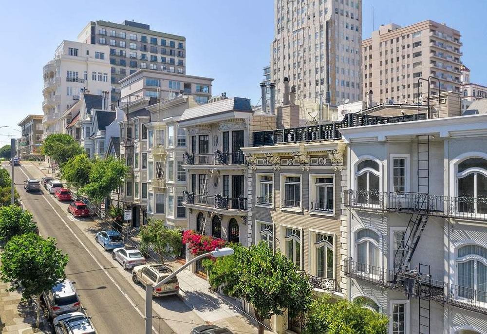













At that price, having a (probably soon to be painted brick-red) “bus-only” lane hard up against the curb of your (narrow, steep) sidewalk… feels to me more like a former residence prime to be converted into a girls school or an institute of “tent camp studies.”
California is a big place. The US is an even bigger place. You don’t have to live here or care about here. It’s okay. Go be happy.
Not big enough that we don’t feel crowed out by toxic tech bros named “zac”
you won’t be crowded out by Zac if you outbid him…you aren’t owed anything. Good luck bidding!
I’m sorry to hear that. My comment was not sarcasm but genuine. There are many issues with our society and I’m not in denial. However I still try to be optimistic and hopeful. Cities and societies change all the time and will continue to change for better or worse.
Not in tech, but I was a cook pre-Covid. There’s plenty of toxicity in the kitchen but the sucky part is we get sh*t pay while dealing with it. 🙁
I know 1 random dude online is not going to change your mindset but hey I just wanted to share. Please take care.
The “tech bros” were always a very small minority of the city population, and post-pandemic, and even starting a few years before, they have long ago decamped to “greener pastures” (Tahoe, Miami, Austin, Salt Lake City, Denver, Portland, Seattle, Honolulu, etc). I say you sound like you’ve been stewing too long in your own toxicity. Get out from behind your computer and enjoy the city! Despite frustrations that one experiences with any place in which they live, I have been happy to be here for the past 25 years, I have seen “tech bros” come and go (I even remember the“Dot.com” crash), and I am still here! I am everlasting, Dear, everlasting!
My initial response to your comment on this particular article was in really poor taste. I’m sorry. I’ll do better.
Major kudos for the current and all former owners preserving all the arched Beaux Arts windows. Far too many of these are ripped out and replaced with rectangular lites, in the name of efficiency.
Beaux Arts + Palm Springs = fail.
Look, I love the Palm Springs aesthetic, and I can understand how someone might have wanted to punch it up and make it feel fresher and younger, but it just did NOT work out here. They took a perfectly lovely Wiseman decor, and now it looks like what someone like me would’ve done with an unlimited Wayfair budget. Maybe there was a successful redecoration possible in there…this is not it.
So sad we can’t enjoy the best example of a style, no matter how unhip it might be now (Beaux Arts, dark wood Arts & Crafts). Hmm, trying to imagine updating the Gamble House with white paint.
It’s now Bozo Arts.
I feel like this idea is what leads to people gutting homes and removing historic details… after all, if you can’t blend classic architecture and modern furniture, you might decide that the best option is to eliminate the classic architecture. Which happens a lot.
Personally I like seeing weird, clashing choices like this. Makes it feel both historic and like a reflection of someone’s current taste.
That said, this is just staging, right? So who cares really.
That carpet on the stairs is presumably not staging, which makes it likely the coordinating furniture isn’t either.
Hmmm. I’d have classified it as a transitional building, on it’s way to Beaux-Arts but not quite there yet…
Pourquoi? The “Beaux Arts” was a design school that emphasized certain design precepts – axiality, hierarchy, ornamentation – rather than a particular style (tho they favored a style which might be called “French Renaissance”). So assuming you’re not just generally averse to (over)use of the term, why do you feel it’s “not quite there yet”??
I guess “style” might cover the elements I find off, like the stairs and the paneling. It almost feels like the original features were built as an [Edwardian] renovation of a [Beaux Arts] space.
The only way to stop the gray, white, black floor movement is for the flippers to fail to flip at a profit. When that happens, a return to respectful renovation will start. The argument for gray, that “this is San Francisco” can only die a capitalist death.
The decoration is too cartoonish for me. It’s hard to focus on the details of the rooms. I’d much rather see it empty.
I entirely agree, hideous and laughable décor/staging
Completely agree, and I would use the same word as derrysf, hideous.
I personally think it’s always a mistake to spend big money to decorate in ways which are going to be viewed as strange or unconventional (and I think I’m being kind with those words) by most people. Of course, it only takes one “right buyer” who appreciates the design choices, but that right buyer needs to have $8 million+ to spend, and so it’s a relatively small pool of buyers to begin with. I’m going to guess that the number of buyers looking to spend that kind of money and also looking for this designer’s particular sense of whimsy is close to, and maybe exactly, zero.
I don’t think that’s staging, it’s exactly what I’d expect Jonathan Adler’s house to look like. I mostly like it—perhaps a bit too white for the style but I have no idea what condition it was in before the remodel—but to each their own.
It’s far outside the stratosphere of my price range but am I crazy for thinking that’s not a bad price? I’d never have guessed that was one residence.
It’s Betty White! Little old lady on the outside but wacky fun on the inside!
Absolutely delicious! That staircase, those details, the nighttime view of the Huntington Hotel! Dreamy.
In another decade, might this have been converted into 3-5 apartments? Maybe remodeling it as a mansion was not the right choice…
For the price, not enough light for modern tastes. The neighborhood doesn’t carry the prestige it once did and lacks amenities of other neighborhoods.
One amenity that Nob Hill does have in this day and age is a relatively small stock of addicts passed out on the sidewalk in their own excretions. There is that……..gotta look on the positive side and take what you can get in our increasingly dystopian hellscape.
UPDATE: Renovated Beaux-Arts Beauty Trades for Millions Less