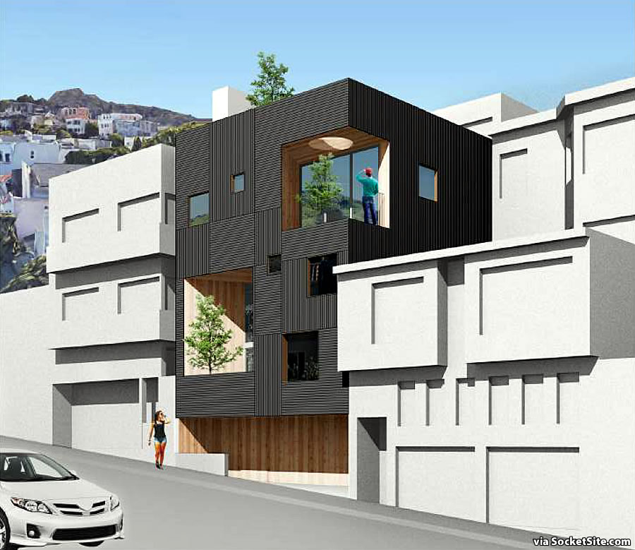
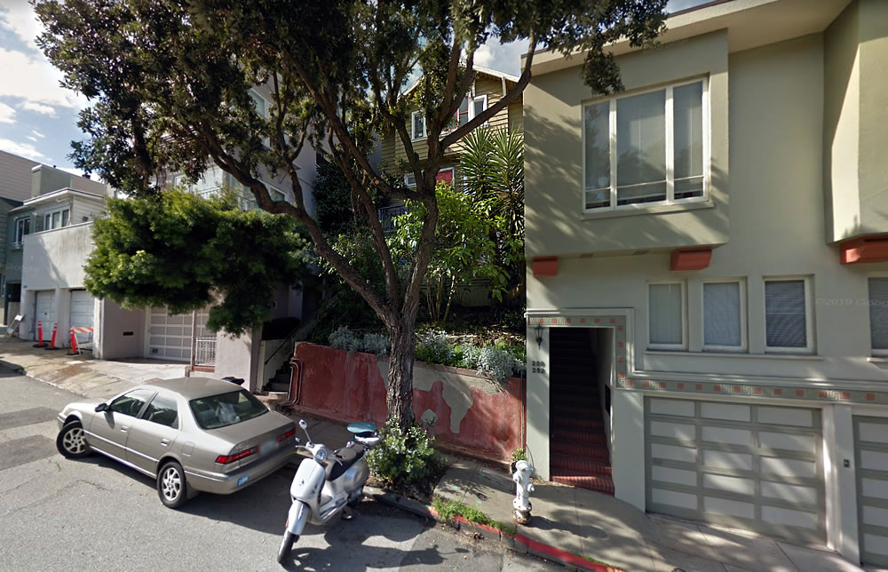
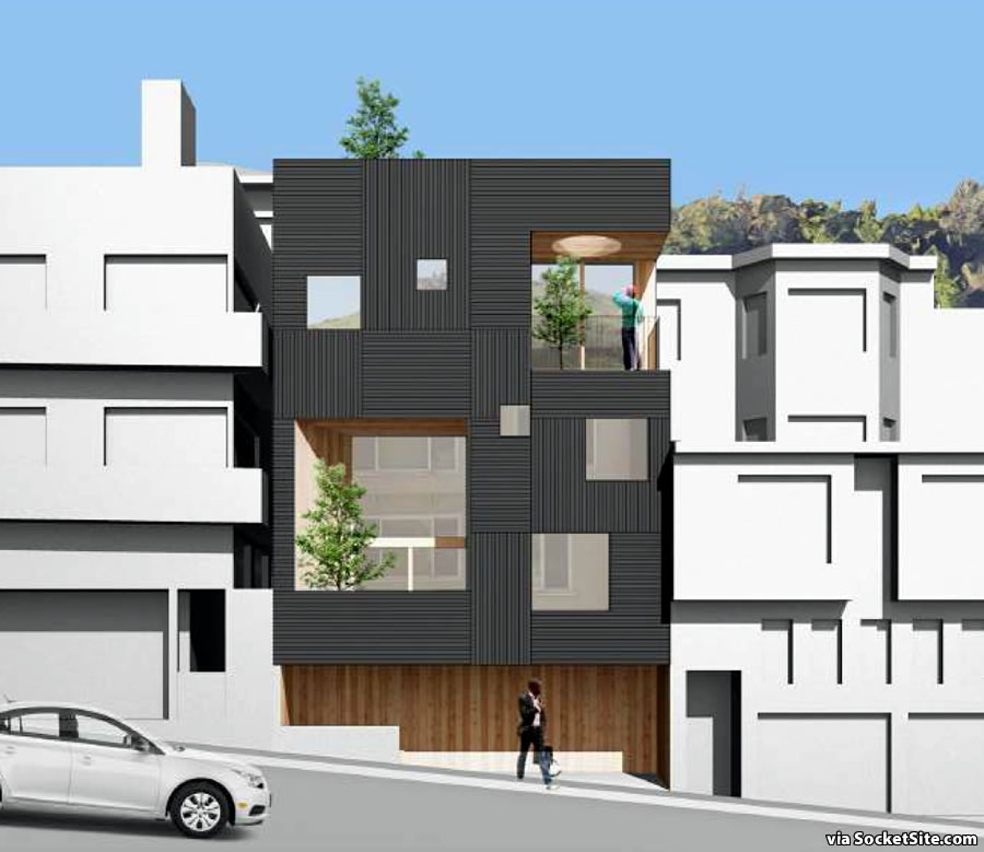
Plans for a modern addition to the existing setback, three-unit building at 254 Roosevelt Way have been in the works for nearly two years.
As designed by The Open Workshop, the footprint of the existing structure would be extended to the street, along with two new basement levels, a discrete two-car garage and an additional 2,640 square feet of space, for a total of 5,140 square feet, including 1,685 square feet of space across the aforementioned below grade levels.
Building permits have been requested and the project has cleared the necessary environmental reviews. But a Discretionary Review has been requested by the uphill neighbor concerned about a rather certain loss of light and air to her building, not to mention the views, next door.


What actual Eff is going on with the Christmas trees on the decks… and don’t get me going on the dude in the baseball cap…
Baseball cap? I was more drawn to the image of the woman with daisy dukes and thigh high stockings out front.
She’s looking up while calling her friend inside, asking how she gets inside.
Forget the people, which are funny; forget the trees, which are impossible. But please, if you’re going to make a render with some detail, include a door.
I’m not usually one to over criticize at renderings but these did catch my attention. Besides the trees and people, those poorly cropped out cars just pasted on top of the image are literally laughable.
Building looks nice though
great design, multiple units, height matches neighboring buildings. discretionary review should be thrown out and this should be immediately approved
No-brainer infill, but definitely a tough pill to swallow if you’re the uphill neighbor. You lose your views of the Bay and a bunch of natural light, and the brand new unit next door takes it all.
I can definitely understand being bothered by this sort of thing, and I think most people would be if put in the same situation. But I also think that more buyers need to understand and evaluate the chances of infill, expansion, and upzoning next to their properties. The baseline assumption should be that if there’s a property that can fall into one of those categories next door, it will happen eventually. And it’s on buyers to determine whether that would be a deal-breaker long term.
Neighbors get all twisted and bothered if you change doorknobs…. Giving/Allowing a neighbor to veto your project is absurd
Yeah, I agree…
Of course. I’m with you 100%. This is a reasonable project and I support it. Just saying, it sucks to actually have it happen as the neighbor, as it’s not that frequent that small-scale infill like this actually occurs.
The houses on either side didn’t think of those things when their places were built.
Until the downhill neighbor extends their upper story to align with the average front facade. It’s a game of dominos.
Check it out on Google maps, would have been better to keep the existing set back and extend in the back.
Why would they prioritize eating into their own backyard, which is a useable space, instead of the unuseable, steep, dark front yard? In reality, both probably makes sense as outdoor space in SF is typically underutilized, however if I had to start somewhere, I’m infilling the useless front area, as they are doing.
I would say for starters, to be a good neighbor, but more importantly to improve curb appeal. The street wall doesn’t work because of the gap required at the property line because of the neighbor’s window. Yards are useless in the city, because it’s never nice enough, and this area is right at the fog line. That said, because of the steep site, it’s easier, and likely cheaper to just build towards the street as it minimizes the earthwork. EIR Drawings here, or go to the planning site and select records.
I don’t get the design. I assume there is a view going down the hill so why the tiny windows?
If I were the uphill neighbor blocking my side windows would definitely not be ok with this. I would be doing all I can to get them to keep a setback or at least do a large notch in front of my windows.
Where is the front door?
Definitely do not like the black color or the pattern of the wall – looks like cheap floor or ceiling tiles to me. And who wants a black colored façade in their neighborhood? Grim.
Guessing door(s) part of wood base as break in curb/parapet. Late pal used to comment that with Modern: “They always hide the door.” Kinda had a point.
How is this infill? There are already 3 units – are more units being added through this upsorting? Maybe the goal is to simply to increase the price point on 3 currently less expensive units.
Is the garage camouflaged? I’m not seeing the garage door (or front door)
From the original photo it looks like this new home will bring up the value of the neighbors homes and also beautify the neighborhood ! I Wish them luck getting this built.
my biggest complaint is that the owner/developer of this property is none other than Spike Kahn, the absurdist mission district “activist” who opposes literally every development in the neighborhood unless it somehow benefits her posse. now i know the truth — she’s one of the rich landlords living in the san francisco hills who can afford a fancy renovation while simultaneously opposing smart infill in the rest of the city.
Am I the only one who thinks that the new design looks like a Borg Cube landed in the front yard? I would advise the neighborhood to prepare for some assimilation. Not my favorite design, but it deserves credit as commentary on the City’s zeitgeist, whether intentional or not.
Did we ever get anywhere on denying frivolous DRs? Light, air and views are not protected in SF, yet you can still DR for one? And property line windows are not protected. Why can we continue to have DRs filed on projects for items that are not protected?
You have no legal right to a view.
That’s correct. But there are protections for light and air, hence the typical phrasing with respect to requested Discretionary Reviews and project appeals.