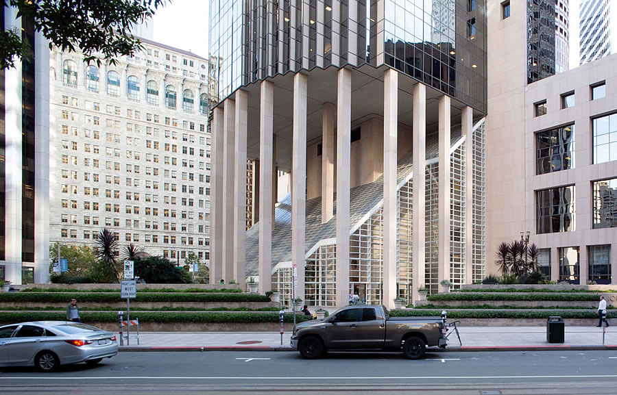
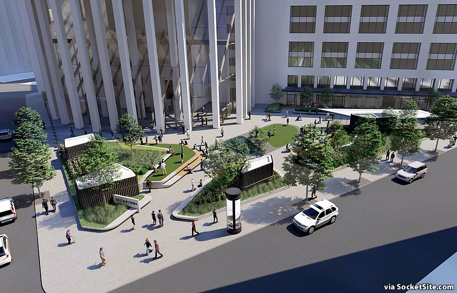
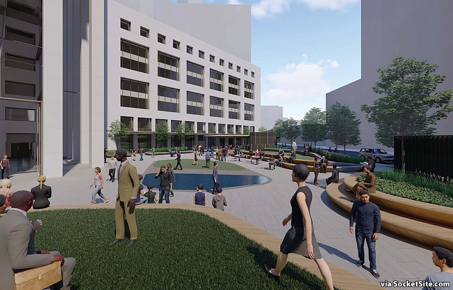
Plans to “revitalize the pedestrian realm” at the base of 101 California are in the works. And in addition to “updating” the existing glass enclosure of the tower’s lobby – employing larger glass panels and a new, muted, mullion scheme – the tower’s corner plaza is to be completely redesigned as well.
Elevated lawns and planters, wrapped with wooden seat walls, would replace the existing ziggurats, with small, uninhabitable, structures for the building’s garage vents and egress, along with a central “pond” and third lawn.
And as proposed, a little retail pavilion would rise across from Pabu and The Ramen Bar.

lovely!
What a metric pant-load of MEH. I feel terrible for BCJ. This is clearly a diluted solution after building ownership gutted the budget and leasing agents infilled it with their great “design ideas”. Such a missed opportunity.
Seconded.
leasing agents? try again. leasing agents aren’t landscape architects urbanista.
You missed the point Frank. It is leasing agents and poorly educated building owners that dilute good design (like the kind that comes from BCJ) to the point that it ends up looking like this carp. How do I know? Because I work with leasing agents and building owners all the time on projects that involve architecture, landscape architectrure, civil engineering, branding, etc.
Oh leave it alone: nothing is gained by introducing what looks like a mini-golf course (or 5 holes of one).
One improvement they could introduce – or re-introduce – is those giant ornaments they used to have during the holidays…I walked by there New Year’s Eve and it looked like they don’t have them anymore. (and what a Christmas cheer-less walk it was: Gumps shuttered, no tree @ 555 California…I might as well have stayed in Oakland)
there was a tree @ 555
Really? Either they took it down (too) early or it was a lot smaller than before.
They must have taken it down; it was the same tree they’ve had for years.
It’s huge. Hard to miss.
The ornaments were in place for the entire holiday season.
Notcom… more like Not Honest! 101 clearly had their ornaments as evidenced on the (soon to be dead) flickr website.
And as mentioned in comments, 555 also had their tree that they’ve always had.
“Taken on December 26, 2018”
“I walked by there New Year’s Eve’
See the problem there ??
So maybe “Not Timely” – Notimely?? – but not Not Honest
It ain’t broke. If no one is hanging out there, it’s because there’s nothing to hang out there for. Putting in grass (which would have to be maintained) changes nothing. The ziggurats are perfectly fine for sitting and hanging out…if there was something to sit and hang out for.
Last time I went through there at lunchtime, there seemed to be plenty of people using the seating (granted, that was a few years ago).
The ornaments were up at Christmas and beautiful. They must have taken them down a bit early. I love this plaza as is. It is never empty. I see many financial district workers with their $16 giant Mixt salads.
OK, thanks: I’m disappointed ….but relieved.
So much for Twelve Days of Christmas, I guess.
Revitalize the pedestrian realm? Two food trucks and a music program would do that. Everything about this makes the plaza less interesting, but altering the lobby enclosure is an insult to the building. That fine white grid of mullions is one of the building’s aesthetic pleasures. Doesn’t it get any famous-architect, perfect-expression-of-its-era credibility and respect?
Really. Where are the preservation planners? Try to change one window on a residence, and they are all up in arms.
They should just put up a ton of fixed tables and chairs and do a rotation Off The Grid and Framer’s Markets and stick a rotation of live bands in the nook.
Please don’t!
Not much of an “improvement” really. But particularly the glass panes in the atrium, which are now in a kind of retro-post-modern style which seems elemental to the building design. The more transparent new glass is more of the “meh” mentioned above…
I can’t see logic here: would these changes translate to higher building rents? And even if you believe they did, wouldn’t the year plus of disruption make the office/retail space less desirable?
My guess is that the owners feel they “have to do something”: the building is 30+ years old and prospective tenants want concrete evidence – or in this case, maybe, “removal of concrete” evidence – that it’s being kept up-to-date…so “do something”, even if it’s the wrong thing.
You can’t change the office floor plan layouts, which was in a semi-circle requiring custom fitted furniture, and the feeling of going around in circles all day as you go from your assistant’s cubicle to the conference room, other colleagues’ offices and then back to your own.
Front desk security was high when I worked in the building, in light of the law firm shooting decades ago and post 9-11. 24 hour prior notice of all visitors to your office was required, so it added an extra level of work involved for staff.
I suppose – sadly – these kind of security procedures aren’t uncommon anymore, but “24 hrs notice” seems extreme: I would think for professions like psychologists and personal attorneys, who routinely deal with – if not “walk-in”s – then at least a lot of (potential) clients who are nervous and /or upset, the thought of scaring them off is enough to seek less intimidating quarters; there are still, I think, a lot of (mostly older) buildings with very little security at all, beyond a desk attendant.
I’ve had plenty of same-day meetings there.
This is one of the country’s premier architectural treasures. Leave it alone!
I can’t say I agree with all these “upgrades” or “re-designs”. But I for one would applaud any change to the seating in this area. Have you ever tried to climb, and I mean climb, up those “steps” on the existing planters? I guess that’s what they are. Good luck if you’re a woman in a skirt. Might be nice for those down below looking up but otherwise forget about it! Let’s hope they also do away with allowing smoking in this area (gross it’s 2019, for gosh sakes, people) and keep a water feature.
A little late on the thread here, but this is poor design and is not an upgrade from whats there now. I hope the property owner gets these messages and saves their money for a different project