Purchased as a three-bedroom for $4.98 million in 2012, the full-floor cooperative unit #3 at 945 Green Street, high atop Russian Hill, was rebuilt as a two-bedroom, returned to the market listed for $9.95 million in 2015 (“showcasing complementary elements of gracious scale & simplicity”), and sold for $9.4 million that June.
And while it never officially hit the market, the now 4,150-square-foot unit (per the agent who quietly handled the sale) has just traded hands with an $11 million contract price ($2,651 per square foot).
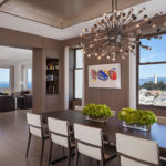
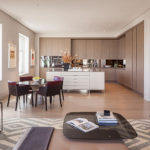
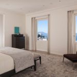

So now we have it: proof positive that all those doubters (of stagnating R/E prices, based on comprehensive market surveys) were right all along that the plateau was “fake news”…based on this sample size of one.
Bought it for 5M at the bottom of the market, put in another 1-2M, sold for 9M. Excellent flip work.
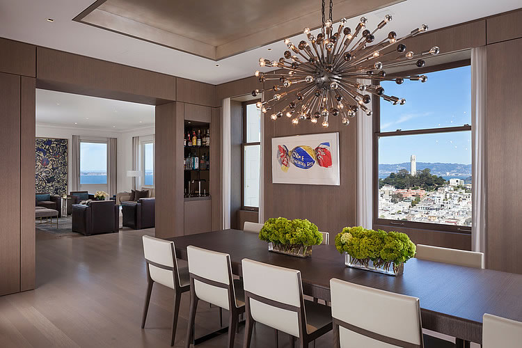
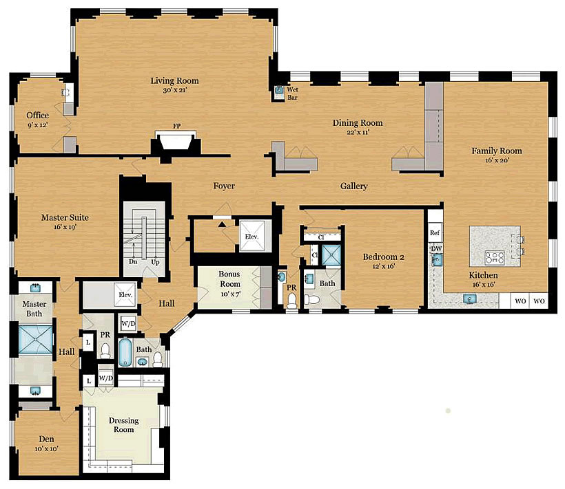
Judging by the apartment layout, everything is really well thought out and the flow is very good.
I disagree a bit. They clearly stuck with the original-ish floor plan to avoid any structural work. My armchair architect would have made the second bedroom the dining room, so living/dining/kitchen are one big room. I dislike the separated, formal dining room.
And what about the Dressing Room bigger than the den? Course the work they did on the former would make Wilkes Bashford envious. And whatever the Armchair Club may think of the work overall, they found a buyer.
Who has that many shirts/suits/shoes and pants.
They must really hate to do laundry.
Panhandle Pro – so you prefer the dining room to look into what is essentially a light well between this and the adjoining building…rather than at the Bay? There is a reason all the principal rooms are on one side and the service rooms on the other.
Then how about a switch b/w the dining and family rooms: this would allow direct access (i.e. no awkward s-shaped path) b/w the kitchen and dining and allow the living and family rooms to be opened up into one large space if desired? (I will concede, tho, it’s possible they don’t want the kitchen exposed to the dining area…perhaps to keep their culinary secrets more secure, if not for aesthetic reasons).
from a building code perspective it is interesting that a high-rise seemingly only has 1 set of stairs running up and down the building.
Although it’s not shown in the floorplan, a check on ‘googleview’ shows the building is equipped w/ an exterior fire escape (access would seem to be from the window in the bath of bedroom #2) which presumably precludes a second interior stair (although would a building w/ this small a floorplate require one otherwise?)
an exterior fire escape would not conform to stair requirements for today’s code. obviously this is an old building and i’m not trying to nitpick on why it doesn’t meet today’s code. but the requirement to have a 2nd stair (a real protected stair within a fire-rated enclosure protecting from fire and smoke – not a fire escape) are normally required for medium and even smaller sized buildings. it is just interesting if this requirement was not in effect back whenever this was built (because it seems kind of important … if a fire occurs anywhere and the 1 stair that is available was somehow compromised, basically you’re screwed).
No I didn’t mean to imply that it met current codes, only why it might not have had one when built. I brought up the floor size issue, b/c I know there are buildings in Oakland – the Tribune Tower for example – that lack even the fire escape (note that what was originally an open stair [in the TT] has had the runs enclosed w/ doors, but one must open them for transit since there’s no landing…hard to correct the mistakes of the past, I guess)
that’s interesting. since you’ve found examples of older tall buildings with only 1 exit from the floors, with or without fire escape, one can only surmise that this was allowed by the code back then. this won’t be allowed under current standards once you go up to 3 or 4 stories.
LOVE…wish I had the money. I love the formal dinning room it’s great for entertaining close to the kitchen for serving yet still formal by being separated. If you wear a suit to work everyday that is a dream wardrobe.
I love the seamless in plaster lights used in this residence. (Most probably from Number 8 Lighting) If I were to take a guess, was the interior done by “The Wiseman Group”?
I hate to see designs that has the sleeping room first as you enter into the suite. Bad design.
So the only bathtub is in the smallest bathroom, which is off the hall area by the staircase, and is farther from the two bedrooms than any other room in the place other than the office…
Nice design.
i can’t believe all the bathrooms are so small at this price range, if the place went through a full remodel; unless you say that all the bathrooms were confined by structural walls in which case ok.
The wet bar is awfully cramped. Pass.
Is that a “her elbows are too pointy” snark? 🙂
No hall closet anywhere near the elevator. Pass.
that “bonus room” looks like it can serve as hall closet.
Looks like that used to be the maid’s room.
… and she twirls her hair too!