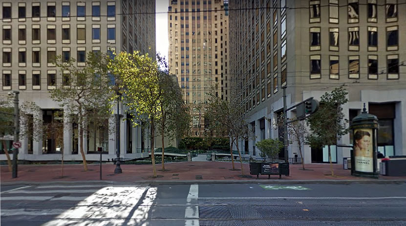
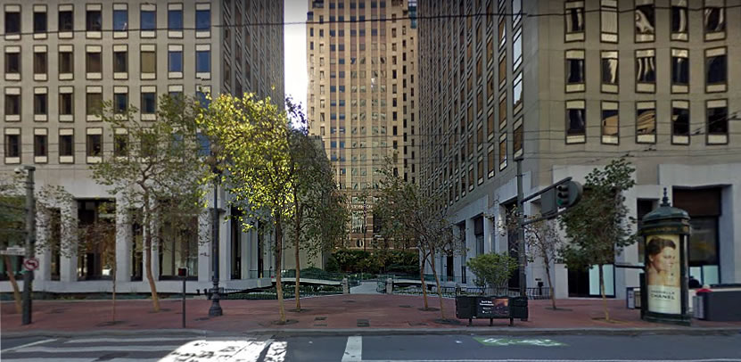
While technically a 13,000-square-foot “plaza,” the area between the two downtown buildings at 555 and 575 Market Street was effectively privatized and turned into an elevated walkway and entrance to its two adjacent towers back in the 1990s when the Market Center complex was owned by Chevron.
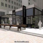
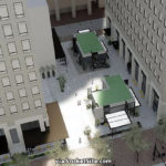
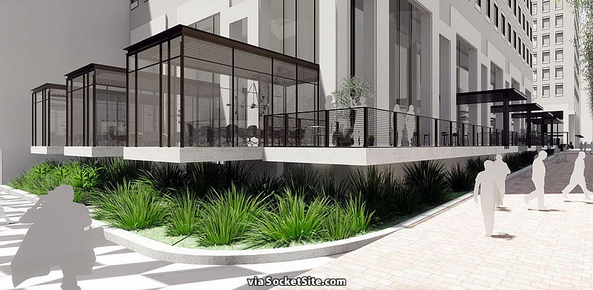
But as newly proposed, the wall that currently separates the space from Stevenson Street will be removed, along with the elevated walkway, and the space will be completely reconfigured, proving a new mid-block passage between Market and Stevenson with two new “micro-retail” structures, structures which the project team intends to fill with food and beverage tenants “to draw the public into the plaza between.”
As part of the project, which is being designed by SkB Architects, the team is also planning to convert the tenant gym space in the southwest corner of the 555 Market Street tower into a 3,200 square foot restaurant and add a series of floating peninsula rooms on the northeast corner of the building, overlooking Market and Ecker Street Plaza.
We’ll keep you posted and plugged-in.
About time. It was so ridiculous that for years the public was prevented from walking from Stevenson through the plaza to Market.
Will be glad to see that rear barrier wall, which is a true annoyance, disappear.
That said, the elevated walkways are quite attractive and unique(-ish). I think it’s a shame (and somewhat counter-productive) that they’re proposing to “open up” the plaza, and then turn right around and plop two buildings in the middle of it – decreasing the visual openness and “invitation” to walk through the area.
It’s always a challenge. The pavilions are there to activate the space, but it’s true, they are bulky whereas a sculpture (the other standard option) would be more visually open but less of a traffic driver.
Just walked by there (after my comment this morning) – the sculpture garden is great; I’d love to see them just remove the wall, and then build a 4th elevated walkway from the existing middle “intersection” to Stevenson. That would be very inviting, while preserving the existing attractive garden / art.
I agree. That would be way better. Those gardens are truly wonderful. Plenty of plants thrive in little or no sun.
I remember when it was owned by SOCAL. They would plant flowers throughout the whole section according to the seasons. Now it’s all about money and “convenience”.
you mean Chevron, I think.
S(tandard)O(il of)CAL(ifornia) = Chevron…doesn’t it ??
ah, I see that name change happened in 1984, after SOCAL and Gulf Oil merged. Before I arrived in California; had never heard of the company referred to as anything other than Chevron. Thanks for the history lesson!
Such a beautiful little garden back there. I hope they keep it landscaped but I’m thrilled they are opening it up! Stevenson is such a great street. The more pedestrian connections the better.
As proposed and rendered in the gallery above, the garden would be removed and the plaza paved, with some planters added.
What a loss – given, as noted, that the beautiful green space is going to be paved over. But wait – there will be a few planters. Aside from the wall this was a rare oasis of green in the downtown area. Yes, it serviced the two office buildings but even at that the curved elevated walkways served as a form of visual interest – of “sculpture”. In return there will be no artwork, no water feature and no heart nor soul in this passageway. A sterile cemented “street” with equally sterile bland boxy food stands. This is bad urban architecture.
Good urban street/plaza spaces are intimate and engaging. They create a visual narrative with boundary and tone-setting functions. Trees, masonry walls, benches, paving stones; water features and sculpture. They are places one wants to linger in and not rush through. Such enchanting plazas and passageways abound in Portland and other cities and stand in sharp contrast to what will be doe here. A disappointment but not a surprise given the state of urban planning in SF.
I imagine you’ve never tried to enjoy the ‘plaza’ as is? There’s absolutely nothing inviting about it. I’d argue that activation of an otherwise private passage into a lobby is more important than the number of plants or water features.
I first read Poland has enchanting Plazas (and they do) – but I should know better, always the praise of Portland and Seattle – gets really old.
This passage way between two high rise buildings would not make much of an oasis either way. As I see it the area under the floating peninsula rooms at the NE side of the building would probably be better suited for mushrooms than greenery.
OK, forget Portland – and Poland, check out Pittsburg. Some great plazas and passways there too The point being SF is woefully lacking in such pedestrian friendly amenities. There is green there now but, as you indirectly acknowledge, the “green” space underneath the proposed peninsula rooms will hardly be a place where plants would thrive. This will basically be a cemented in sterile expanse of pavement.
Pittsburg? THIS Pittsburgh There’ll be more people working in/visiting those kiosks than there are in all of downtown Pittsburg.
Now Kraków, OTOH ….
Dude what? They’re turning an uninviting, useless, dead-end space into something public, open, and functional, and all you can do is complain about it. Get a grip.
“Get a grip” – the great, unhelpful knee-jerk rejoinder. And from “Anonymous” no less.
As I and others note above, this is an usual and attractive green space in a sea of downtown concrete… there’s also an *existing* connector plaza between Market and Stevenson, just 100 feet to the east (leading to NewTree, etc.).
*Yes*, I think there’s agreement that it’d be great to “tear down this wall” and open up another connector, *but* it would certainly be possible to do so while preserving greenery and water and sculpture … instead of creating yet another bland expanse of pavement, centered yet again around some “quaint” formula retail kiosks.
Which begs the question: how much rent can they make on these small kiosks?
You sure spent a lot of time saying nothing. Nobody disagrees with using and making this space better. Maybe don’t assign your own (read: wrong) interpretation of other people’s words to that person.
And pretty directly implying that this project has little to no merit because someone disagrees with the details of a non-final design, as has been done here, is a textbook kneejerk reaction. And an extremely ignorant one at that.
I meant SOCAL: Standard Oil of California before it went to Chevron.
The thing is, there’s a walk thru right next store at 525 Market St.
Can’t have too many walk throughs!
Like so many retail and quasi public spaces, this one has been through numerous remodels.
When first built, it was a large water pool with, if I correctly recall, ceramic tile in yellow, orange, and brown mid-century modern stripes. Then it has been at least two versions of a landscaped garden, the most recent with the odd bridges.
At one point, architects studied lowering the ground floor of 555 to plaza level, but structural complications and cost considerations prevailed. Key at every juncture when this was SOCAL/Chevron was not having any space for public assembly (read protests).
Good riddance to a bad design and hopefully for the first time in 50 years the public will hopefully actually get to use the space.