Having received an exemption from having to complete a resource intensive environmental impact report, and with some confusion as to the historic merits of the existing, versus previous, Kaplan’s Surplus store building on the Mid-Market site having been resolved, the plans for a 10-story hotel to rise at 1055 Market Street could be approved by San Francisco’s Planning Commission next week.
But Planning does have a concern.
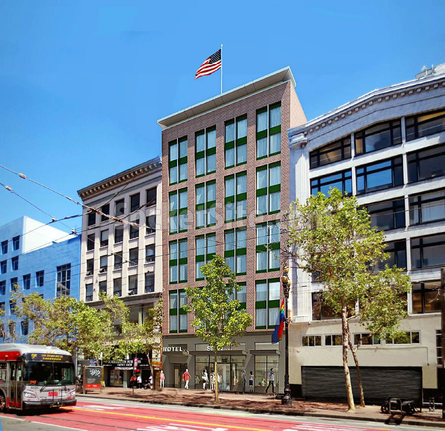
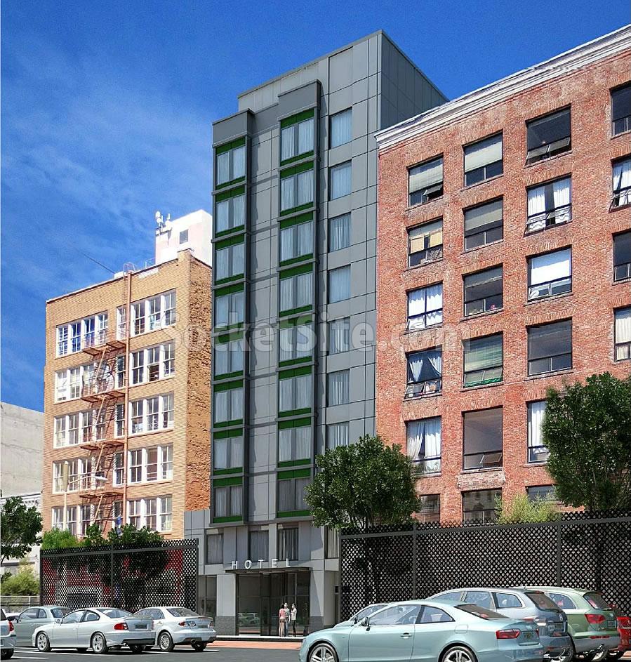
As refined and newly rendered by Stanton Architecture, the design for the proposed project includes 160 hotel rooms over 2,000 square feet of ground floor retail space fronting Market Street, with a secondary entrance leading to the hotel’s main lobby which would actually front Stevenson Street.
And as required by San Francisco’s Planning Code, the development includes a 1,468-square-foot, Privately-Owned Public Open Space (POPOS). But it’s the location and accessibility of said POPOS with which San Francisco’s Planning Department has raised concerns.
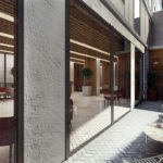
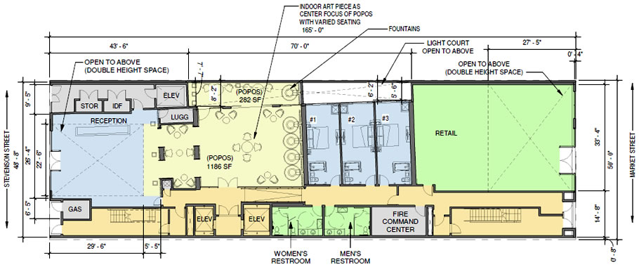
The proposed POPOS is located in the middle of the development, between the hotel’s lobby and retail space, with a 1,186-square-foot interior portion effectively acting as an extension of the hotel’s lobby and an adjacent 282-square-foot open air light court.
From Planning with respect to the POPOS as proposed:
“The Department believes that the arrangement of the ground floor does not comply with [Planning Code] Section 138 and the Downtown Area Plan. The current proposal places the POPOS behind the hotel’s reception and lobby area, a location that doesn’t easily convey the public nature of the space.
Alternatives such as relocating or removing the location of the three hotel rooms at the ground floor were rejected by the sponsor.
The Department recommends that the hotel rooms be removed and the ground floor be redesigned so that access to the POPOS is more publicly accessible and closer to available sunlight from both Stevenson and Market Streets.”
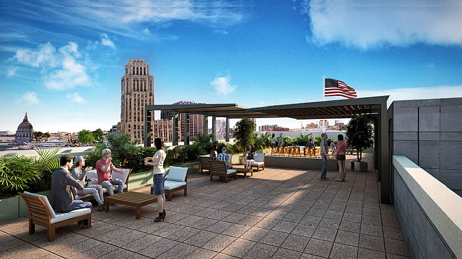
And yes, the proposed project includes a private roof deck as well.
We’ll keep you posted and plugged-in.

this is a classy looking design. Very nice for the area as mid market continues to become nicer. I wish the roof deck was the POPOS. Super nice.
….OTOH hand on my walk down mission from 4th to 1st st this morning I had yelling deranged [homeless people], and a [homeless person] mooning (possibly pooping as well) all the dream force minions walking around….definitely still major issues even in the nice(r) east of 4th street areas.
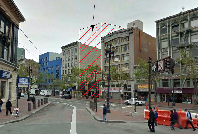
Notice the man in blue coat in the center of the first pic was jaywalking against red light. This is the worst pedestrian crossing in San Francisco. You can never proceed in green light because people are jaywalking every time! The other day an approaching Muni honked a woman who is about to step off the curb. The woman was startled. Then she did the oppose of she was supposed to do, she spun in front of the approaching bus to cross the road!
Sound like the next step is to install automatic targeted taser gun in front of the bus to disable these folks before they kill themselves.
Market St. east of 5th and Union Square have gone downhill in recent years. Forget west of 5th. In the 17 years I’ve been here and two huge tech booms this area hasn’t changed other than the addition of some market rate housing (which clearly hasn’t improved the streetscape or cleaned up the area).
Have you walked down 1st, New Montgomery, 2nd, or 3rd streets recently? All are pretty packed with pedestrians, new businesses, galleries, and plenty of tech offices—much of which has appeared in the last decade. Powell/5th/4th are still ugly, trashy, and transitory, but that area is chock full of tourists, parking lots, and the subway construction nightmare…and will be for at least 2 more years.
Yeah, my office is at 2nd/Mission. I’ve walked down all these streets you reference at 7am and 9pm, as well as on weekends. It’s a much different world outside of business hours. Sounds like you’ve given up on Powell/4th/5th. It’s our supposed retail hub and shouldn’t just be a magnet for hoodlums and homeless accosting tourists. Subway construction is a minor issue…the real problems have been there for a while.
Well, all those downtown streets are still much cleaner and lined with businesses on weekends, even if most of the offices are closed (and some restaurants). Do you remember what it was like before the Transbay project got underway? Pretty bleak.
I live nearby and have to use Powell Bart station frequently—haven’t given up, but the sunken “plaza” was a nasty vortex or panhandling and tourism since its debut 40+ years ago. Should have a tall tower built over it with some great ground-floor visitors center / SF museum instead. I think the 5M project (if it survives litigation) will be a major change that area and bring some new privately-managed open space…but again, that’s in a decade or more. Central subway impact should also be pretty visible.
I agree 2nd is shaping up very nicely.
1st st is too officey… though I like the way it’s coming along. It’ll probably be dead outside office hours for years still.
The transbay bus terminal will be like the existing temp one, in term of traffic, so it will also be dead outside commuter hours.
Actually as I walked along 1st under the terminal on my way home today I wondered how all the planned retail will survive. It won’t. Not until Caltrain and HSR come in… and we need another 10k housing units there. There won’t be enough mass outside commute times in afraid.
Still a huge mega improvement from 15 years ago I totally agree.
On weekends it is pretty sparse and some of the retail is not open – catering only to the weekday office crowd. Don’t see much additional residential construction around the TTC (aside from what is in the pipeline) and certainly not 10K more units. The area is running out of parcels zoned for large residential projects.
Not the most inspired design, but tasteful and appropriate. Hope the brick doesn’t get dropped from the final build like so many others I’ve seen IRL lately.
Brick veneer has no place in honest architecture.
Oh please. It does too. Many modern buildings done by Johnson, Mies, Wright and others used brick. It’s very modern.
Absolutely agree with you. 240 Pacific Ave and 150 Broadway are good examples.
Brick veneer does, however look nice. See, for example, AT&T Park, which is beautiful.
Well, to those of us in the profession AT&T Park looks like an anti-contextual joke with an awkward skin that cannot resolve itself visually.
I’m in the profession too. The ballpark is just fine: nice juxtaposition of rugged exposed steel framing (which references the 3rd st bridge nicely) and the nice, warm red brick (which nicely references the many original brick warehouses nearby).
Contextual, solid and modern.
The 99.9% of us outside the profession find that sentence to be 100% garbled nonsense.
AT&T Park looks exactly like a baseball stadium should look.
AT&T Park is classic timeless modern and proud, all in one. Fits into and anchors the developing MB area nicely even if it overall (MB) has a boxy boring formula feel.
I don’t even generally like sports gatherings or masses of humans… but it’s a great park. it really brings people to the area. Mostly without autos.
I just wish it had a cooler name, non corporate.
And this great ballpark is exactly that: a great sports park where the architects spent time understanding the surrounding context of history and materials and made good decisions to incorporate that history into the design and materials of the ball park.
Were I hiring an architect, I’d want to know the name of your firm so I could move on quickly to someone else because I couldn’t disagree more.
@BT: and I am very selective about which clients I take on. works both ways.
Yes, it does.
Architecture has always been artifice.
The cladding of architecture has nothing to do with “honesty” anymore than clothing does.
Brick “veneer” is the same as veneer plywood — both are a more efficient use of material in order to convey the desired feeling — and just a valid as tile.
The city knows POPOS in hotels do not work (see the Intercontinental)—is there no option to pay the POPOS $$ into the parks fund for space elsewhere? Or what about adding privately managed landscaping/seating in front of the building parklet-style? really I’d like to see the brick deathscape of UN Plaza to become a privately managed park like Yerba Buena Gardens.
The design is not bad and the brick is appreciated – faux or not. There is a warmth to earth tones and brick that one certainly wants a hotel to convey. The only thing missing are some awnings or articulations over the top windows to break up the brooding mass this design along with adjacent buildings presents at street level.
That leads to POPOS which, as SF history shows, is a giveaway to developers to avoid street level open space. The Intercontinental Hotel was allowed interior POPOS at a top floor which was inaccessible to passersby. Recently, as no one uses it, the Hotel is trying to convert it to private use and pay a fee to the City. Said fee won’t go to more open space – it will be added to the park maintenance budget which is a bottomless pit. All the money in its budget and the parks in SF are some of the most poorly maintained in the country. Think also what the City allowed Salesforce to do with that POPOS stretching between Fremont and Beale which provided some much needed open space downtown and was a haven for office workers at lunchtime. It was turned private and will be walled off from passersby.
How about setting the building back 10 feet or so, use that as POPOS, and break up the brooding, cold mass of buildings this section of Market is becoming Other cities encourage setbacks and mini-parks at street level in their more built up areas to enliven and soften the streetscape. Only SF refuses to do this and, unless Planning insists on it, developers will not do it.
Agree, we need more street-fronting mini parks. As well as street-fronting major parks.
It’s hardly a cold mass of buildings given that the block is comprised of a multitude of individual buildings with individual architectural styles. You want cold massing walk along King St. or most of MB.
As for street-fronting parks, until the area is cleaned up you can forget about it.
From a sidewalk perspective, despite the slightly different designs, this will and does feel like a brooding wall – the lack of no street level parks/open space or amenities worsens the situation. The Hub will be this on steroids and turn Market/Van Ness, a few blocks up from this project, into an overpowering, pedestrian unfriendly, sterile citadel.
It’s a typical city block filled with multiple structures, not unlike a lot of the city, which lacks open space and street level parks. Also, it’s Market St. and a wind tunnel a lot of the time so it’s pretty much pedestrian unfriendly due to the natural elements in addition to the streetlife. The Hub (what a ridiculous name, BTW…yet another marketing ploy) is already pedestrian unfriendly and merely an extension of the mid Market environment.
I agree Market St. has natural elements stacked against it. Add to that the paucity of open space and I doubt it ever becomes a premier location to live in or to visit. If only Burnham’s vision after the quake had been pursued. It’s a problem that exists throughout the City. The Sunset grid pattern and lack of canopy/open space. The outer Mission – pretty much the same problem.
Well, I guess the same could be said for the existing historic buildings that front the development on either side. This is how city blocks have been built going back to Medieval times and earlier –you construct a building so it fronts the public walkway. 200 years ago, 100 years ago, 60 years ago, you would not set back a building and put a little mini-park in front of it, which frankly few people would use and which likely would be difficult to keep from becoming an eyesore and a nuisance.
The POPS requirement should be rethought, and in many cases (not every case, but most), developers should instead be required to pay a fee to the Parks Department so existing REAL parks can be kept up nicely and perhaps more open space and parkland could be acquired in neighborhoods where people live, rather than invested in stupid parklets and open alleyways that most citizens of SF will never use.
Give me a REAL city block that looks like one and take all the money for POPS and put it into REAL parks where people actually live. Currently, SF does a mediocre job of maintaining its existing neighborhood and regional parks–extra funds going toward existing parks would go a long way to remedy this problem.
SF has a lot of cement. It also has one of the largest city parks in the country. The same can be said for NYC. However, the parks in NYC are a hub of activity–good activity–and are patrolled by beat cops (even before 9/11).
As usual I disagree with everything Dave says. This is not a large building and the brick is perfect for it. The varying facades of other modest sized buildings along the block make for a very interesting street wall in an urban sort of way.
As for The Hub, the Market/Van Ness intersection probably couldn’t be worse and putting a lot more people in the area should help, not hurt it. An active street life, and businesses catring to it, should follow the presence of those people. My only real concern is the wind effects–I hope efforts to mitigate the sidewalk level winds through building design work.
Actually in this case if they really opened the rooftop to POPOS it would be the best thing ever. Especially if it was open almost 24/7, obviously wouldn’t be, but like 8am – 1am….
That’s a pipe dream I realize but the reality is most people don’t know or take advantage of the POPOS.
And in an intimate hotel like this it would be easy for the lobby team to screen belligerents away. Which wouldn’t really be an issue I don’t think.
Meaning you could create a cool spot on mid market up 10 floors or whatever open to all. Put a bar up there and a cafe.
It just needs more open hours. There’s enough tourists and locals in this area to support that.
Its real, genuine brick, made from clay and baked in ovens. It’s not faux.
It is fine as is without meddling from the city. Every “open public” space in SF, especially in this area, will turn into some kind of magnet for the homeless. Ever walk through the Civic Center or Powell Street MUNI/BART stations? It is an embarrassing for tourists (paying steep dollars) to have to witness.
I think the three hotel rooms on the ground floor should remain to accommodate any disabled or elderly guests who wish to be on the ground floor, or simply guests who don’t want to wait for elevators during rush times.
Privately managed open spaces are entirely different from city-managed ones, and do stay clean (see Yerba Buena or POPOS like the plata at 303 2nd Street, which are clean and inviting, versus Civic Center’s blank & trash-filled “park”). Most of SF’s worst plazas could be cleaned up if we upzoned land around them in return for private landscaping/security/etc. from future developers. Worth a try…
You can build as high as you want around public space, but it won’t clean up the area. No developer is going to pay for upkeep of public areas that the city is too damn lazy to maintain.
In fact, that is exactly what happened with Yerba Buena Gardens beginning in 1992. Not sure why you don’t believe me.
I don’t believe you because I’ve lived and worked in the city for the past 2 decades. I see it first hand. As for YB, try hanging out after work or on weekends. All those workers sunning themselves M-F are magically gone.
I’m there many weekends, and it’s always very clean and I’ve never seen open drug use like I have at most SF parks. The workers are usually replaced by museum visitors (if the weather is nice). Not sure which YBG you’re going to??
Clearly, we’re walking on opposite sides of the street. 2nd St. between Market and Mission alone is void of foot traffic other than scraping wheels of shopping carts pushed by screaming homeless people. I was there two Sundays ago at noon dropping something off at my office when on that one block I had to deal with 5 separate incidents. Then you have the homeless loitering around the Jewish Museum near the restaurants in that “public place.” The homeless may not be taking a snooze on the merry-go-round with tourists and children, but they are out and about ready to hassle anyone who is nearby. Gets worse the closer you get to 4th and 5th. Not sure why you don’t believe me.
yerba buena is still 1/4 filled with vagrants on the weekends
are you guys going there at 3am or something? Anytime I’ve ever been the vast majority of users are tourists and residents, not vagrants.
The city claims that we do not have a homeless problem worse than other cities, but whatever they are doing to hide it, we should copy. New York, Washington, Baltimore, Boston, and in Europe: Paris, London, Edinburgh, Milan, Brussels, Amsterdam. They all are doing something we are not. They do not have a visual, intrusive, repulsive situation. What are all these cities doing?
SF is in denial. SF is used to turning a blind eye and focusing its attention on useless ideas, like Meatfree Mondays, rather than tackling the serious problems that have plagued the city for decades and are only getting worse…homelessness, poor transit, unaffordability, etc. Good luck, folks. All yours.
@Mark – to the extent public open space in SF is poorly kept and riddled with homeless and drug dealers, that says something about how dysfunctional SF as a city is. LA has plenty of open space and it is not all riddled with problems as is the case in SF. Same for Chicago. and other cities. Some cities like Seattle and Portland have incredible public open space filled with artwork throughout their boundaries and those spaces flourish with no where near the chronic problem SF has.
Have you ever been to Los Angeles? Their homeless problem is as bad as ours if not worse.
Suggest you check your facts about LA and Chicago. LA still has a skid row with an estimated 15k homeless. Chicago had 7k murders last year. So as bad as SF is, it is not as bad as those and other places.
LA has 7x as many people as SF and only 2x the homeless. Our per capta rate is much worse.
The artist rendering shows Stevenson with 4 cars alongside one another, an impossible feat! Look at Google Earth street view & you will see it is a narrow alley. Look at that block on Google Earth & you will be a big challenge with [homeless] & trash.
Thumbs up to them for not putting in a parking garage.