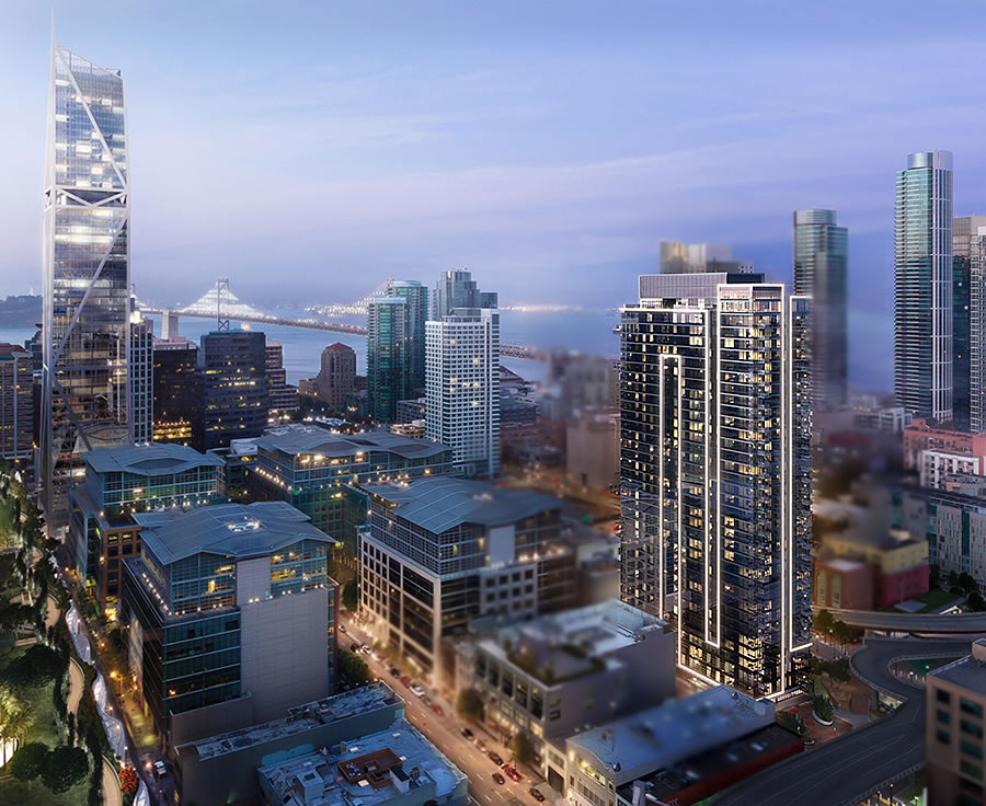
The refined designs for the public art to adorn the 35-story, 403-unit apartment building nearing completion at 33 Tehama Street (a.k.a. 41 Tehama) will be presented to San Francisco’s Planning Commission on Thursday afternoon.
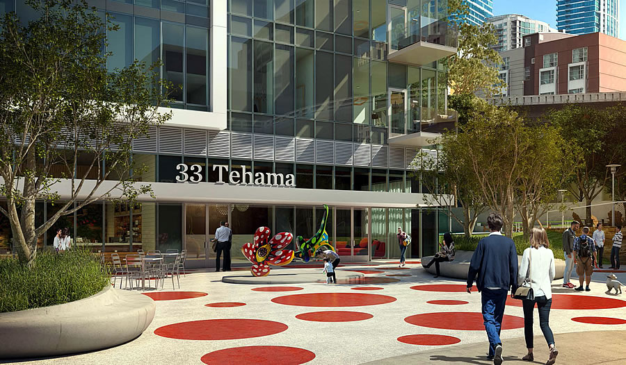
Yayoi Kusama’s Flowers That Bloom At Midnight sculpture will be set on a base in front of 33 Tehama’s lobby plaza on the southwestern side of the tower which will eventually connect to the future Oscar Park.
In addition, a series of Kusama’s characteristic polka dots will be incorporated in the plaza’s paving and two oval planters will provide permanent seating along with some additional green and shade.


Eek gads. Beauty’s in the eye of course, but I don’t care for this, nor the polka-dots, myself. I think the city lets the developer select these works of art. Maybe that’s not a great idea.
You think city politburo would be better?
Even worse would be to put art selection up to a public vote. Then you’d end up with Thomas Kinkade-esque schlock.
Best solution would be to consult with YBCA, SFMOMA, etc. curatorial staffs and let their opinion guide selection. Maybe that’s what big developers are already doing?
Y’all are aware of the San Francisco Arts Commission, right? They run the the selection process.
No they don’t. The Arts Commission has absolutely no involvement in the review or approval of the public art installed by developers in satisfaction of the 1% for art requirement. The Planning Commission does review and comment but does not have direct approval authority per se over the look and content of the art. The things they look for are things like whether the art is in a public enough place and whether the “artist” and the “art” meets the definition of those things in the Code (eg they are not gussied up architecture masquerading as “art”).
While developers have a vested financial interest in the attractiveness of the building, in the past that has resulted in very conservative, fairly generic art selections. I think things have changed a little bit and some developers are going for more bold pieces because the economic make-up in the City has changed (ie more innovation/tech, less law/finance/insurance). To be sure, some developers still pick very ho-hum stuff. But you know what, go to the sculpture garden at the De Young and tell me that if you put most of those pieces in front of an office building that you wouldn’t also think it was kind of uninspiring.
A difficult call: who would decide, that had a vested interest in a great outcome. I’m wondering if the project architect(s) really like(s) the giant loud flower by the front door. Personally this seems like the wrong place for a loud pop art piece: in front of a grey and cream edifice (clashes). Perhaps the architect(s) might be best at the selection, and or a consultant of the architect.
A similar public art display situation graces 9th Street just south of Nema. The developer took a mural intended for a pool house in Beverly Hills and slapped a copy of it on the side of the basically black BMR high rise.
Maybe take a few minutes to learn about the artist and the context of her work?
100% agree. Not only does Yayoi have an international reputation, but her background is super interesting. Lot’s of good [stuff] to pull from in terms of making the installation a potential destination. Aesthetically, there are plenty of far more hideous corporate pieces spread all over the city to pick on.
So much of this “international reputation” thing is based on trendy back-scratching among the donor class. Doesn’t mean the art is “good”.
Nonetheless, there is no such thing as an “objective” standard for good (or great) art. So, we are arguing about opinions and taste.
Agreed. I think the proposal is underwhelming. But it is the developers money – so it is their decision if they want to put in 1960’s polka dots…
What does “trendy backscratching among the donor class” really mean? Does it mean those that contribute to urban locations by providing jobs, and paying taxes?
Yea…what a terrible idea to allow the architect and developer, both of which have outstanding international reputations and have built award winning projects, globally to select the art. It would be better to have the Board of Supervisors pick it.
This is great, I have seen nothing like this nearby this part of the city and I can’t wait for this to finish up and for Oscar park to open up.
That is what I love in a city … bunches of differing architecture and streetscapes. This adds.
Very nice hidden art that most will never see since it’s off the alley not a main st. I love this kind of stuff.
cute! 可愛い
I like it – bright, playful and livens the space up a little.
It appears that the artist’s learning about the city and its context ended in 1969 during its flower-power phase.
The same goes for the Transbay (ahem.. Salesforce) Transit Center. Paisley, paisley, paisley everywhere!
I like the individual parts – looks a bit busy with the polka dot pavement surrounding the polka dot sculpture, but it may be because it is on a drawing, and the overall look may be better when it is to scale.
Polka dots have been been something that I liked & this is no exception. A good example of bad “art” is at Nema at 10th & Market Streets. The textured concrete on the side of the building is presented as art. Too often we get crap in San Francisco.
This is nice – whimsical and engaging. Seattle and Portland have an abundance of street art – some of it whimsical. The only thing missing is a water feature. Hopefully care is taken in choosing trees for the seated planters. Not too many trees do well in planters – even large ones.
I wonder if the sculpture will be internally lit? It somewhat reminds me of Corson’s solar powered Portland streetlights.
Subjectivity of art will always exist, but putting aside whether you like red polka dots, having Kusama’s art piece on your property is bad ass. Per LA Times, Kusama’s upcoming 3-month exhibition at the Broad museum sold out in an hour with 150k people waiting in the web-queue to purchase tickets. SF certainly needs public art, especially by internationally recognized ones.
Thanks for the link. I saw those sculptures last month but only in the daytime. The look great in the dark and fit well with Portland’s gloomy winter weather.
Yeah – they look great at night and during Portland’s enchanting winter. There are many large parks throughout Portland but there are pocket parks too with water features, sculptures and all sorts of greenery – nice little surprise as one walks around a corner. I hope we can see some of that in SF.
Honest opinion, though: Public art should be all about scale and context. Have not seen this in person, obviously, but it reminds me a bit of the Koons piece in Sacramento. Shiny, poppy, and completely lost in the scale of the Golden One arena.
This piece seems to small and too out of character for the setting.
But…maybe I will be wrong.
Try walking around the almost complete building then so [you] understand … it’s compact on small side streets/alleys….. this is perfect and tucked away.
fair enough. I hope so.
That Sacramento Koontz piece cost MILLIONS of dollars. Perfectly illustrating my other point above (donor class).
As to Just My Opinion’s riposte: Perhaps. So many of the elite in SF though are vampire squids, casino gambling fraudsters, and Juiceroo “dreamers” whose ultimate goal is to eliminate humanity from as much of the economy as they can manage.
Putin says the dots are in… and they must be red. I’m more favorable to the lighted tulip.
Love it
Might have chosen blue, green or turquoise dots to match the glass panels
I bike through this alley every evening on my way home – will be so glad to see a little color in that bland concrete on concrete heart of darkness.