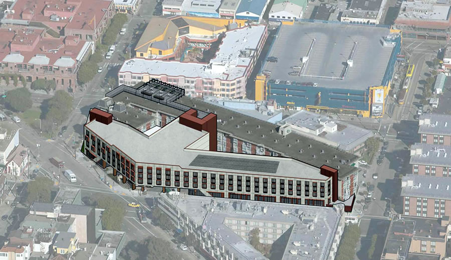
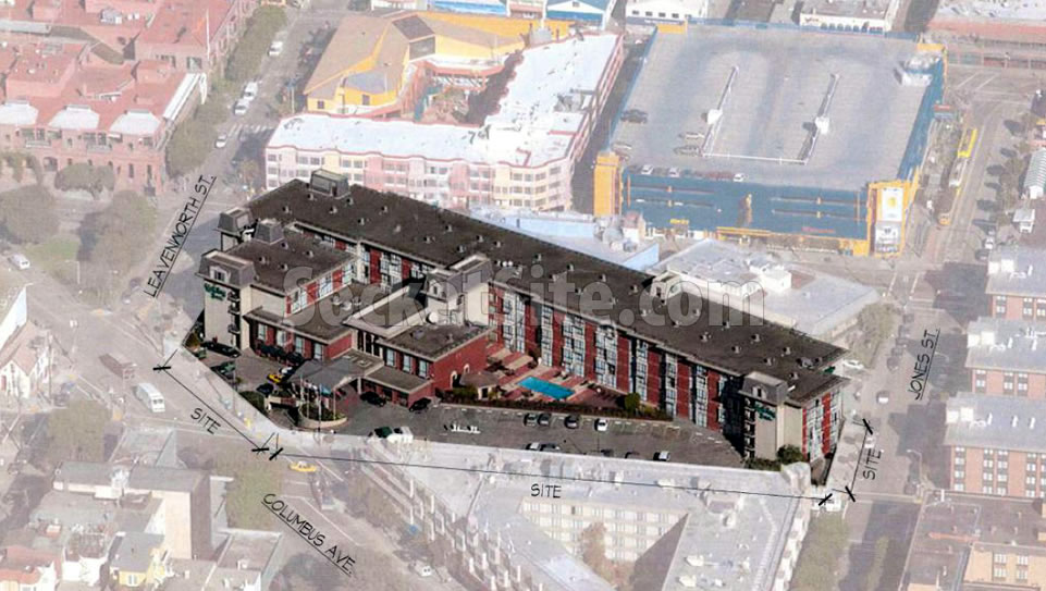
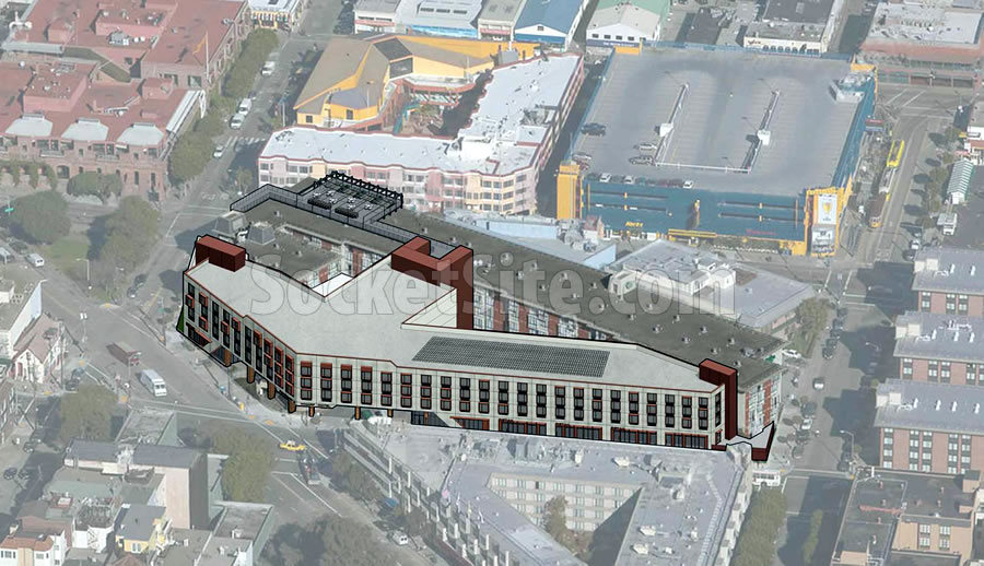
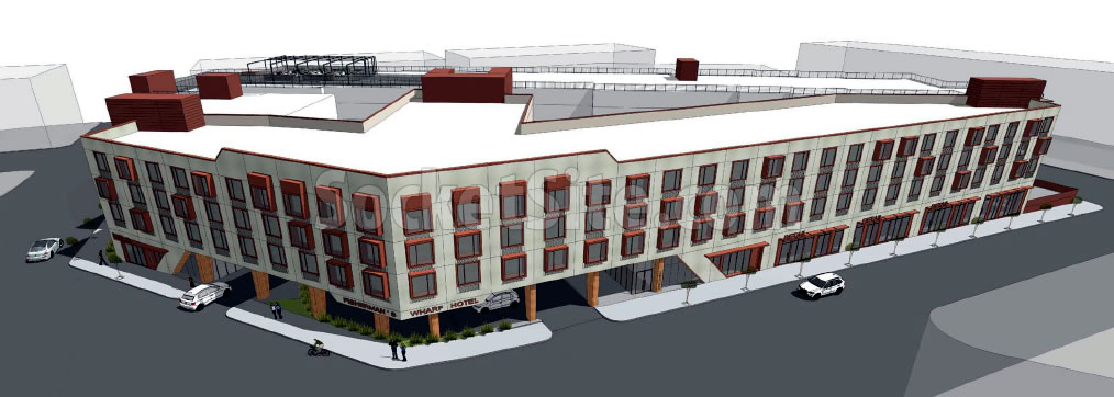
While the mass of the proposed four-story addition to rise upon the parking lot of the Fisherman’s Wharf Holiday Inn at 1300 Columbus Avenue hasn’t really changed, its façade has been completely redesigned following Planning’s preliminary feedback to the project team.
And the formal application to move forward with the 88,000-square-foot addition, which would yield an additional 174 hotel rooms and 8,200 square feet of new retail space fronting North Point and Columbus has been submitted to the City for review.
From the project team with respect to the revised design:
“The revised design includes a larger lobby with direct frontage onto North Point Street. Entry doors here will improve wayfinding into the hotel and provide direct pedestrian access to the lobby without requiring people to walk through the porte cochère. At ground level, the revised design includes intervals of cement plaster and storefront glazing to provide a pedestrian-scaled rhythm along the sidewalk.”
“Vertical metal panels interspersed in the storefront also add variety to the facade experience at street level. The building is no longer “floating” above an all-glass retail level; instead large swaths of cement plaster connect the façade on all four levels so as to “ground” the building.”
“The revised design includes numerous window boxes popped out from the facade at the guest room levels. The window boxes mimic an architectural language used on the existing building where the guest room glazing undulates in and out from the facade. The locations of the new window boxes are irregular so as to create a randomized three dimensional effect on the facade.”
And with respect to “Celebrating the Corner,” as requested by Planning, and revised palette:
“The revised design includes unique architectural articulation at the corner to emphasize the main entrance. Diagonal geometries frame the two sides of the porte cochère and connect to a raised portion of parapet above the corner of Columbus and North Point. Many window boxes in this zone are popped out from the facade (and also taller) to further celebrate the corner.”
“The ground level columns and the underside of the porte cochère are clad in wood veneer to differentiate the corner from the rest of the building, as well as provide texture and warmth to the main entry. Hotel signage wraps the corner facade to give the building presence from both streets.”
Once again, the proposed expansion of the 46-year-old, 342-room hotel would result in the loss of 54 parking spaces but the remaining 166 spaces “will provide more than sufficient parking for hotel guests and staff.” Well keep you posted and plugged-in.


I didn’t think they could make it worse, but here we are.
Their idea for celebrating the corner is really poorly executed. “We bumped up the parapet by a few feet ($50 in materials) and wrapped the pillars in wood veneer ($100-150 in materials).” The bump is completely lost in the rest of the overwhelming flatness of the facade and the introduction of wood in the porte cochère has no connection with the older project or the new one.
Finally found their glorious inspiration—a 1970s dormitory in West Germany.
Only very, very marginally (if at all) “improved.” Maybe it’s the massing after all.
Definitely pointless, but we’re not the ones who have to satisfy Planning.
Good goddess, so boring. The first design was so much more site- and era-appropriate. Instead Planning forces yet another bland box on San Francisco.
It’s hard to say which design is worse.
Hideous. As a San Franciscan, I avoid that hood as it is so bland. The first design had more potential for a bit of decent design in this wasteland. What is wrong at Planning?
I think they only redesigned it so they could use the term “porte cochere” in the new description.
Mind-numbing & dull. Tedious. ‘We dare you to stay here’. Akin to the 101-adjacent motels in S. San Fran. Good thing visitors usually book without having a sense of the ugliness that they will encounter. Of all areas needing something interesting! (Wait am I being too harsh?)
Not harsh enough, but certainly on the right track.
I recently watched a couple old movies (60s/70s) shot in SF which had scenes in this area. It’s like a neighborhood frozen in time and not in a good way. Other than the usual NIMBYs and “let’s keep SF in 1950” fans, there is no reason why this area cannot be built up. And I mean up. Not 4 stories, but 6 or 8 or even 10, in places. If done right (which is always a concern) it can add much-needed housing to go along with retail/commercial space and certainly warrant the expansion of the T line past Chinatown through NB (which it sadly ignores at this stage) to the wharf.
I’ve been beating this drum for a moment now as well. Fisherman’s Wharf is a prime candidate for added density. The MUNI owned Kirkland Yard on Powell and Beach Sts. can serve as a logical extension of the Central Subway with workforce housing placed above. That area can eventually grow to feel like an actual neighborhood with full-time residents mixing with tourists if those opportunity sites are leveraged properly.
All true.
But with THD around, we all know it will never happen.
Well, this is a Holiday Inn, what do you all expect?
The first design, which was better?
Does Holiday own the land and building or are they merely leasing the property and paying a branding fee?
RLJ owns the land and the building. Holiday Inn (IHG) manages the hotel
Actually there is a family trust that owns the land, a Chinese family I’m told. RLJ owns the building, and IHG (Intercontinental Hotels Group) manages the hotel. They also manage the Holiday Inn Express next door. The 2nd building for the Holiday Inn on Jones, RLJ owns the land of that building and the building itself. There are many hotels and office buildings in San Francisco where the land is leased.
Looks like they are trying to compete for who has the worst building at that intersection (so far it’s a tie between the Marriott and this).
I can’t agree the first design was better but I do agree that at 2 to 2.5 times the height (and maybe a third attempt at the facade) it would be improved. I don’t want tall buildings on the waterfront at Fisherman’s Wharf although I don’t mind them downtown (say at 100 Folsom) but this is well away from the waterfront and should be taller to help tone down the appearance of the entire neighborhood as being in suburban Dallas.
Height limits in action! No shadows! Fishermans wharf is the neighborhood NIMBYS are fighting to turn SF into.
Most importantly, this project blocks none of Aaron Peskin’s “constituents” views.
What happened to this? Holiday Inn sold the property to another hotel chain,who did a minor remodel? Hotel Caza.