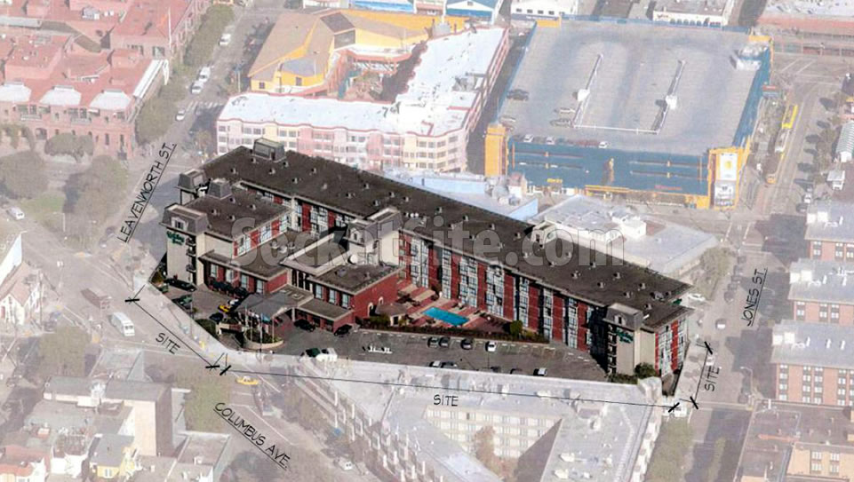
Built in 1971, with a total of 342 hotel rooms and 220 parking spaces on its nearly two-acre parcel at 1300 Columbus Avenue, plans to add 174 new rooms to the Fisherman’s Wharf Holiday Inn have been drawn.
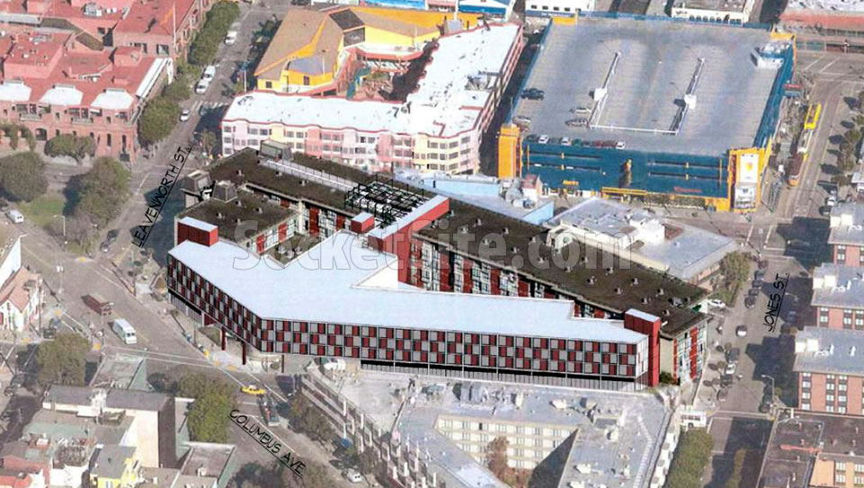
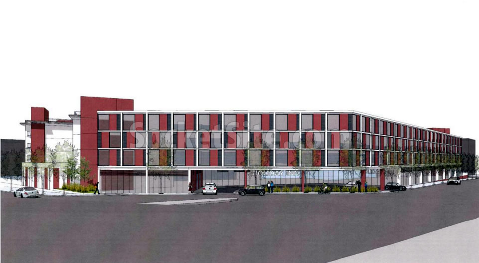
As designed by Axis/GFA Architecture, the proposed 4-story addition would primarily rise atop the hotel’s surface parking lot fronting North Point and Columbus, which would result in a loss of 54 parking spaces but the addition of 8,400 square feet of new ground floor retail space fronting the two streets, and parking for 38 bikes, as well.
And a few excerpts from Planning’s preliminary feedback to the project team:
“Please minimize the extent of glass and introduce solid walls and /or columns to the exterior ground level façade. Integrate the architecture between the ground floor and the upper floors to provide unity, continuity and “ground” the building.”
“The size and location of this building make the roof as visible from the surrounding hills as the facades. Programming the roof with a deck is an option to animate it. Consider other roof features such as a green roof to further enhance the visual and functional performance of the building.”
“Building form should celebrate corner locations. Consider an architectural form that celebrates the corner at Columbus and North Point and highlights the main entrance.”
We’ll keep you posted and plugged-in as the plans progress.
usually i would say, “planning needs to back off” — but then i went to the architect’s website, and saw they designed that oppressively banal Monument to the Third Hyatt Place in emeryville right off shellmound — and i can see why planning is worried.
What they did to the Hyatt SFO is a crime. Talk about bland, sterile architecture.
Agreed. By comparison it makes Starbuck’s 90’s-2010’s banal architecture/style appear inspired.
I recognize the architect’s POV but it’s too nerdy it gets lost within itself. Personifies “Me too” whatever that means.
So the solution to a tasteless 1970s “design” is more of the same. It looks like a checkered pattern reminiscent of police cars in Europe. What happened to architecture?
It’s not a bad design per se since there are huge constraints as to what is allowed per NIMBYs and Planning dept. With that said, green roof for this building sounds like a wonderful idea although cost may be prohibitive for the developer.
There’s a 4-story parking garage in the next block, and Planning’s concerned with fiddling a perfectly adequate design (and one which is, notably, respectful of the period architecture of the original building).
One of the potential alignments for phase 3 of the Central Subway has a station at Conrad Square. In SFMTA’s Final Draft Report there was exploration of bumping up heights to 65′ and 80′ in that general vicinity.
One wonders if upping heights now as opposed to later would help strengthen (and speed up) economics of said extension.
Great idea. But better check in with Sup. Peskin first to see if any variation from the 40′ height limit is acceptable to him. If the answer is no, there’s really not enough density in that corridor to justify the cost of a subway past Washington Square.
Very interesting and appropriate design. I do wish Planning would just keep their hands out of design. Most are incompetent.
And, BTW: Robert Venturi would love this design and approve it: Building as bill-board. Ordinary and complex.
Yes, speaking of Venturi, this building is straight out of the 70s. I think he would also prefer a symmetrical entrance from the corner, rather than this anonymous glass frontage.
You need to freshen up on your arch history / theory. This is not a Venturi, nor a building that has any thing to do with his ideas.
I’m quite well versed in architectural history and Robert Venturi as well as Denise Scott Brown. He was a genius, and this building is a piece of art in his style and mode of thinking.
But very few people will truly understand why this building is good, because it’s not very “pretty” and it’s not very “similar” to their common tastes.
Maybe it’s a “Billboard as building” project, if that Billboard is a full scale advertisement for a knock off Saitowitz project.
This is no football hall of fame.
Genuinely curious what you like about this building.
The brilliance of this small, simple building addition is that is tries NOT to fit in, or be terribly understandable, but rather ordinary, perhaps banal in its’ simplicity of form and repetition of a singular pattern. It recalls parts of the original hotel fenestration patterning, and yes “ordinariness”.
Robert Venturi believed “modern” architecture to be “messy vitality over obvious unity”. I’m not trying to be a smart ass, but rather just supporting this project for that reason.
The sad thing is the Planning Departments desire to dictate a more bland, conventional,”safe” kind of architecture that just is easy to understand, that “fits in” ( I hate that), wants to “celebrate” a corner (tired mantra) and conform to standards out of a first year design manual.
That’s why San Francisco, and many other cities end up with a lot of bland architecture, designed to please the most people, most of the time.
This is a “small, simple building addition”!? It’s the size of an entire block. And while I like the idea of “messy vitality over obvious unity” (some of the best parts of SF are like that), a block sized building with a uniform design over the whole structure is pretty much the opposite of that.
Am I missing something?
Alai – You’re not missing anything. The project tries not to be anything let alone “fit in”, its a lazy design.
See, we can agree on something 🙂
Yes, and thank you.:)
Do you agree?
Sierrajeff: “a perfectly adequate design”
Futurist: “this building is a piece of art”
I hate to defend bureaucratic meddling, but the proposed facade is ugly in all of the ways mentioned and more.
“Minimize” the glass on the ground floor? Really? We want dead, concrete walls now, I guess.
That is wretched. I believe I actually prefer the parking lot.
Seems to “respond to context” quite obediently. Why doesn’t everyone love this?
Ugh. Why can’t SF do better architecture? And more density? Prime location to do something signature and we get a completely unremarkable proposal.
This is signature. Would you prefer it had a wood cornice, lots of Victorian trim and maybe a pergola or two?
Not at all on both points, but I understand eye of the beholder and all that.
I don’t believe in eye of the beholder, there is objectively good and bad design. This is a bad.
“Built in 1971, with a total of 342 hotel rooms … plans to add…”
Aaaaack. This sentence construction says that the plans were built in 1971 with a total of 342 hotel rooms.
I believe it is unanimous….ugly ugly ugly. A tourist prison.
Nope. Can’t wait to see this built.
Looks like a low rise Jack Tar.
Exactly!
This is gross, Need to tear it down and build a skyscraper for housing, so the high rents go down.
I don’t like the design, but I’ve seen far, far worse in S.F. As far as this vs. housing for residents, the area is zoned C-2 and within a 40-X height and bulk district. There’s no potential for either housing or a skyscraper at this location unless you believe in spot zoning.
UPDATE: Major Hotel Expansion Redesigned and Closer to Reality
Interesting discussion. I appreciate “Futurists” comments on Venturi’s “messy vitality over obvious unity.”
I like the 70’s flair to it, even though it has connotations of cheap 2 1/2 star hotels the world over built in this time. Nostalgic but not merely sentimental. Back when some viewed the world was large and could be unified via enthusiastic expansion.
I love the clamor of architectural styles in SF it’s actually glamourous. So far the transition has not been horrendous but not particularly innovative.