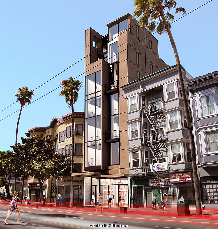
Challenged for looking too upscale and appealing to “wealthy residents that will negatively impact the character of this working-class neighborhood,” the façade of the proposed Mission District development to rise up to seven stories in height upon the former N&S Auto Body Shop at 1924 Mission Street has been redesigned:
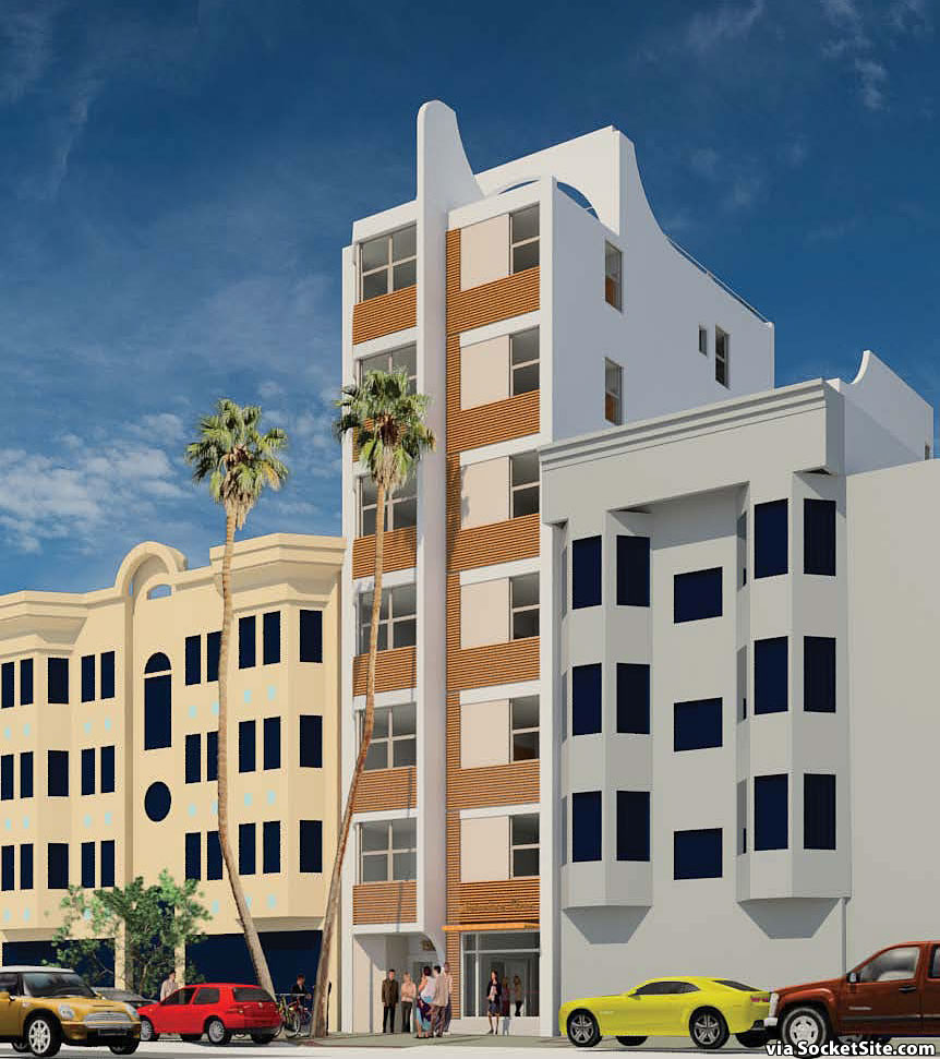
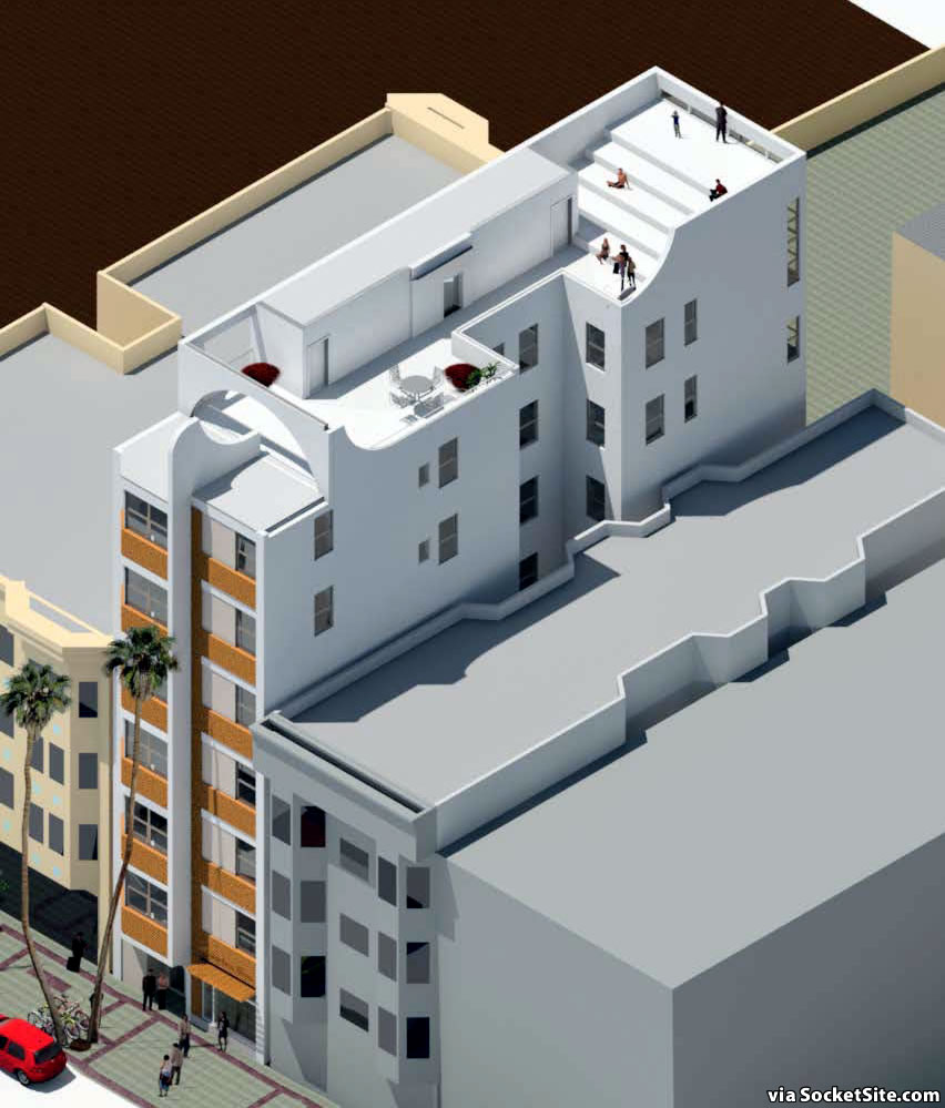
While the project will still yield 11 new apartment and roughly 1,200 square feet of commercial space on its ground floor, along with a storage room for 13 bikes, the development’s large windows (which had been characterized as “a statement of class and privilege”) have been reduced in size or screened; the height of the building’s entry has been lowered; and the building’s roof deck has been setback 10 feet to be less visible from Mission Street.
As such, San Francisco’s Planning Department is recommending that the City’s Planning Commission approve the proposed redevelopment of the 1924 Mission Street parcel, for which the building permits have been in the works for over a year, on Thursday, July 6.
That being said, while the “Department finds that the project modifications, which reduce the amount of glazing on the front façade, appropriately address the concerns” expressed by the requester of the aforementioned challenge, “in accordance with [the Department’s Urban Design Advisory Team’s] comments, additional design revisions are needed to reflect a more traditional architecture, in keeping with the character of the Mission Street Neighborhood.”
And as such, as a proposed condition of the project’s approval (and deja vu all over again), the project team would be required to continue to work with the UDAT to further refine the development’s façade, “to reflect a more traditional design, as is consistent with the character of the Mission Street Neighborhood.”
Is this an April Fools joke?
No, people like keeping things sh*tty. SF hippies at their finest – their own worst enemy.
These people aren’t SF hippies, they’re not even Americans.
chill…out. Some people don’t want SF looking like a mall with zero character. It’s not a big deal to make a small change to make it look less hideous. You people clearly see no irony in jumping down “hippies'” throats over perceived offense (especially considering you don’t even live in the neighborhood in question)
the original design was waywaywaywaywaywaywaywayway less hideous than the revised one, imho.
Does the new design somehow have more “character?” No. Also, the challenge was not about “character,” but based on the previous design somehow looking too “upscale,” whatever that means (and certainly not the word that comes to mind when one thinks of a mall).
This is just so much BS. There are so many more important things to worry about with development in the city. Silliness such as this is part of what makes SF a dysfunctional place.
um… do you have access to their citizenship records? Need to see a birth certificate?
You mean NIMBYs, not hippies
Take the top two floors off the front end of the building. 9 outrageously expensive apartments is better than 11 outrageously expensive apartments. Anyone can see the building is too tall for this block.
Wow, so infuriating. This does nothing to address the petitioners’ gentrification concerns, all it does is make a new building a whole heck of a lot uglier.
the petition is dumb, but i think it looks a lot neater. the other version just looked like everything else. as long as it’s not modified to include bay windows, i’m good.
I think it looks better – it now harkens to some of the Art Deco period buildings in the area, instead of a jarring modern façade.
A laughable comment – the Art Deco buildings were jarring when they went up in a Victorian neighborhood.
Exactly. What is possibly good about fake Art Deco?
fArt Deco
Thanks – I respect your opinion about subjective aesthetics too.
Aesthetics may be subjective, but architectural history and styles less so.
Fake history has no place in real cities (though its been a tactic of regressive, Disney-fied, New Urbanist development for decades now).
You have got to be kidding?? You have no idea what authentic Art-Deco is.
Not sure why I’m bothering to respond, but … did I say “authentic Art-Deco”? NO. I said “harkens to some of the Art Deco buildings”.
@Sierrajeff: I agree that the new design is actually an improvement. The original design looks pretty much like every other new apartment building — this takes a different approach and is more visualizing interesting (IMHO).
I am not sure how this new design is less reflective of “privilege” etc. than the original design — but since I don’t really understand that argument to begin with, I guess it doesn’t matter.
The building paint is now too bright, indicative of the occupant status and privilege. Also the fin at the top is an architectural accent that no one without an excess of capital would build.
It provides a nice canvas for the El Salvadoran gangs to tag.
right – because only rich people have windows – the poor live in the dark. the (lack of) logic here is astounding.
the 2nd design looks like miami southbeach. the 1st is much better.
Totally Agree.
If they add bay windows, I’m going to throw up.
[Editor’s Note: Speaking of which, “UDAT recommends that the facade design facing Mission Street be revised to reflect more traditional design elements (i.e. roof, cornice, bay windows, base, etc.), in keeping with the neighborhood.”]
Straight out of Miami. Where are the pink flamingos?
Flamingos stay on the roof….
But only on the setback portion so as not to be seen from the street as flamingos are exotic and therefore an eyesore to the working class.
Thanks for a laugh I needed just now.
i say keep the original version, and encourage the occupants, and door people, to wear those new, expensive jeans, that come ripped, with fake mud attached: a nod to those less fortunate, which is ridiculous, but so is making it ugly so no one will mind.
I’ve seen pee stained jeans with tears for $250 on Valencia. Like I said, people like keeping things sh*tty in this town.
Some people want to improve their lives and some people are threatened by those with higher standards.
Is the figure in the second floor window in the first version wearing a sombrero?
I think it’s a hipster hat.
palm trees with an art deco feel…..perfect for miami beach.
The second version is more in keeping with the historical character of the mission. Too bad it offends some of you yuppie racist punks!
Why should everything in the Mission look the same? Uniformity is boring.
Your contradictory tone shows your age as well as a lack of understanding of “historical character of the Mission”. There’s nothing overtly historic or relavent about Spanish Revival remods that replaced the Victorian facades between the 20s and 40s. Or the stucco-clad, 50/60s era modernizations that stretch up and down the strip. OR even the shabby 1990s BMR beasts that awkardly consume swaths of Mission.
There’s a lot of architectural character to cherry pick from, but most of it is pretty unremarkable and shouldn’t be mimicked for piece of mind.
Nothing adds value to an argument quite like a gratuitous accusation of racism. But nice to see that you have the sympathy of the site moderators, who are known to censor far less inflammatory comments.
Couldn’t agree more!
Your attempt at satire is a bit weak, but you are spot on with parodying the insanity of some of the NIMBYS in the city who come up with BS arguments to try to stop development in the city.
Neither design looks like anything original to the Mission. And, they both look “upscale,” so now the lame objector will come up with another outlandish objection to try to stop the development.
Both designs are unimaginative and not worth being built and reflect poorly on the owner/architect team that is behind it. The realities of the planning process in SF are not a secret. Learning how to navigate the process (ridiculous as it may be) is an unfortunate necessity right now.
What’s needed in the neighborhood architecturally speaking is some real vision for 21st century design that is subtly infused with the context of the neighborhood, but isn’t some revisionist design pastiche.
The exceptional modern architect Steven Ehrlich used the term “multi-cultural modernism” to describe his firm’s approach to work that “fits” it’s context despite not having any actual architectural elements that are present in the context.
What does this word salad you posted even mean in a real sense?
Perhaps you could point to an example of a building that would meet your criteria. Otherwise, your post seems like gibberish.
Ugghh, the second design is much worse. I’m not sure how it reflects the character of the Mission beyond making the apartments darker.
Maybe they can keep the windows but add bars on them – plus clothes lines on the patios. That and a payday loans office in the street-level commercial space should be enough to uphold the loser class character of the neighborhood.
Hahahaha! So on point. The sooner this neighborhood gentrifies, the sooner they can have nice stuff.
Whoa, is this SocketSite Miami Beach edition? This building must be a copycat of an old building along Collins Avenue.
Success. The units will have less light, the building looks tacky and the white outside will quickly look grimy. We don’t want nice things in the Mission.
Not a problem. Nice things cease to be nice when they’re in the Pission.
completely dumbfounded by this! original design was FAR superior!!!
Who do we contact to voice our disgust with this possible outcome?
The Planning Commission. Their emails are here.
If you live in District 9, you can try contacting Supervisor Ronen too.
Personally, I like the redesign a lot more than the original. More to the point, the challenge and the resulting redesign could have been avoided had the proposer of the project and/or the architect involved engaged with the community, scheduled meetings to elicit input from local community leaders and so on, just like TMG Partners did for their project on the border of Presidio Heights, before submitting the redevelopment proposal.
Why should residents of the Mission not avail themselves of all the tools available to them for influencing the built environment when developers propose buildings that clash with the existing character of the Mission neighborhood but in other, ritzier areas decide to align their proposed designs to respect said neighborhood?
The redesign still looks like a new building. There is nothing about it that reads “Mission,” and the objection that was filed was just part of the standard tricks that NIMBYS throughout the city use to try to stall or derail a project that they know they otherwise have little chance of blocking. The objector did not really care about the old design, and the new design is no better (it is just weirder looking). Now, the objector will try some other nonsense objection.
This should be decided by the sf planning department and not by neighborhoods. The looks are so subjective. This all neighborhood dramas add to the cost of building up and adds to more unaffordable housing . Anyways this part of the street is full of zombies . They are better off without the glassy structures to start with .
“Large windows are a statement of class and privilege.”
I never thought, “Let there be light,” would be equated to, “Let them eat cake.”
“is this a joke?” Class and privilege design due to big windows? Need to redesign to an uglier design. Working class people deserve big windows as well!! This is gross…
It does look tackier and more like poor people belong there now, Congratullations to the design team!
laughing my backside off …. only in San Francisco can buildings look too nice. Message to the Mission: there is no such thing as a working class neighborhood left in SF.
Totally insane. Shame on the Planning Dept. for listening to these [people].
Really, let’s let the NIMBYs ruin the look of anything decent in SF. We should get some people on the Planning Dept. who actually have some taste. No offense but they keep saying that they have nothing to do with design and the stop good design. It’s insane…
Well, the petitioners wanted a crappier-looking building and they are getting a crappier-looking building. Congratulations, I guess?
The Bay Area, and even more SF in particular, is the center of the world for new technology and ideas but we put up the worst architecture! The process sucks and allows people who shouldn’t be involved dictate the outcome. This is a perfect example. The original wasn’t anything to write home about, but to change it for the alternate, makes me sick…
Well, at least with the new design, people won’t be rushing across the street or trying to cross mid-block.
If they wanted to darken the interior and include Mission neighborhood design elements, why didn’t they just put fake fire-escapes down the front of the bldg?
This just makes me sad. Let’s build a crappy, ugly building so that we won’t risk attracting anybody with money.
You shouldn’t be sad. In case you haven’t been paying attention to the real estate market over the past years, the people with money have all kinds of choices and attracting them is not a problem at all.
In fact, developers in most of the Bay Area’s cities nearly met the regional goal for above-moderate income housing, compared with building only 28% of the moderate- and low-income housing goals during the eight years leading up to 2014.
If it was easier to make housing, the above-moderate income housing WOULD BE the moderate-income housing. Your observation is nothing other that, “Bay Area housing is expensive.”
Branching off from the ugly new design, how is it that they can put property-line windows on the upper floors?
Maybe they’re not ‘windows’ – maybe they are translucent wall materials.
Hahahaha, that’s a good one. Gotta remember that for future use.
This new design is awful.
The developer should not have caved to the change request. Using language directly attacking a class of citizen who could afford to purchase the offering leaves those complaints open to outright rejection. I’d have forced the issue.
The new design is slightly less tacky. They could still go a long way to making it fit in with the neighborhood, but that is obviously never going to happen. Architecture is a lost art.
Less tacky?! With those ersatz/faux Art Deco/’historical’ swoops and arches literally tacked on?! Are you kidding?
I don’t even know what to say about this except it feels somehow like it should inspire an episode of Black Mirror.
I thought the exact same thing.
I think what is missed is the way the visual image of the windows on the front elevation are a tribute to the brilliant design of the Parkmerced towers. The wood embellishment will age horribly allowing the structure to blend invisibly in the downscale neighborhood. The hood ornament will remind one of the great ride of the Packard.
Brilliant! Even though the Mission is no longer the blue collar neighborhood it once was we’ve got to keep it looking like it is. We call that authenticity. Sort of like making all these nods to the Castro’s gay heritage just as it’s becoming markedly less gay. Cities evolve why can’t people?
lmao–I couldn’t believe it when I read that objection to the original design. Only in SF.
Ditto. This sort of lowest common denominator design input is depressing.
Architectural best practice is never to build something new and make it look old; you get a Disneyland feel since its intuitively obvious to everyone that it’s make believe. For instance, if you do a renovation / intervention of a building on the historic registrar, the historic commission wants the new construction to be modern so that it’s obvious what’s new and what’s old. Today, you can build with glass and steel. So that’s what people do. Building to look old makes the place look like a crappy movie set. This was a very bad call.
Do you have a link to where this idea comes from for the rest of us? The “never build something new” one, not the requirements to differentiate between new construction and original in the context of a historic building.
Because although I’ve heard this a lot, it seems to be less “architectural best practice” and more like “Dogma”.
Exhibit A: Victoria Mews on Potrero Hill.
Whatever. Let them design it as unimaginatively as they wish.
You let crazy tenant “activists” run wild and this is the kind of lunacy you get…
UPDATE: Plans for a Less Classy Mission District Development in Play