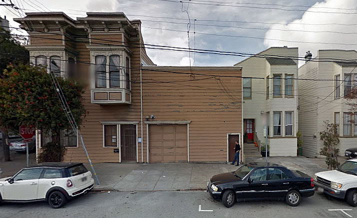
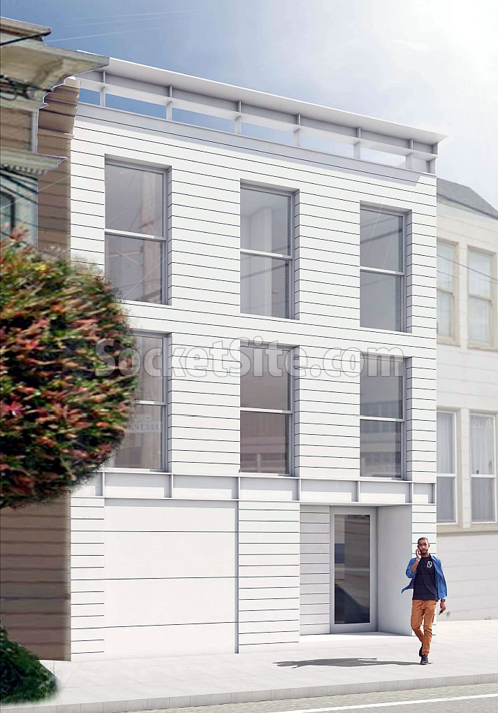
Purchased along with the adjacent two-story Dogptach Victorian at 694 Tennessee Street for $3.25 million two years ago, plans to convert the 1,875-square-foot warehouse/garage at 690 Tennessee Street into a five-floor, 6,111-square-foot residential building are in the works.
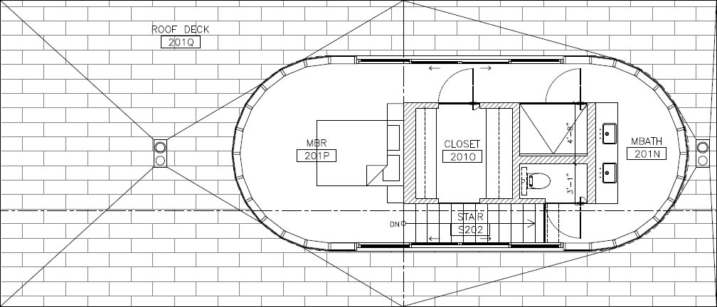
As designed by Natoma Architects, the proposed development features a “capsule-shaped penthouse” suite, which would be set back 18’-7” from the front of the building and enclosed in a glass curtain wall, with access to the surrounding roof deck.
While technically proposed as a two-unit building, with two three-bedroom units and a two-car garage, an architect’s note reveals that it’s also designed and likely to be used “as a single family dwelling.”
And according to a preliminary review, San Francisco’s Planning Department is on board with the proposed design, assuming the modern penthouse isn’t visible from the street. But as the property sits within the Dogpatch Landmark District, San Francisco’s Architectural Review Committee will be weighing in as well. We’ll keep you posted and plugged-in.


Surprisingly contextual for Natoma. The floating I beam as a cornice is a witty touch.
I was really ready to hate this when I saw ‘Natoma Architects’ on the front page. But, you’re right; it’s -shockingly- elegant and appropriate for the surroundings.
Definitely. I’m surprised to see anything built in SF today that is contextual. Off the top of my head I can think of two others: 240 Pacific and the CPMC campus on California.
Note our second to last sentence above with respect to the contextual nature of the proposed design.
I agree that this works really well. It is so much better than the standard approach of having boxy building with some protrusions that are supposed to reference bay windows (but really don’t look like them at all). This is modern but also blends in.
Interesting the way the closet’s open to the stairs….one of those roomy 3-D looks? Or maybe it’s a consideration for………….I might be tempted to consider pocket doors on the closet and water closet.
That’s not awful! Nicely done. Who knew contemporary design could reference the past and still look modern. A small brow over the windows would enhance the Victorian feel.
It looks pretty nice. Love the guy talking on the cell phone out in front — so very 2017!
Perfect as is. Don’t touch it. Would love to see more designs that reference age-ed architecture so gracefully.
I’m not seeing 5 floors. 2 story basement perhaps?
One story below grade on the back of the lot (plus the penthouse).
It startlingly doesn’t have the bleak, chilly imperiousness of NA’s signature maximum security prisons. I’m worried that the iconoclast Stainless is being held hostage by vulgar historicists, or maybe a South African shaman has put a spell on him, cruelly compelling him to design buildings that don’t declare symbolic war against their surroundings…
Still, one less PDR space in a city where PDR space is nearly impossible to find.
Cool! Hope they don’t rape the inside of that Vic.
Plans for completely remodeling the Victorian are in the works as well.
‘Remodeling’ ugh
Double ugh. The socketsite editor should start getting going on adding the “White Box Victorian” tag in order to get ready for the almost certain travesty that will result of said remodeling.
Yeah, “remodeling” a Victorian these days is code word for making it look like a modern office building lobby.
I’m sure it will have all the warmth and charm of a surgical theater.
Very nice. I wonder what it would cost to put a master bedroom pod on the top of my house?
The rendering shows what looks like a garage door, but without a curb cut. Just a rendering error or is this a visual fake-out and the garage entrance is elsewhere?
[Editor’s Note: Rendering error.]
This is exactly the type of contextual modernism that I decried as lacking in that awful Mission District design featured last week, the Miami-Deco-ish project that changed from bad to worse.
Thumbs up.