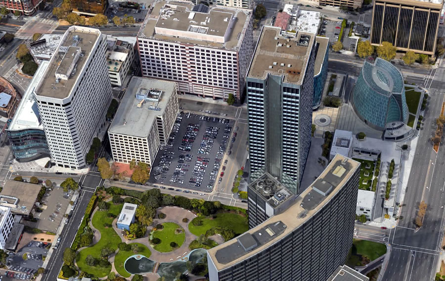
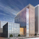
Speaking of major projects being redesigned, the plans for a proposed office tower to rise up to 450 feet in height at 2 Kaiser Plaza (a.k.a. 325 22nd Street), on the current parking lot parcel in the heart of Oakland’s Central Business District, as pictured above, have been completely redesigned as well.
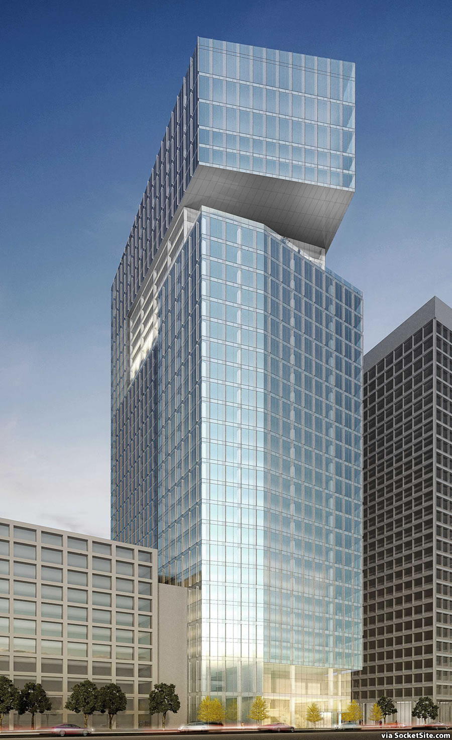
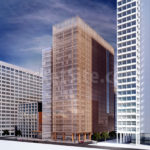
Responding to criticism that the proposed building, as rendered above, appeared too bulky and insensitive to its surrounding context, SCB has returned with a revised design “to break down the bulk” of the building, provide “more refined exterior treatments,” and to be “more consistent with the rectilinear forms” of the existing high-rise buildings in the area:
As before, in addition to the proposed 450-foot-tall, 34-story tower which would yield 1.1 million square feet of commercial space and a garage for 352 cars, an alternative plan for a 250-foot-tall, 21-story building with 670k of commercial space and a 311-car garage to rise on the current parking lot site is an option as well:
In the eyes of Oakland’s Planning Department, however, the tops of the redesigned towers “are awkward and appear more like enclosures for sports courts than decorative architectural features.” And the Department’s staff is recommending that the project sponsor and architect consider changes “to provide an exceptional building that can become an icon of Oakland’s Central Business District.”
The revised plans are slated to be presented to Oakland’s Design Review Committee on Wednesday. We’ll keep you posted and plugged-in.
They proposed a unique building and the City of Oakland demanded they change it to a basic box? A city of arts is managed by a bureaucracy of close minded check collectors.
Sigh…, from a lame box to another lame box. Come on Oakland I love you!!! You can do much better. For one at least add another 100-200 ft to avoid a tabletop here.
I [think] it a good plan for Oakland around [the] Lake Merritt area.
That would have been a very cool building
dealing with the oakland planning commission must be a nightmare
This looks like a bunch of books lined up on the library shelf. Come on, this site right next to the lake deserves something exceptional. Does everything have to be a box with hard edges?
Disappointed to see the design go from something unique to a bunch of “rectilinear” buildings. We work right across the street and was excited to hear something unique was going in.
Either way, construction doesn’t seem to be waiting for an approved plan because heavy equipment is on the site and it is being dug up.
Between this and the Asian Art Museum, the philistines are having a field day.
I work at Kaiser Center so I know the area well. I’m going to [be] contrarian and say I much prefer the new design.
I prefer the new design. High-rise buildings with cantilevers are going to look very dated in the future.
Just to point out the obvious, everything looks dated in the future.
New Design, with the second image taller building at this location. 3rd image looks like it was shortened…
Can anyone point to why the developer is proposing two building height options?
The original proposal took the same approach. I imagine it’s zoned height and then preferred / proposed height increase.
Both are zoning compliant. It’s a hedge based on how much space they pre-lease.
See our note above re: Floor Area Ratio (FAR) limits for the site.
Staff report says ‘needs more information’. I assume the final determination depends on what counts towards commercial FAR and what does not. Gross office + retail + lobby = 865k. I can’t imagine they would go through the hassle & battles for a variance like that just to go ~~ever so slightly~~ over 20 FAR.
As you say, the compliance of the taller proposal has yet to be determined.
It seems a rather common tactic in Oakland – and elsewhere, for that matter – presumably in that there’s a ready-made alternative if the first one doesn’t get approved; and of course economics may dictate a smaller building becomes preferable. (Though I think there are usually differences other than height b/w proposals…not much point in a whole set of plans if the only remedy is “shorter”)
I’m curious what all the efficient market theorists have to say about building – finally – in what many people think may be just in time for a downturn; if the excuse is that “building didn’t pencil out” until now, then do they think rents will go even higher, or at least continue this high, for a sustained period…or is the alternative explanation that (many) developers are reactionary and don’t really know s^&* about what’s going to happen next, at least plausible ??
Downtown Oakland’s office market is very tight and extremely under built. Oakland’s downtown economy has been artificially suppressed in order to accommodate SF projects and developments. Oakland lost the Cost Plus headquarters to Alameda due to a lack of office space. Oakland is situated in the center of the Bay Area with 3 downtown stations and 3500 units of housing under construction. There are still surface parking lots available for more highrise office towers.
While the site doesn’t have a height limit, it does have a Floor Area Ratio (FAR) which is set at 20 square feet of building per square foot of lot size, which would appear to limit the parcel’s development to a maximum of 892,000 square feet.
As such, the taller proposal, which totals over a million square feet, could require a variance while the shorter proposal would not.
I did like the fist taller option, but the city should definitely go with the taller option of the new version. More square footage=more property taxes for the city, and additional employee space.
Sorry, but 70s office blocks aren’t a context worth being sensitive to. It just perpetuates the problem.
That Ordway building is a thing of beauty.
The rounded look of the Kaiser Building is also magnificent. That’s a landmark building for the Bay Area.
There’s a rumor that Oakland Planning is going to force the Kaiser building to take off the rounded portion by filling in the corner.
I heard it was the TransAmerica Pyramid. People have been complaining for years about how those elevator shafts stick out of the top floors.
Only boxes allowed.
I tried to go to a meeting at the planning department wearing a colorful scarf and they made me take it off. They gave me a beige suit jacket with shoulder pads to wear, everyone in the building was wearing them
As much as I appreciate the original proposal’s attempt to be more (as the city puts it) “exceptional” in its silhouette, I definitely prefer the massing in the second round of proposals.
Breaking up the massing is probably the best thing going for this design. The city should focus more on pedestrian/streetlevel experience over skyline aesthetics.
I think they should make it like the Transbay pyramid. Then we can have one too.
I’ve seen great downtown architecture in Boston, Chicago, NYC, Austin, etc. Can we only build boxes and silos in the Bay Area?
Whatever Oakland does must be purposely made mediocre otherwise Oakland wouldn’t be Oakland. What a bunch of stupid expletives.
Oakland Planning wants an “exceptional” building. Ironically, a recent article in SF Business Times related how SCB has become a favored architectural firm of Oakland developers (5 projects currently approved with more in the works) known for their frugality of design and function. And that’s before the Value Enginnering!
[Editor’s Note: See Articles Recently Tagged: Solomon Cordwell Buenz (SCB) for SCB projects past, present and in the works.]
Aren’t Solomon Cordwell Buenz also popular in SF? Oakland is only 30% of their projects.
The 4/28 SFBT article was entitled something like “Architectural Firm remakes 2 cities skylines” (SF & Oak) but focused upon how SCB is dominating the current spurt of development in Downtown Oakland and that their cost-consciousness in design is a definite reason for their popularity.
it looks like the old Crown Zellerbach building in San Francisco at Bush and Battery. From 1959.
Probably my favorite building in Downtown San Francisco. Just about the only building that doesn’t feel dated – and it’s almost 60 years old!
Seems like they could have preserved at least some of the unique elements while still scaling down the massing, right?!
Hmmm… ….Maybe they could put the unique elements on the top to the interior.
The first thing that struck me was how the new building is practically smashed up against the the Ordway. Terrible. That was actually approved?