The proposed expansion of San Francisco’s Asian Art Museum at 200 Larkin Street has been completed redesigned.
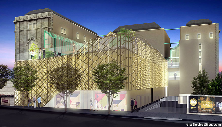
The extruded aluminum screen which was envisioned to wrap around the expansion and existing structure below, with a matte finish and champagne color to complement the building’s limestone façade, is gone, having been found to be “not in keeping with the existing tonality of [the building’s] facade materials and finishes” by San Francisco’s Architectural Review Committee last year.
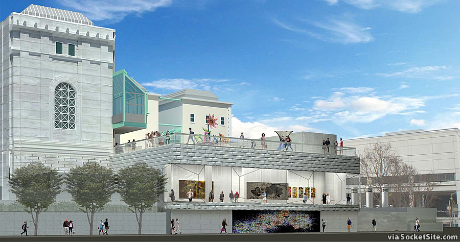
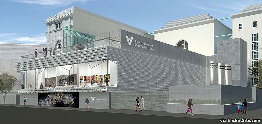
And instead, a more “compatible” design has been drafted by wHY:
The new design incorporates a panoramic window intended to “activate” Hyde Street by revealing the art and activity inside the pavilion lounge and strengthening the connection to UN Plaza.
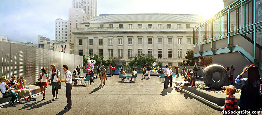
And while the new outdoor roof terrace over the proposed one-story addition, which is to be used for both outdoor sculpture exhibits and events, remains, the canopy structure is gone as well.
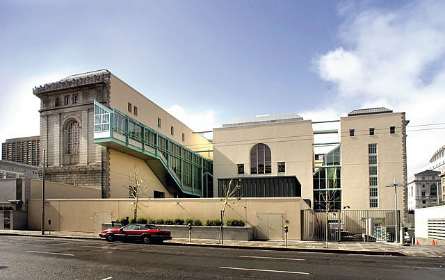
Owned by the City and occupied by the Asian Art Museum via a long-term lease, the 200 Larkin Street building, which is a contributing resource to the Civic Center Landmark District, was constructed as the city’s Main Library in 1916, designed in a neoclassical Beaux Arts style by architect George A. Kelham, with alterations in 1996 by architect Gae Aulenti as part of the building’s conversion to museum space.

The Asian Art museum is great – so an addition is wonderful. But it seems really weird to basically be building a 2 story building in the Civic Center? The scale reads as Walnut Creek suburbs.
I assume it has something to do with historic preservation, staying below existing windows and generally not modifying what’s already there. Not that I agree, but these are normal limitations.
I like the new version! The window is perfect for keeping eyes on the street on Hyde, I hope this gets built!
Like idea of activating Hyde; but the uninspiring addition looks like a drab 1970s shopping mall cafeteria. This, in the heart of a growing area (Mid-M, Hub, Hayes, Van Ness, Hayes). Keep Hyde concept; redo entire addition design. It’s a museum after all — take into consideration the evolving area, think big and take a risk!
heaven forbid the asian art museum look to asia and hire a chinese architect to do something really audacious like the beijing olympic buildings or a japanese architect to reimagine a minimalist concrete teahouse.
instead we get this.
an american firm w/ a thai born founder creates a suburban shopping mall under the eye of city government.
lucky us.
Completely agree – this design is way too uninspired and bland, reflecting the attitude of most contemporary SF architecture.
Museum commissions present the rare opportunity to challenge the architectural status quo. We luckily can see this potential even in local examples like the DeYoung, SFMOMA expansion, new UC Berkeley Museum and the Shrem Museum at UC Davis. As such, this Asian Museum expansion really is a huge missed design opportunity.
There are so many great architecture firms with Asian partners/founders (even some local ones) who could’ve stepped up and delivered a far stronger design than this banal box. Hopefully the renderings shown here are not a done deal!
Are you kidding? The “Bird’s Nest” stadium was by Herzog & de Mueron (Swiss), the aquatic center by an Australian firm, what amazing Chinese architecture are you referring to? Furthermore, why mention that the architect is Thai? Seems Asian enough to me.
actually, the chief architect and conceiver of the “Bird’s Nest” was Li Xingganga and the final product is considered a joint venture also including Herzog & de Meuron, project architect Stefan Marbach, and artist Ai Weiwei. it is based on chinese basketry….not suburban American mall architecture.
and i don’t think you can argue that a lot of really great global architectural is now birthed in china and japan.
as to the Asian Art Museum, the current architect of record IS American, of Thai descent and a successful immigrant story (which I felt was relevant in today’s America and I suspect was part of the reason this firm and design was chosen. it seems an attempted nod in the right direction but not one that went far enough to me).
Anyone want to explain the Asian Museum logo? The upside-down A?
Mathematical symbol that means “for all”
I’m not sure aesthetically one can pleasingly have cladding in the granite block direction hovering over a field of modern-direction glass. Not to mention there’s no lintel, nor posts. I’d have to say lean more modern, or lean more traditional, but one can’t tap dance and ballroom dance simultaneously. The skin reminds me of Z-brick.
How drab the new design appears. Definitely prefer the juxtaposition of the earlier proposal though working in the window on Hyde of the new would be an improvement. This “matching” of new to old is even less successful than facadism’s preservation of old with new.
How…predictable.
Both designs are a hot mess!
Will it have a moat and drawbridge?
A “monstrous carbuncle on the face of a much-loved and elegant friend”. ( HRH Prince Charles regarding a similar museum addition in London in 1984)
while they’re spending all this money, why not deal with the terrible loading dock on the corner.
Architecture is a lost art.
Imagine if someone designed an addition that not only actually complemented the existing old library building, but also evoked the historic architecture of Asia? Would that really be impossible? Instead we get modernist crap of one kind or another
If they really want to activate Hyde, then they should put in a street-level café or shop – both designs leave in place the block-long, pedestrian-Unfriendly windowless wall.
And note that the new design now includes a spur tower (stairs? elevator?) that blocks the current window wall between the northern and central pods of the existing museum.
In short, this is *horrible* all around, and an embarrassment. They should take a page from SFMOMA, and do a complete rebuild of the entire Hyde side – not some piecemeal shoehorning of a yet-one-more-style “addition”.
Personally, I’d rather they pulled inspiration from the lattice work on the windows of the original structure vs the stonework. Whatever though.
The problem is that an excellent period Beaux-Arts library was converted into an Asian art museum. The building should have been preserved for books: the special collections of SFPL, the California Historical Society, or another collection.
A new building on some other site should have been built suitable to Asian art, perhaps by an Asian architect, but reflecting our times.
You can really see everyone twisting the architect’s arm with this design, beat down with endless one dimensional speeches about fitting in. Of course it’s utterly unremarkable.
New and older building has never looked anything like Asian. Create something dramatic and new reflecting Asia and Asian art.
My observations over the past 30 years have been that whoever happens to be negotiating approval of major building designs in San Francisco has horrible taste, as evidenced most recently by turning down the inspired initial design shown and approval of this incredibly mediocre one. Is it design by committee? I love San Francisco. I love good architecture, and I am perpetually embarrassed for us by the prevailing mediocrity or flashy, cheap-looking gimmickry of what they approve. It’s a continual insult to me (minus a few exceptions) as a San Franciscan.
Why not take the granite blocks (bigger scale ones), and place down adjacent to the sidewalk, same scale as the big block granite there now, run it about 15′ high, and then unleash the original version atop that? That way a nod to the old, yet also fresh and new.
I’m still looking for the books they threw out when they moved the library.
From exciting to dull. Who are these people on the San Francisco’s Architectural Review Committee?. Dullards for sure.