Newly built on a Noe Valley parcel which was purchased for $900,000 back in 2011, at which point a 1900s-era fixer without a garage occupied the site, the designer five-bedroom home at 4352 26th Street is slated to hit the market early next year with an asking price that has yet to be determined.
Designed by John Lum Architecture and SF Modern, the four-level, 4,800-square-foot home features a rather dramatic main level, with an open floor plan, a double-height ceiling over the dining area, and big Noe Valley and Downtown views.
The kitchen is outfitted with high-end appliances and a custom designed island with a pull-out breakfast bar.
Custom millwork and designer finishes are featured throughout.
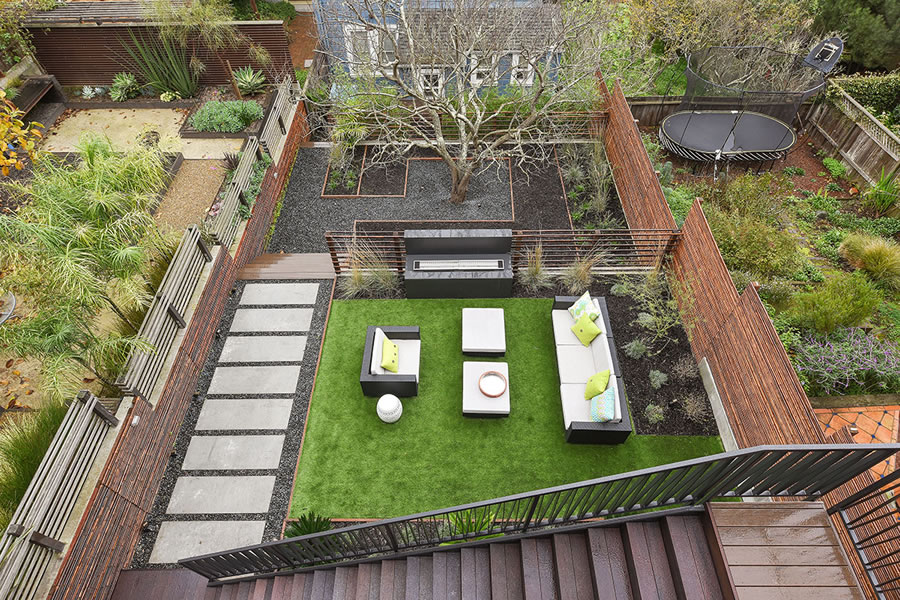
The home’s garage can accommodate two full-sized cars via a full-floor lift system. And yes, the terraced rear yard includes a fire feature.
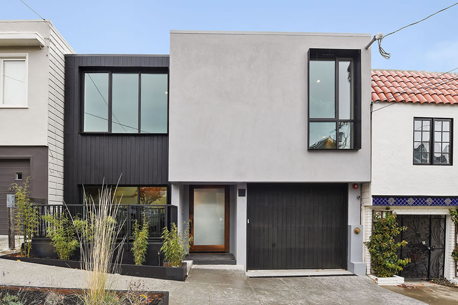
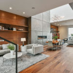
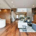
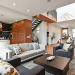
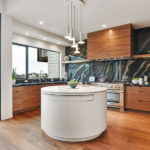
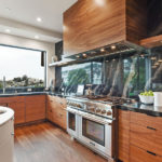
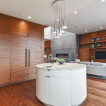
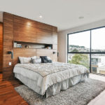
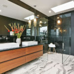
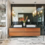
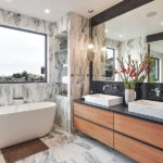
I like the wood paneling inside – adds warmth and yet still feels modern. The central space below the skylight probably feels huge and gracious.
IMHO the front facade doesn’t measure up to the rest of the house, especially for new construction. That vertical siding must be special somehow but reads a little cheap to me. I would also question the fairly specific marble choice for the kitchen counters and backsplash. It’s pretty, but not for everyone. Round kitchen island also a specific choice.
4,800 sf * $1200 = $5.76mm? Fade the market and it trades at $4.8mm? I’m probably wrong here. Good luck to the developers – this was not a cheap time in the market to build ground-up.
The paneling was a nice idea, but poorly executed- the grain patterns are ill matched from one cabinet surface to another. A small thing, but the devil is in the details.
My exact thought. The graining on the refrigerator doors is especially disconcerting.
Really well done
So, what’s with the disappearing/reappearing electrical panel in photos 8 and 11? (And a couple other photos where it’s there, then it’s not!)
If you mean in the ceiling of the bathroom, then you’re probably talking about a fan & its reflection in the mirror. Otherwise, I’m not seeing what you’re seeing.
Look at website photos: it reappears on photo #13, then disappears again on #22.
No, no. The electrical panel on the bit of wall next to the staircase on the main level of the home. It’s there, then it’s not there. Then it’s there…
You have to look at the photos in the actual listing to see it appear and disappear. (It’s also in the second photo of the first multiple-photo set here on SocketSite, but photo 2 is just a glancing look at it and in #3 it’s gone.)
Now I see it. Really strange they would try to hide it. No home sells without being toured. And what a strange place for an electrical panel. Just put it in a closet.
My contractor tells me that it is against the code to put electrical panel inside the closet. Is this correct?
Code does not permit an electrical panel inside a closet.
Good eye Bob. Yeah, they ‘shopped the panel out in photo 11. Then it reappears in 13. Gone again in 22. Weird. Makes you wonder what other cheating was done in the photos.
What is baffling is why didn’t they just paint the panel door the same color of the wall. Paint is the easiest way to conceal something ugly. And if paint doesn’t do the trick, just hang a picture over it.
Better yet would be to locate the panel in the laundry room. Placing it right in the middle of the great room seems like a bad choice.
Now I’m starting to think that the builder actually relocated the panel to the other side of that narrow wall between the staircase and the portal. Generally relocating a big panel like that is next to impossible, but flipping it around so it faces away from the great room could be feasible. No wires need to be rerouted if there’s enough slack. Probably a day’s work for the electrician alone and worth it at this price point.
So maybe there were two photo shoots, one before and one after relocating the panel?
I think there was just one photo shoot. The potted plant is exactly the same in both with- and without-panel photos. I suppose they might have retaken an “after” photo from the exact same position as the “before”.
They probably decided to flip the panel, as you suggest, and maybe photo-shopped because it was going to be that way…
Would require changing the function of the area on the other side of the wall, though. In the plans it’s a closet, but as others point out that’s not a legal place to put a panel. I guess they could make a “study nook” with a built-in desk.
I have to wonder if the decision to step down into the first-floor living area was forced by the neighbor (or fear of the neighbor) insisting the house be lower than theirs. It seems like an odd choice.
What ever the reason, it’s clumsy and ungracious. Greeting a group of visitors looks dangerous.
Love the hot tub in the kitchen!
It’s nice but I don’t understand buying in that part of the city at Pac Hts prices.
For a demographic that is quite real, the extra hour a day getting onto freeways from Pacific Heights is a nonstarter.
It’s striking how much flexibility an extra 5′ of width get you in a floor plan. I wish my lot had been 28 or 30 feet wide.
The marble used in the kitchen isn’t my cup of tea. But why on earth pock-mark it with cheap electrical outlets like that?
Also, whoever laid out the veneers for all that casework needs to have his or her vision checked. Many areas look like a drunken attempt at book matching.
Regarding the comment on Noe Valley vs. Pacific Heights: the market this is aiming for wouldn’t be caught dead in boring, auto-oriented, fussy old Pacific Heights. To each their own taste.
The original house was much more adorable. Oh well…
It is a little bit much for Noe, both in terms of aesthetics and price. I pass through this block several times a week and the home hardly warrants a second look from the outside, though being somewhat under cover can be a good thing.
UPDATE: Designer Noe Pad Priced at $6.8 Million
if i see one more raised bowl bath sinks i am going to barf on my keyboard. hoping ’17 purges us of those horrid objects.