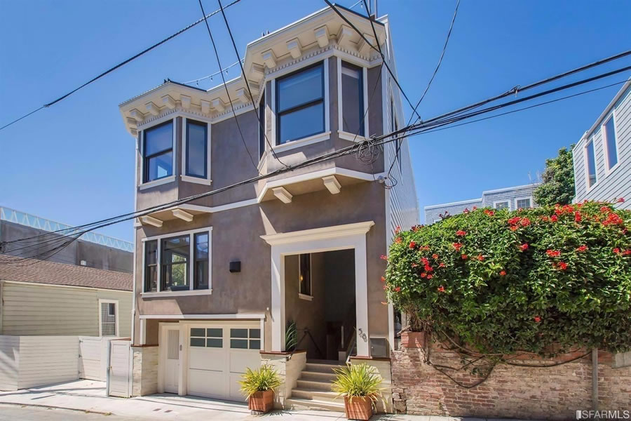
Newly built in 2012, the 2,700-square-foot single-family home at 58 Wilmot Street, half a block off Fillmore in Lower Pacific Heights, sold for $2.55 million that October.
The kitchen opens to a terrace as does the rather sweet master suite which features a protected wrap around deck, fire pit and an outdoor shower with views.
And having just resold for $3.1 million, once could easily call it evidence of a 22 percent gain, or an average of 5 percent a year, over the past four years.
That being said, the home also traded hands for $3.3 million in April of 2014. So more accurately, the sales suggest a 30 percent gain from 2012 to 2014, followed by a 7 percent loss to today.

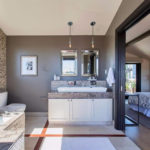
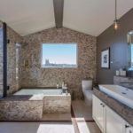
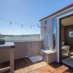

Number of days a year the outdoor shower is functional = 0
Outdoor shower with views (for your neighbors).
I know a surfer who uses his deck shower all the time. He doesn’t want to trudge through the house in a salty wet suit and rinses off on the deck first. The wet suit makes the outdoor show bearable in cold weather.
But that guy lives a lot closer to the Pacific than this place in Lower Pacific Heights.
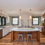
Overpay for “unusual” (dated? Home Depot-ey) finish choices, don’t expect great financial outcomes. It’s not simply location-location-location. It’s location-size-finish. Even the exterior paint choices could be easily improved.
Agree. The sale price reflect the fact that the interiors are not great. My bias is that no one should be allowed to build a new house that tries to look like an old house. It rarely works. How about that fireplace vent(?) right in the middle of the front facade?
My guess, which could be wrong…a design and build firm (a contractor who thinks he/she is an architect).
That first floor window is really clumsy. The size, design, and placement is unappealing.
The second floor bay windows also seem to be too big. They “loom” over the façade.
Why is modern design-build so horrific?
Why is modern design-build so horrific? It doesn’t have to be and sometimes isn’t. When it is, it is due to lack of real design capability, and because, generally, I think you get a better product when the architect (among others) is holding the builder/general contractor accountable for execution and details and design. Just my opinion.
Oh, and did I mention the vent right in the middle of the front facade?
Unless the market has changed, the same discount/premium for the location, size and finish of 58 Wilmot, all of which are above average relative to the market in general, would have applied in 2012, 2014 and this month as well.
It’s true – yet no one can prevent a buyer from overpaying. Not sure the latest buyers got much of a deal either.
Is that a fireplace vent? I thought they were going for the Brooklyn style slam in place air conditioner look. Something about those open view toilets is also slightly bothersome…
I don’t think it’s bad at all, though a few things could have been improved. The fireplace might be fixable with an Ortal, which has a vent technology that might allow for removal of the vent on the front. Would be nice to have a toilet room in the master bath, but sometimes spacial constraints dictate. Finally, the facade isn’t a big deal since it’s a pretty narrow street, and location trumps curb appeal here.
They could have just run the flue inside the walls up to the roof. That would have added only a few hundred extra to the construction costs. The wall vent is just the cheap way out. Fine for side or rear walls, not the front facade.
One of the best examples of visually nauseating hodge-podge I’ve ever seen.