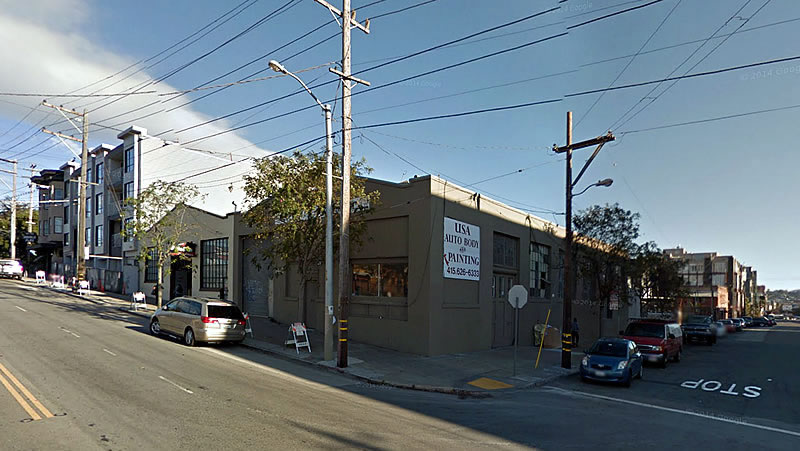
With an exemption from having to complete a lengthy environmental review in hand, and the paperwork for a permit to demolish the two auto shops on the southeast corner of 16th and Florida Streets having been filed, the refined plans for a modern seven-story building to rise on the 2435-2445 16th Street site are slated to be approved by San Francisco’s Planning Commission this afternoon.
As designed by D-Scheme Studio Architects, the proposed Mission District development will yield 53 condos (a mix of 30 studios/one-bedrooms, 18 two-bedrooms and 5 three-bedrooms) over 1,600 square feet of restaurant/retail space, 2,000 square feet of commercial PDR space, and a basement garage for 40 cars to be accessed by way of Florida Street.
A 4,600-square-foot roof deck and 2,000-square-foot courtyard would serve as open space for residents.
The development will cast a shadow on the edge of Franklin Square to the east, but the 0.00429 percent increase in shadow hour square footage has been deemed “insignificant” by the General Manager of the Recreation and Parks Department, in consultation with Recreation and Park Commission.
If approved, nine (9) of the 53 condos will be offered at below market rates, as required by San Francisco’s inclusionary housing program.
And while the City’s Planning Department has received 21 letters in support of the project, the Mission Economic Development Agency (MEDA) is opposed, citing concerns that the project is “only proposing to provide the minimum amount of affordable housing required (16%),” the loss of 8,000 square feet of PDR space, and that the number of parking spaces (40) is too high for a transit corridor.
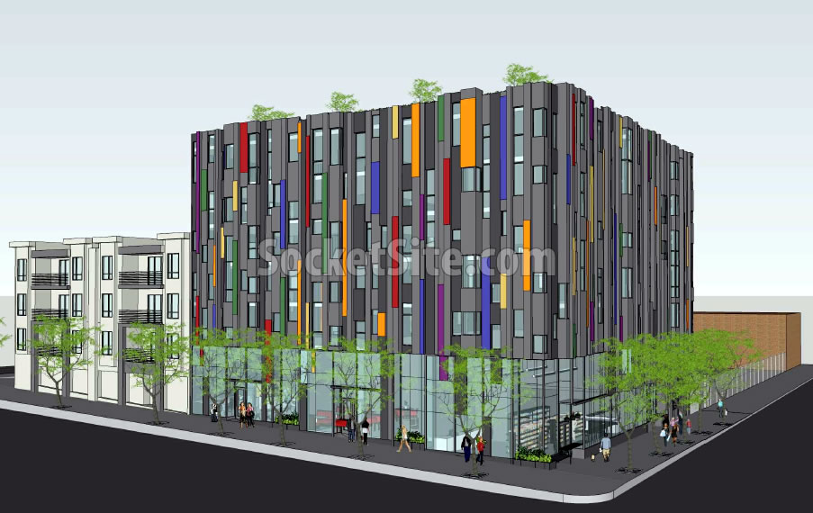
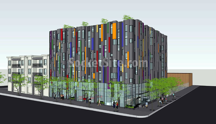
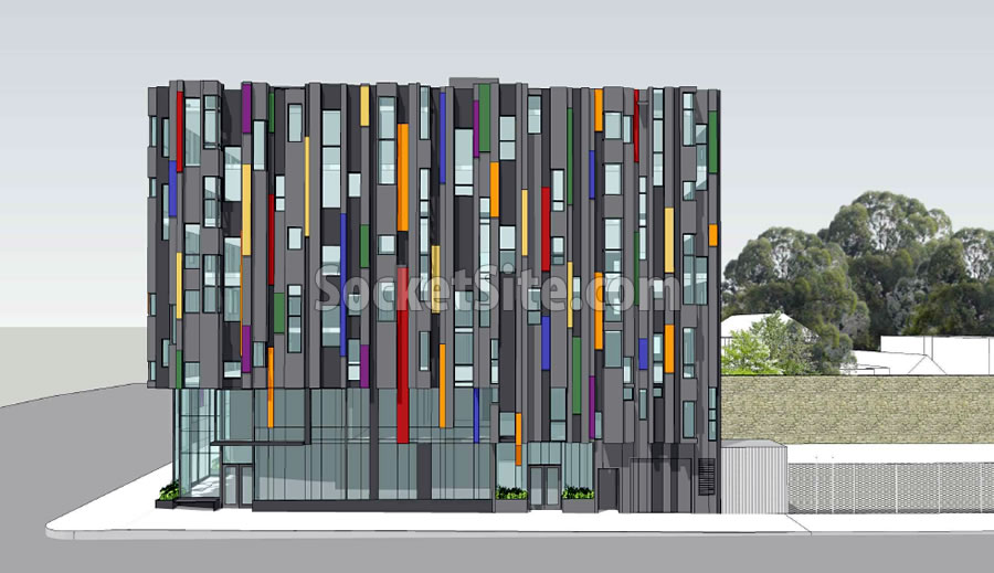
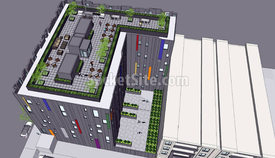
It’s hard to tell from the rendering- this could either be very interesting and successful, or super ugly.
Agreed!
fun colors! I like it!
I wish if it were possible for planning to approve it after they see a 6-8 foot tall mock up of the exterior cladding/ window. We do these all the time for our exterior core and shell projects before construction begins.
They cost about $100,000 but are TOTALLY worth it. Everyone knows what the finished product will look like and there are no surprises regards color, texture, window frames, sealants, glass tint, flashing etc.
Despite being someone who absolutely rejects the legitimacy of localities requiring “design review” as part of securing entitlements and permits – and sees it as nothing more than an unholy alliance between NIMBYs and busybody architects – this building looks like its walking WAY close to the edge of sheer FUGLY. Maybe even the Platonic ideal of fugly. Like, when you see something that is fugly, you recognize the essence of fugliness in it, that is a pale shadow of pure abstraction of fugly that is this building.
This project will be interesting, colorful, and yea interesting and colorful! And will add some much housing to the Mission.
You qualify as a NIMBY by insisting that somehow 3 to 7 story buildings are *always* better than high rises, whether they be 8 or 10 or 20 stories, regardless of context. Bizarre that you would think otherwise.
Folks, we may be starting to win if people opposed to actually maximizing sites are refusing to call themselves NIMBYs. This Wonk is a NIMBY.
Regardless, its money crazy development. With [the loss of] another much needed commercial space.
Yeah, but it’s lost to much needed residential space.
The building includes over 3,600 square feet of new retail space.
The building that’s being replaced is a 10,000 square foot commercial building.
They should force the parking underground. So short-sighted. Sigh.
One approach I read about, which I liked, was that the city required any aboveground garage space to be readily convertible to other uses should the need arise (for example, by requiring standard-height ceilings).
Given the vacancy rates in most SF commercial districts (albeit not auto shops, but) how can you make such a definitive statement that “commercial space is much needed”?
Given the rents being charged, I think it’s pretty clear that commercial space is very much desired. The fact that some landlords are apparently so unconcerned with money(?) that they prefer to let space go unrented is odd, but does not show that space is not needed.
Gotta make room for that parking garage.
The Mission Economic Development Agency is a PO Box as far as any of my neighbors are concerned. What guiles us the most about the “PDR” choc-a-bloc zoning in this area is that it reeks of Environment Injustice. In Pacific Heights they wouldn’t let people spew pollution into the air 50 feet from housing like they do in this part of the Mission.
All the PDR thing was was a device to lock down land values and try to force the owners to sell at artificially low costs to — who else, The Mission Economic Development Agency’s client developers. Thank goodness their little scheme backfires pretty much on a daily basis. But the pollution issue needs to be addressed.
Actually that is NOT the history of PDR zoning in San Francisco. The PDR zoning designation represented a compromise between developers who wanted to build residential and mixed-use residential projects in certain traditionally industrial & mixed-industrial areas in SF (like SoMa and parts of the Mission) on the one side, and community activists on the other side who were concerned about the loss of industrially zoned space in the City, and the working class jobs those kinds of industries provided.
PDR was a “kludge” zoning designation that provided a sop to community activists while at same time providing a zoning designation that was more flexible than a light industrial designation.
Thanks SS editor for your so open minded but biased censorship.
[Editor’s Note: Try attacking the argument, not the individual.]
While I sympathize, how many of these types of business were in the area before the housing was constructed?
This is hideous looking imho
I can’t get over how these renderings make the site look flat. How they gonna do that?
Oh, you noticed that too…huh ?? It looks like a 6-8% grade on the (I guess it’s) 16th Street frontage > the building should lose a half-story or so going up the hill. They also made the apartments at the end of the block disappear…. guess the Auto CAD was set on Witchita, or somethin’
How are they allowed to build a 7-story building in a neighborhood where all buildings are 4 stories or lower? This will stick out like a sore thumb!
Heavens! it will tower over everything!!!
(Except for the new building two blocks away on the other side of the park)
Is this the junk that contemporary architects defend? I can’t even fathom how this is considered architecture.
MEDA’s objection is laughable. I wonder how many of their members support paying their min. wage employees double what the law requires…
this is the second multi-family housing project i saw from the same architect – another horrific design. Agree with Serge, how can this be considered Architecture? they should stick to their TI build outs.
Wow….this is incredibly ugly. It is so brutal. The architects should complete this building with iron bars across the slits called windows and name it “The Dungeon”….this is way harsh. Is this meant to be a correctional facility?
Even by SF architectural standards, which are not great or even good, this building is indeed ugly.
What is it with the craynola colors? If they are meant to hide how bad the underlying design is they are fail at that completely. IMO.
What is the point of having a Planning Commission and design guidelines if they allow something like this to be built?
Because surely having as many people as possible signing off on our designs will lead to superior architecture. I mean, it has already right?
Its a tough call. Dallas and Houston have much looser design controls and, though they don’t get great architecture, they get architecture better than SF.
Of course there is a need for a Planning Commission and design review, but it needs to be done w/in general guidelines.
Taking this project – the flat roofline is awful. Such projects should be required by code to develop non-flat rooflines. How they do that, there are many ways, is up to the architectural team.
POPOS must be required in all medium sized projects – and larger.
Blocky buildings, such as this, must be forbidden by code. If nothing else, building insets and articulations should be encouraged.
The streetscape has to be more than planting 3 spindly trees.
There must be some deference to the context of surrounding buildings. In this case the craynola colors are absolutely out of place, in context, and should not be allowed by code.
Keep the design guidelines as general as possible, but require them and require the PC to adhere to them.
Why do we have a Planning Commission?
Well so the Supes and the Mayor all have plausible deniability. It’s a brilliant way for them to not be responsible. Duh!
Looks like a cross between a Stage IV metastasis and a Borg ship. O, God, pluck out mine eyes.
Hate the colors. Looks kitschy.
I want to like it, but do not. The building looks commercial, rather than residential, too bulky, windows too small.
Looks like a cheesy disco light (namelink)
Stalin would be proud
UPDATE: Mission District Parcel with Approved Plans for 53 Condos in Play