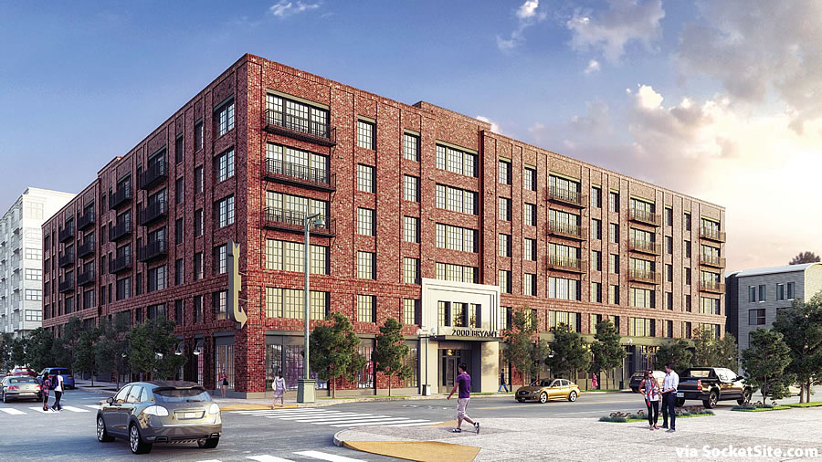
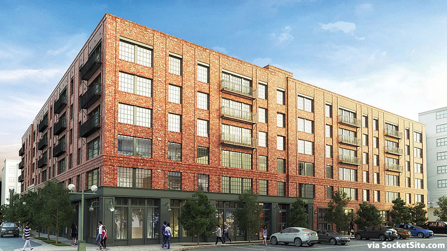
Facing pushback from the neighborhood and powers that be, developer Nick Podell and team circled back to the drawing board and returned with a “completely reimagined” proposal for the development of 2000-2070 Bryant Street, a project which could rise across the majority of the Mission District block bounded by Bryant, 18th, Florida and 19th Streets.
Under Podell’s new plan, the southern third of the site, the 2070 Bryant Street parcel, would be dedicated to the Mayor’s Office of Housing and Community Development for the construction of a Below Market Rate (BMR) building, as we first reported earlier this year and is now roughly rendered in white behind the brick building above.
Based on a preliminary study, the 2070 Bryant Street parcel could support the development of 136 BMR units and the Mayor’s Office of Housing has tentatively agreed to accept the parcel to fulfill the inclusionary housing requirement for the development as proposed.
Upon the northern two-thirds of the site, the proposed 2000 Bryant Street building would rise six stories in height, with 186 market-rate apartments and 3 rent-controlled units (to replace those which would be razed to make way for the development) over a garage for 85 cars and 7,000 square feet of retail space at the corner of 18th and Florida.
In addition, 4,000 square feet of new PDR space would front the development’s proposed mid-block passage between the market rate and below market rate buildings.
And as envisioned, the 2070 Bryant Street building would include 7,000 square feet of art space, but the former CellSpace turned InnerMission at 2050 Bryant would be razed.
While the City’s Planning Department has received “numerous” correspondences from the public regarding the reimagined project, “much” of which has expressed opposition (including a petition entitled “Turn the Beast on Bryant into a Beauty on Bryant” which seeks 50,000 square feet of PDR space, a 50/50 split of the site for affordable housing, and a guarantee that both buildings will be built at the same time), the Department is recommending that the 2000-2070 Bryant Street project be approved by San Francisco’s Planning Commission on Thursday, May 19.


I think I’m missing something, the brick building looks almost identical to the previous design…
The footprint of the brick building is over 50 percent larger than originally proposed.
And between the brick building and dedicated affordable parcel, the potential unit count for the site has increased from 274 to 335, with 196 market rate apartments (31 fewer than originally proposed) and 139 below market rate units (an increase of 92).
But the new plan doesn’t fund the development of the affordable site.
Ok, so their “completely reimagined” line is a little misleading.
While the design aesthetic hasn’t changed, the proposed plan is dramatically different.
wait wait…they’re trying to demolish and ENTIRE city block? i’ll take those houses, what a waste.
The “percentage” of affordable has become so meaningless now. Even though it’s 33% of the land, it’s more like 40% of the total units… and the developer doesn’t even get a density bonus on the market-rate portion of the site!
Considering the size of the land dedication, the developer has the right to ask for up to a 35% density bonus while blowing out height restrictions and parking minimums.
Many SF groups have vowed to go nuclear on any developer seeking to use the State density bonus, a bonus which is now *routinely* used in Berkeley and Oakland. Prepare the popcorn popping apparatus.
there are at least a dozen projects lining up to do so and one developer told me he’s willing to use the SDB as a battering ram against obstruction.
Please no fake brick veneer. If the builder wants to reference the industrial vernacular, use something more appropriate for earthquake country. Fake brick is insincere and tacky.
I couldn’t agree more.
They should also add fake silos, fake exterior duct-work, fake rooftop water tanks, and fake smokestacks with LED imitation gas flares on top. You know, to make it all look more industrially. Also add scent dispensers throughout the building, that emit an air of fish-processing and diesel. Hipsters would totally go for it.
That will go perfectly with all of the fake jobs the people in the market rate condos will be working at.
San Francisco has mad irrational love for brickwork.
get over it — brick tile acts like a rainscreen just like any other exterior finish material. in fact, it’s much nicer than the standard FCP panels or lap siding, plastic-composite imitation wood, or shiny oil-canning metal paneling. just because they’re not structural doesn’t mean they’re fake. all buildings have a purely aesthetic epidermis, this one will look great. careful what you wish for … also, authenticity is dead, bro.
Seriously doubt your claim that this particular brick clad panel system is also a rain screen system. Those require a complex waterproof membrane and drainage system. The panels must be held away from the membrane on a clip system, and the brick panels would have to have open spacing at all sides to ALLOW the rain to percolate thru.
This just looks like a more traditional (and often used) precast concrete panel with factory applied bricks attached to a steel or concrete subframe. Good example over on Battery Street is the Levi Plaza headquarters complex done in the late 70’s.
I’m not complaining about the functional qualities of the veneer, just the aesthetics. Go ahead and use panels with similar qualities, just don’t make them look like red brick. There are plenty other patterns and designs to employ.
And there certainly are authentic industrial buildings constructed today. You have to step outside of SF to see them.
I go with AA; and furthermore is it actually a veneer or a wythe . Sure, the former is tacky – unfortunately not so much literally (i.e. they tend to fall off) but the latter is a time-honored practice.
(And technically, it COULD even be a bearing wall… though I doubt it)
Sorry, I didn’t mean veneer in the traditional mason’s sense. I meant those precast panels that are about 1-2″ thick and look like red brick and mortar on the outside.
I live 5 blocks away and I say … Build it!
It takes years for developers to jump through all the hoops to build something … And we wonder why housing is so expensive
you should come to the hearing on 5/19.
The more prices increase, the more community benefits that can be extracted. What a perfect system.
I like the look – I hate SF goofy planning.
So, in order to appease some neighborhood radicals, the developer is sacrificing 1/3 of its land—which would have been built conjunctively alongside what is now the proposed market rate section, adding 100+ units of (arguably well designed) housing to the stock. The results of this compromise equal; the city now has more “BMR dedicated land” (horrible track record building adequate housing, BTW) in which they will promise to one day develop (no doubt, years away and probably not very well designed) up to a speculative 136 units.
Everyone kind of loses here, no?
the affordable component will be entitled and designed, and there has been word that MOH will be able to move an RFP out the door within a year.
whoa whoa, lots of really great affordable housing coming out right now by a variety of great architects. in fact, most affordable housing projects are awarded to designers that market-rate developers consider too good & too expensive! affordable housing projects tend to have many community amenities, nicer materials, and more investment in landscaping. careful what you wish for!!!
Agree with the comments above. If by ‘horrible track record’ you mean that the City isn’t keeping pace with demand, true, but not really fair. But if you mean that what has been built is bad, I don’t think you know what’s been built in the last 15 years.
Also, how ironic would it be if the city sold the land back to the developer 5-10 years from now in order to afford to build some BMRs somewhere else?
No BMR’s please, Let the Market be free! Or make those BMR’s have 1yrs occupancy period max, and completely means tested yearly.
We don’t need more people crying about monsters that they themselves could never create.
It’s though enough on the developers to get anything through here.
I’d like to see SF Planning push for better design, not more units & poor design.
The massing in this schedule is too dense.
“We don’t need more people crying about monsters that they themselves could never create.”
Ah, the battle cry of John Galt, Psychopathic Destroyer of Civilization.
I like the design and the brick. The window treatment is spot on. The entrance to the building is nicely set off and the ground floor transition is appropriate. This is a building one will look at twice or thrice when passing buy. it engages, has warmth and is steps above the sterile architecture of most new buildings in SF.
I am not fixated on brick. Other ‘veneers” could be used. That begs the question – in most new medium sized building no such veneers are being used.
I like the plaza between the two structures – and, of course, the shrubs.
It is too large is my main quibble. Too massive. That is an ongoing issue with most new buildings in SF.
Still, I like it.
One more quibble. The roofline is too flat, mundane – whatever. It needs a small oomph – perhaps a cornice or spaced pediments?
Whether they are using a rain screen system or not it that important to me. But this huge, blocky, false historicist building fails in so many ways.
Complete lack of variation in the facades. Lack of setbacks, recessed, some projections. No variation in roof line of height of parapet.
But, having said that, I suspect that most people in the neighborhood or elsewhere will like and support it. It’s safe, it’s traditional, it reminds them of the nostalgic past, and it “feels” familiar.
If you’re going to do fake historicist, at least do it in the whimsy and style of Venturi Scott Brown, or Philip Johnson. Have a bit of fun with it. As it is now, its pretty boring.
Futurist
Are you Catherine Moore?
This developer built the most whimsical building in town this cycle. At 1645 Pacific.
It appears that you have no idea what whimsical really is. And 1645 Pacific is not. It’s campy, it’s silly, it has some simplistically applied crap to the façade. That’s about it. It has no intellect. It has no depth. It has no philosophy beyond the developer looking into a catalog of cheap precast ornamentation and coaxing, maybe insisting, the architect glue these little monsters to the otherwise ordinary and mundane façade.
Venturi, Johnson SITE Architects and others would have delved into the history and meaning of brick industrial warehouses and RE-IMAGINED them in revealing, contemporary and whimsical ways.
This building does none of that. And neither does 1645 Pacific Ave.
And yes, do go read my comments of 2 years ago when I said exactly the same thing: discussing Venturi and intellect, with regard to his approach.
This building is great for the area and the community.
Build it!
I live within 3 blocks of this development, and I yell “BUILD IT” already. It’s needed to fill in a trash- and vagrant-attracting parcel; architecture fits in this barrio just fine (actually much better than most.)
Oh, and I should add the southern property line is now home to a 5-story “pop-up” row house. So any argument that this is “massive” or “too high” hasn’t been around here (the mission — my ‘hood) recently.
UPDATE: Beast on Bryant Survives Appeals, Positioning to Break Ground