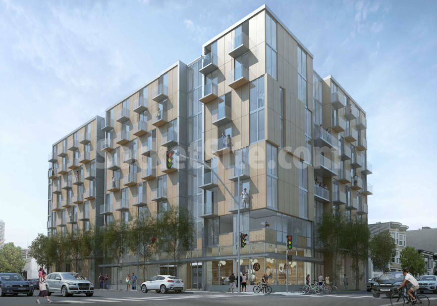
As we first reported and revealed earlier this week, the revised designs for a proposed 100-unit building to rise up to 8-stories in height at 988 Harrison Street, across from The EndUp on Sixth, are slated to be approved by San Francisco’s Planning Commission at the end of this month.
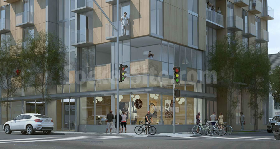
We now have a couple of new renderings to share, which unofficially include Sightglass Coffee rendered in the building’s ground floor retail space.
And another perspective on the development’s northern edge along Clara Street, which includes the entrance to its stacked 73-car garage.
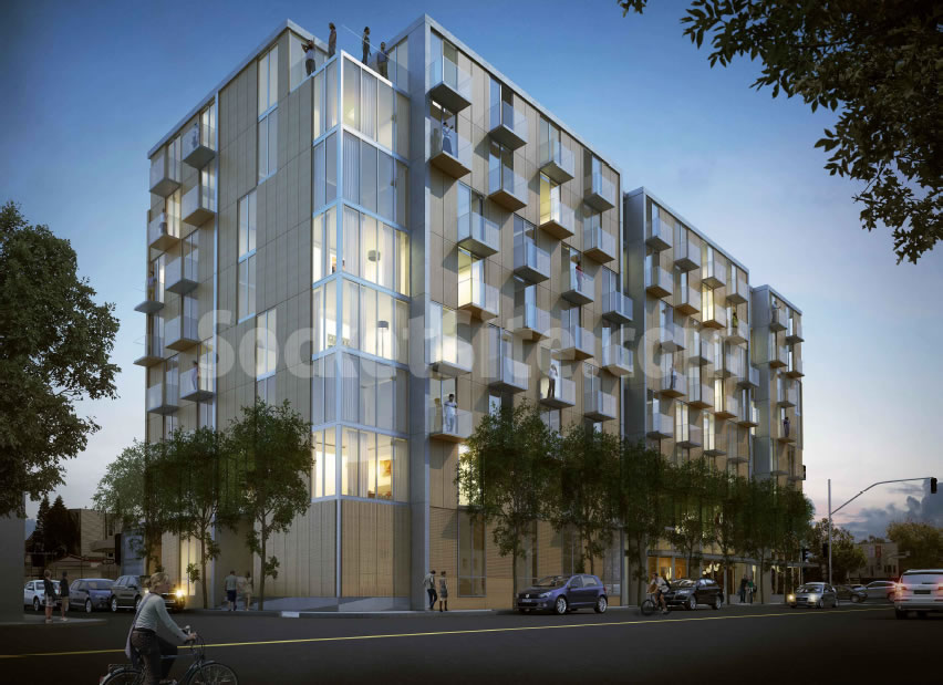
The colored panels are concrete.
I received a slightly different shot from the developers (namelink), demonstrating broad community support for the project.
Great, it actually is that beige.
meh, i like it. i’m sure the color was planning’s “suggestion”
And the problem with beige ( your words not mine) is exactly what?
Would you prefer colors from the Hello Kitty color chart perhaps?
I feel bad for you if you think the only colors available are beige and hot pink / magenta / bright red. If you want a beige box, great, but it looks like a beige box.
Beige is so 2006. If going for neutral why not grey of some kind; it would make the windows and balconies look better. Personally I’d choose a warm white but would probs get dirty from freeway nearby…
Beige always reminds me of the look of a 1980s office. Then everything was beige from computers to cubes to copy machines.
This building could remain beige but fixed up with some splashes of an accent color. There’s a 1970s era off-white office tower that was really improved this way. The accent color was gray. It was an inexpensive way to transform the facade.
You people need to understand the beauty and simplicity of minimalism in modern architecture. Not every building has to scream “look at me”.
Yet so many people here on SS seem to believe that.
And you need to calm down. Go create your own site for “professionals” like yourself. Let’s see how many of them will agree with you.
And for the record beige sucks. It adds nothing to a landscape that is mostly concrete and shrouded in fog.
But Mark, beige is actually very calming. Actually a rather ingenious way to “calm” down that busy intersection.
And where is our landscape mostly concrete and shrouded in fog?
Accent colors don’t need to scream. That 70s era office tower retrofit I mentioned doesn’t scream. The accent color is gray. The accent pattern really brought that half century old building into the modern era. I salute the designer who came up with that.
Beige also a bit too close to “slumlord tan”, that monochrome color made from paint store returns and rejects. It is depressing to walk down a street of formally fine Vics slathered in slumlord tan.
Happily, it turns out concrete can be repainted well after a building is constructed. The color shouldn’t hold anything up.
beautiful to me
A 20 foot tall blank wall on the corner is pretty lousy.
Is that an obligatory gaysian on the balcony?
they have quite the buying power in this city, so yes, most likely.
Any update on this project? Have they broken ground? Does seem weird the corner of 6th and Clara isn’t where the retail would be, rather than the highway-adjacent corner as rendered.
Building permit was issued at the end of november 2018. They havent filed for any addenda yet from what I can see. They recently (1 month) dropped a shipping container on site and wrapped it in green privacy fabric. Im not sure thats for this project, I think its to support the ongoing construction on 363 6th and 345 6th right next door.
Ah bummer—yeah I saw the privacy fence and was hoping it would get moving. So many vacant lots / 1-story autobody shops in this area during a housing crisis. :/
Was sold last Nov.
Curious what will go there.