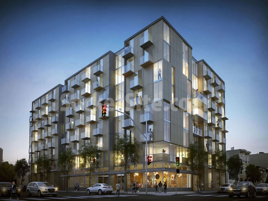
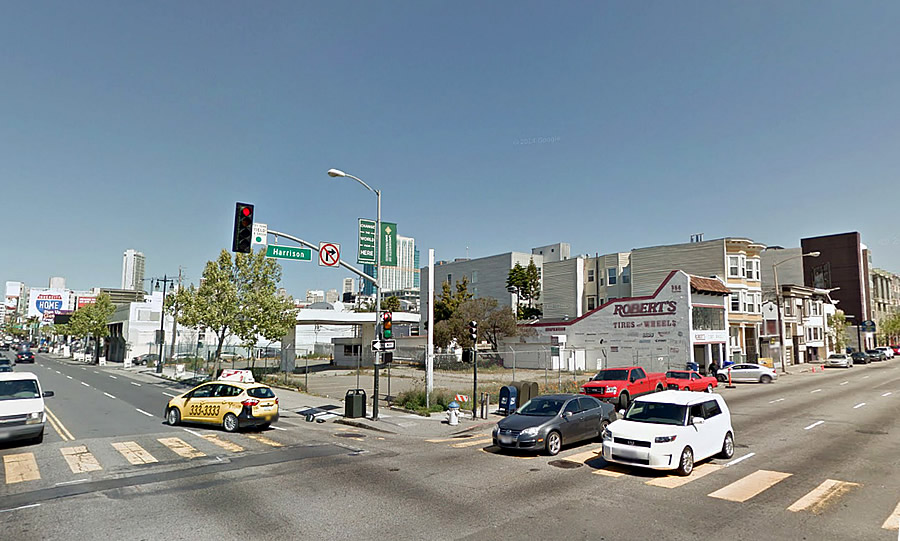
Having shed its current Sixth Street address and associations, the proposed 8‐story building to rise at 988 Harrison Street, on the northeast corner of Sixth and Harrison across from The EndUp, is slated to be approved by San Francisco’s Planning Commission at the end of this month.
The refined plan by Workshop1 now calls for 100 residential units – a mix of studios, one-bedrooms and two-bedrooms, with an average size of under around 625 square feet apiece – to rise up to 85-feet in height over 6,500 square feet of commercial space and an underground garage for 73 cars.
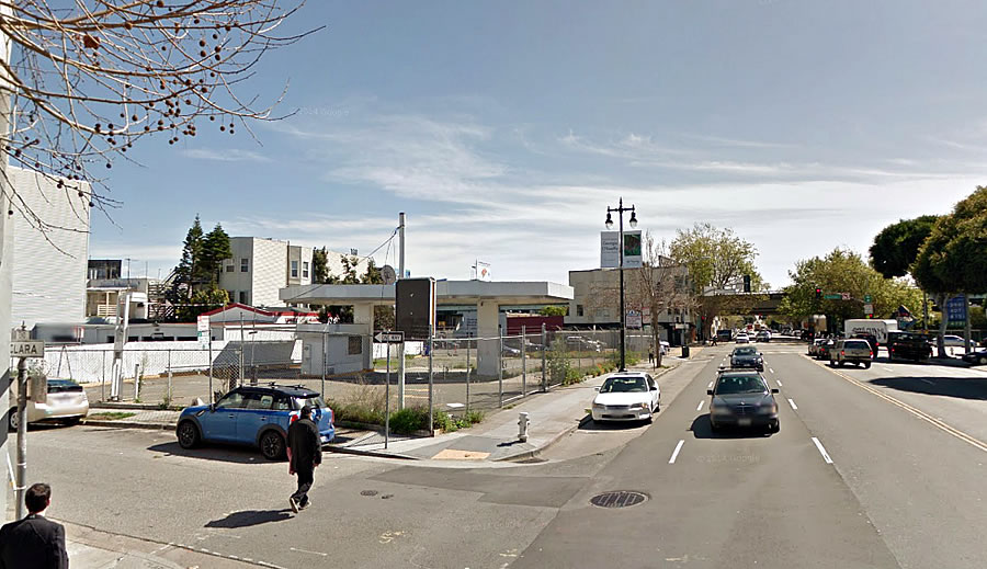
If approved, the entrance to the building’s garage and a couple of lofts will line the northern edge of the development along the south side of Clara Street.
And once again, as the former gas station site’s underground tanks have already been removed, the project team is estimating the development will only take 20 months to complete from the day it breaks ground.


Aside from the beige (not sure if that’s just the night rendering playing tricks), let’s build this!
looks great and that area needs more housing, as well as to be cleaned up. its also a great location for commuters
oh look, a staggered window pattern. BUT, it is nice
And those 2×4 balconies are always a hit for drunken Evita moments.
I’ll have to practice my QEII waving
Typical SF mediocrity. Maybe the architects do these cookie cuter buildings as they know the PC won’t push back.
A generation from now when the Central SOMA is plastered corner to corner with these banal looking buildings, some will look back and wonder how the City allowed it all to happen.
Lol like an abandoned gas station is any better? Or as if if we don’t need the housing? Keep on ranting Dave…
He’s criticizing the design, not the fact that housing is replacing a gas station lot.
It looks like typical modern architecture. It is not financially feasible (nor particularly creative) to design Art Deco-style apartments or to try to build another Seagrams Building. Housing is already expensive enough in the city, we do not need to add to the cost by making buildings more expensive to construct.
The proposal is for your typical square building with windows and unit floor-plans that are efficient and satisfy the preference of most individuals (few people want to live in weirdly shaped units with angles or curves–it makes placing furniture difficult and the over layout is not very functional).
Also, we here the same criticism over and over again–“banal,” “cookie-cutter,” etc. Yet, it seems the criticism itself is cookie-cutter. Repeating words without offering any analysis or explanation is not very persuasive. Explain what would be a better but still financially feasible design.
Exactly. I think the building looks fine. Could it be nicer? Sure, but not everything will be or should be an architectural masterpiece.
Agree completely. Off the cuff, armchair criticism is cheaply sold here on SS. Ok, yea, everybody can have an opinion, but too often, in fact a LOT of the times the criticism is just because they “don’t like it”.
Nothing more, just that. There are people who don’t like anything built. And there are those who offer a quick, cheap comment WANTING us to believe they have a more intellectual and “higher” opinion of architecture than others. By offering negative criticism, they seem to implying they really do know the “correct” solution, when they have no idea what that is.
For the most part, I generally support the design solutions of most new work being built, knowing the extremely complex set of steps that must take place to actually get a building approved and built.
This building is well designed and will be yet another good addition of housing for our city.
I think it looks fine too and oddly I find some of the other new building to be a problem for the very reason that they have strange angles and have no pattern or symmetry to the design. Some on upper Market seem odd to me for this reason
And I think the discordant issue I feel looking at some building from some angles is because of the forced set back on upper floors. Not sure but from Market St the new building at Dolores seems odd and further down the new yellow building next to the the LGBT on Market seems oddly proportioned and bulky to me
I personally like the work of Kennerly Architecture in SF. They seem to have found the right balance of interesting and functional architecture that doesn’t break the bank.
Because all of the other neighborhoods in the City are special flowers that offer unique architecture on every block. cough cough, Sunset….Richmond. etc. etc.
The buildings are of their time. And, I would still claim, far better than 95% of 1970s, 1980s, and 1990s architecture in the city.
So do tell us how this is mediocre and banal. Do you even understand modern, urban architecture? Do you understand the lengthy and detailed process to design AND develop a new building?
This building is clean, modern, fresh and completely appropriate from and urban design point of view.
Dave, I agree, why don’t you chip in a few million dollars or more to build something nicer?
If want the government to have total control over how everything (including private property) looks, perhaps the USSR circa 1980’s sounds good to you?
I’ll never understand this west coast mentality of “it’s your property and your money, but I think I have the right to tell you exactly what do with it.” It’s clearly a huge improvement over what’s there and you’re still moaning as if you’re been wrongly, like someone drank your milkshake.
“988” address. Are we in 2006 again?
Fingers crossed that this actually gets built before the bubble bursts. That area desperately needs life.
Futurist & Chris, I’ll tell you how this is banal and mediocre: The design moves are tired at best, formulaic at worst.
There are many, many recent multifamily projects that put this particular SF project to shame – built in Portland, Seattle, LA, San Diego, New York, Boston, even Philadelphia; not to mention the excellent examples in Denmark, France, Germany, Holland, Norway, Switzerland, Spain, Portugal, Japan, Korea etc. etc.
If you are somehow still in denial about the general mediocrity/banality of most SF housing design, just go look into any number of online postings/galleries of a recent major architectural awards program in the category of multifamily housing. It will be painfully obvious how much work needs to be done to raise the bar here… esp. in terms of urban approach, aesthetic form, spatial quality and building materials/details.
Excellent suggestion.
In terms of urban aesthetic there is a failure to integrate most of the new buildings with their surroundings and with the outdoors.
I cannot understand why San Franciscans don’t demand more from new projects in terms of architectural quality. Its a big issue in Portland and Seattle but seemingly a non-issue here.
Case in point – the TI project. Awful in design, nothing spectacular done with an absolutely unique urban spot. I’d bet if this was in NY, Chicago, LA a truly world-class project would have been built.
Right, because every project ever built has an infinite budget and the client’s #1 concern is winning a design award. Every building that goes up needs a marketing video with Bjarke Ingels gushing about how it addresses the human condition. San Francisco is one of the cheapest places to build, how people don’t spend more to create world class award winning designs is beyond me.
No, you haven’t told us how the project is “banal and mediocre”. all you have essentially said is that you don’t like this project. You attempt to compare many other cities with ours, which is irrelevant in determining excellent design quality. Do you really know what creates excellent design? By your definitions it seems to be ONLY copying what other cities (you seem to adore) have done.
Look at some of the new work going up in and around Hayes Valley. Not interesting enough for you? Not innovative? Not “Euro” enough?
I’ll submit that you really don’t have a strong set of reasons why you dislike this project so much, or other projects; except you don’t like it.
Granted, there’s a difference between just disliking something and actually genuinely feeling that it shouldn’t be ALLOWED to be built because it doesn’t suit your aesthetic preference. Many people in SF are in the latter camp, and it’s absolutely insane. They have no concept of how our government and our economy work.
I agree. Those in the latter camp simply don’t like change.
And there is a lot of bulky, bland, generic junk as well.
I personally would like to see more post-modern architecture. Anyone…?
with spray on stucco and out of scale awkward Michael Graves neoclassical notes? Bring it on!
UPDATE: Another Perspective on the Future of Sixth Street
Time to rewrite that old Malvina Reynolds song from the ’50s/’60s… ‘Big Boxes, Big Boxes, big boxes full of ticky tack, Big boxes, big boxes and they all look just the same.’.
Any update on this development, I recently saw construction on the vacant lot right next to it, but the 6th/Harrison gas station is still there.
Looks like 377 6th was sold last Nov for $11M.
Curious what will go there. I live on Clara between 6th and 5th.